Health & Wellness Welcome Email Template
“Welcome to the Revival”
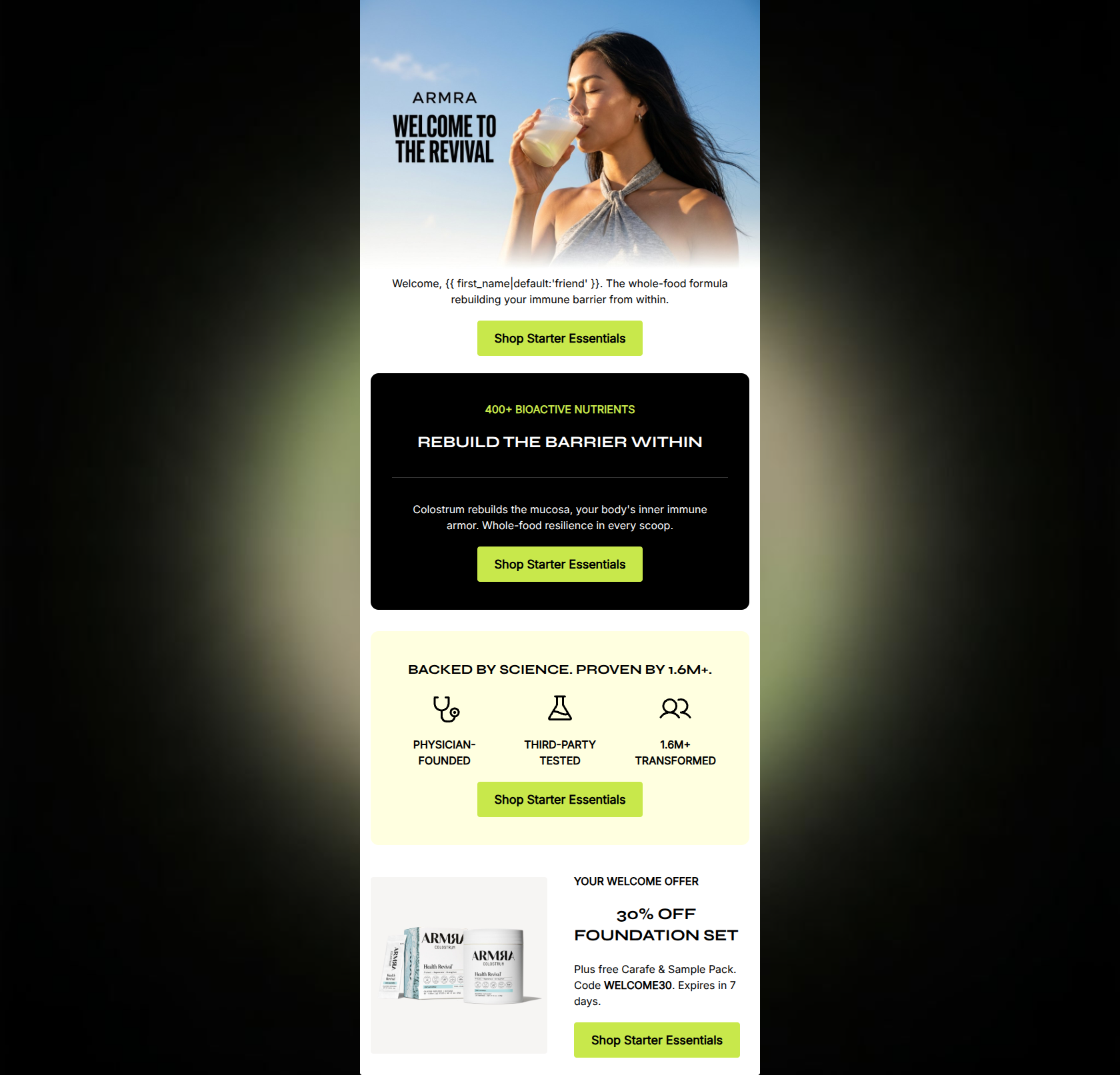
Design Score
80/100This email presents a highly polished, visually striking aesthetic that aligns perfectly with ARMRA's premium, science-backed brand identity. The stark contrast, bold typography, and precise copy effectively communicate the brand's core value proposition. Furthermore, the flawless repetition of the primary CTA button demonstrates a strong grasp of conversion mechanics. However, the email suffers from a significant structural flaw: it buries a highly compelling 30% off welcome offer at the very bottom of the scroll. In a welcome series, the strongest conversion lever should be front and center. By inverting the pyramid and leading with the offer, this email could perform significantly better.
Create Your Own
Generate professional email designs like this one in seconds with Kopi AI.
Email Details
- Subject Line
- Welcome to the Revival
- Brand
- ARMRA
- Industry
- Health & Wellness
- Email Type
- Welcome
- Created
- May 6, 2026
Brand Colors
Email Copy
Welcome, friend. The whole-food formula rebuilding your immune barrier from within.
→ Shop Starter Essentials
400+ BIOACTIVE NUTRIENTS
REBUILD THE BARRIER WITHIN
Colostrum rebuilds the mucosa, your body's inner immune armor. Whole-food resilience in every scoop.
→ Shop Starter Essentials
BACKED BY SCIENCE. PROVEN BY 1.6M+.
PHYSICIAN-FOUNDED
THIRD-PARTY TESTED
1.6M+ TRANSFORMED
→ Shop Starter Essentials
YOUR WELCOME OFFER
30% OFF FOUNDATION SET
Plus free Carafe & Sample Pack. Code WELCOME30. Expires in 7 days.
→ Shop Starter Essentials
Why This Email Works
This email presents a highly polished, visually striking aesthetic that aligns perfectly with ARMRA's premium, science-backed brand identity. The stark contrast, bold typography, and precise copy effectively communicate the brand's core value proposition. Furthermore, the flawless repetition of the primary CTA button demonstrates a strong grasp of conversion mechanics. However, the email suffers from a significant structural flaw: it buries a highly compelling 30% off welcome offer at the very bottom of the scroll. In a welcome series, the strongest conversion lever should be front and center. By inverting the pyramid and leading with the offer, this email could perform significantly better.
Hero (top/initial part) Impact
65/100- High-quality, aspirational imagery that fits the 'bio-hacker luxury' aesthetic.
- Clear, prominent brand logo integration.
Content Structure & Flow
72/100- Clear delineation between sections using distinct background colors.
- Logical grouping of scientific proof points.
Visual Hierarchy & Layout
88/100- Excellent use of negative space to prevent visual clutter.
- Strong contrast between section backgrounds keeps the reader engaged down the scroll.
Call-to-Action Strength
92/100- Perfect adherence to the single-destination CTA rule.
- High-contrast button color (#C8E84B) ensures the CTA pops against all backgrounds.
Message Clarity & Tone
85/100- Strong use of brand-specific terminology that reinforces premium positioning.
- Confident, declarative sentences that build trust.
Readability & Scannability
90/100- Excellent use of typographical hierarchy (H2s and H3s clearly distinct from body text).
- Iconography paired with short text blocks reduces cognitive load.
Offer & Value Proposition
75/100- A highly competitive and clear discount structure.
- Clear articulation of the product's primary biological benefit.
Personalization & Audience Fit
82/100- Use of first-name personalization in the crucial opening line.
- Tone and vocabulary perfectly match the highly educated, health-conscious target audience.
Copy Conciseness & Word Economy
88/100- High-impact, punchy sentences.
- Zero fluff; every word supports the conversion goal or brand positioning.
Quick Wins
- Tease or explicitly state the '30% Off' offer in the hero section to immediately hook the reader.
- Unify the product terminology: ensure the CTA button ('Starter Essentials') and the product name ('Foundation Set') match to prevent cognitive friction.
- Remove the hyperlinks from the icons in the 'Backed by Science' section to eliminate secondary click paths.
Create Professional Email Designs
Generate beautiful, on-brand email designs in seconds. Just enter your brand URL and let AI do the rest.