Fitness Welcome Email Template
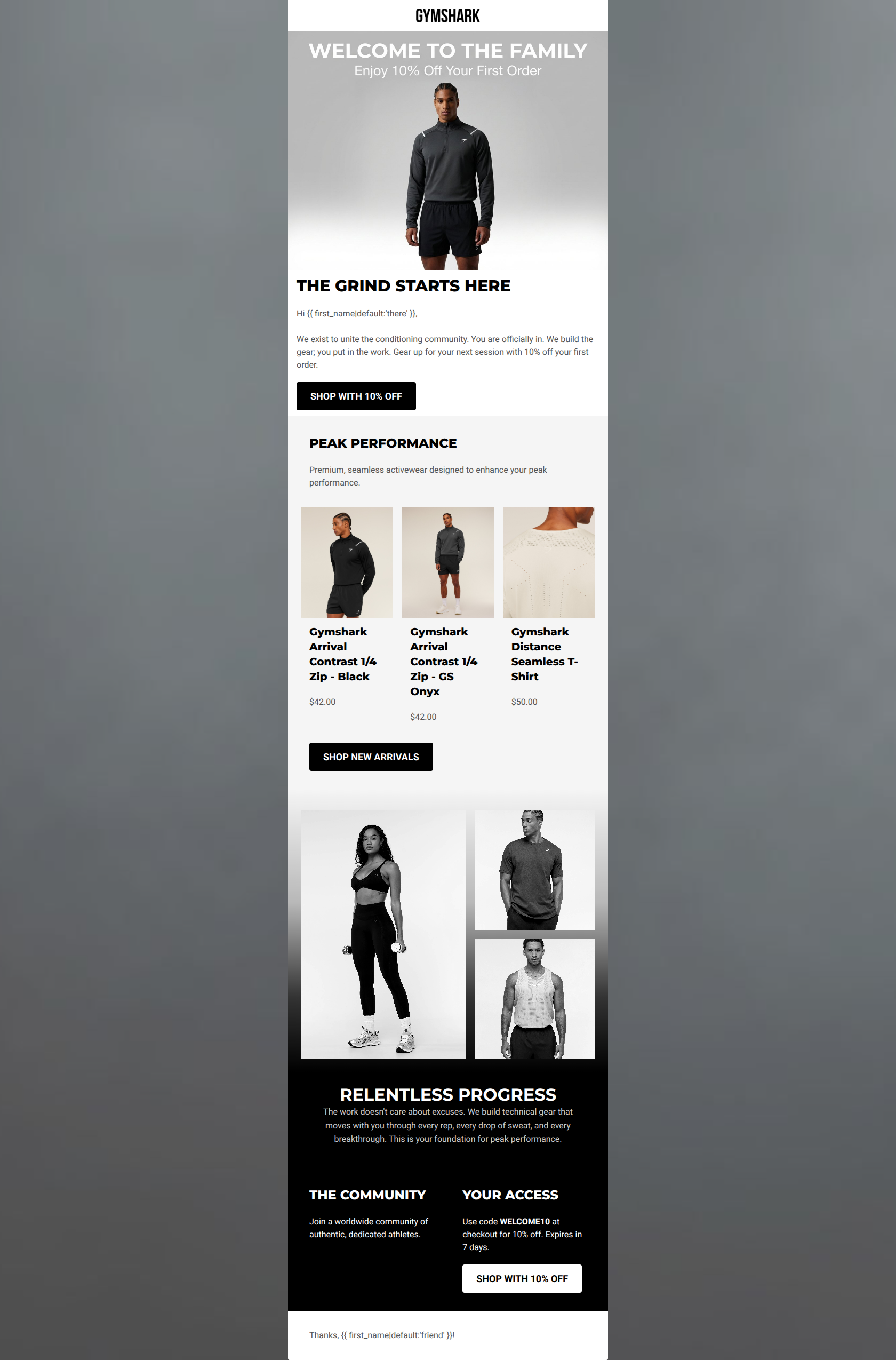
“Welcome to the family. Enjoy 10% off.”
Design Score
78/100This welcome email successfully captures Gymshark's gritty, highly motivational brand voice and clearly presents a strong introductory offer. The visual transition from light to dark creates an engaging scrolling experience that fits the 'relentless progress' theme. However, severe contrast issues in the hero image text and a cluttered, text-heavy product grid introduce unnecessary friction. By cleaning up the typography, fixing the contrast, and establishing a clearer hierarchy among the CTAs, this email can elevate from good to excellent.
Create Your Own
Generate professional email designs like this one in seconds with Kopi AI.
Email Details
- Subject Line
- Welcome to the family. Enjoy 10% off.
- Brand
- Gymshark
- Industry
- Fitness
- Email Type
- Welcome
- Created
- March 23, 2026
Brand Colors
Email Copy
THE GRIND STARTS HERE
Hi there, We exist to unite the conditioning community. You are officially in. We build the gear; you put in the work. Gear up for your next session with 10% off your first order.
→ SHOP WITH 10% OFF
PEAK PERFORMANCE
Premium, seamless activewear designed to enhance your peak performance.
Gymshark Arrival Contrast 1/4 Zip - Black
$42.00
Gymshark Arrival Contrast 1/4 Zip - GS Onyx
$42.00
Gymshark Distance Seamless T-Shirt
$50.00
→ SHOP NEW ARRIVALS
THE COMMUNITY
Join a worldwide community of authentic, dedicated athletes.
YOUR ACCESS
Use code WELCOME10 at checkout for 10% off. Expires in 7 days.
→ SHOP WITH 10% OFF
Thanks, friend!
Why This Email Works
This welcome email successfully captures Gymshark's gritty, highly motivational brand voice and clearly presents a strong introductory offer. The visual transition from light to dark creates an engaging scrolling experience that fits the 'relentless progress' theme. However, severe contrast issues in the hero image text and a cluttered, text-heavy product grid introduce unnecessary friction. By cleaning up the typography, fixing the contrast, and establishing a clearer hierarchy among the CTAs, this email can elevate from good to excellent.
Hero Impact
65/100- Establishes the primary offer immediately.
- The headline 'THE GRIND STARTS HERE' perfectly aligns with the target audience's psychographics.
Content Structure & Flow
85/100- Clear logical sequence from welcome to product to brand ethos.
- The background transition from light grey to black creates a strong, cinematic visual journey down the email.
Visual Hierarchy & Layout
70/100- The stark contrast in the bottom section naturally highlights the final text and CTA.
- Image collages break up the standard blocky layout and add dynamic energy.
Call-to-Action Strength
80/100- High-contrast black and white buttons are unmissable.
- Copy is clear, direct, and reiterates the value proposition ('SHOP WITH 10% OFF').
Message Clarity & Tone
90/100- Tone is empowering, authentic, and highly motivational.
- Strips away marketing fluff in favor of utilitarian, action-oriented messaging.
Readability & Scannability
70/100- Short paragraphs prevent walls of text.
- Bold, uppercase headings clearly delineate sections.
Offer & Value Proposition
85/100- The offer is stated clearly at the top and reiterated at the bottom.
- Includes a concrete expiration timeframe ('Expires in 7 days') to drive immediate action.
Personalization & Audience Fit
80/100- Uses the subscriber's first name in the opening line.
- The photography and messaging perfectly align with the target demographic's aspirations.
Quick Wins
- Remove 'Gymshark' from all product titles in the grid to reduce visual clutter and reading time.
- Delete the 'Thanks, [Name]!' block at the bottom to maintain the serious, athletic tone.
- Bold the phrase 'Expires in 7 days' to ensure the urgency stands out to skimmers.



Create Professional Email Designs
Generate beautiful, on-brand email designs in seconds. Just enter your brand URL and let AI do the rest.