Fitness Welcome Email Template

79/100Fair

Welcome to the Elite. Claim Your 10% Advantage.

Gains in Bulk
Share:
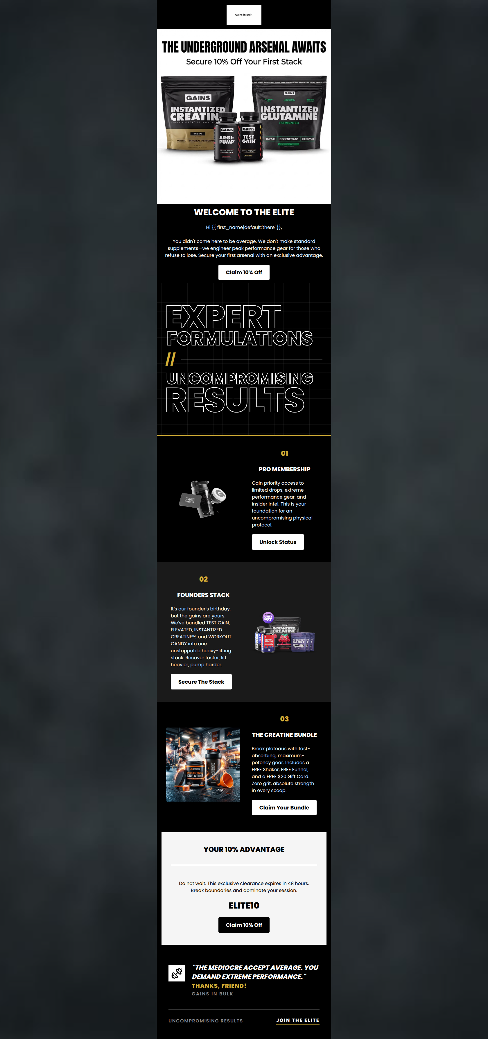
High-contrast dark email showcasing Gains in Bulk supplement stacks and a 10% discount code.

Design Score

79/100
C - Fair

This welcome email successfully establishes Gains in Bulk’s gritty, aggressive brand identity and sets a clear, authoritative tone right out of the gate. The dark-mode aesthetic with gold accents perfectly aligns with the 'underground gym' vibe, and the copy hits the target audience's psychographics head-on. However, the execution leaves conversions on the table by omitting pricing information on product blocks, relying on a visually jarring white header/footer that breaks the immersive experience, and using slightly conflicting tones at the sign-off.

Create Your Own

Generate professional email designs like this one in seconds with Kopi AI.

Start Creating

Email Details

Subject Line
Welcome to the Elite. Claim Your 10% Advantage.
Brand
Gains in Bulk
Industry
Fitness
Email Type
Welcome
Created
March 21, 2026

Brand Colors

Email Copy

WELCOME TO THE ELITE

Hi there, You didn't come here to be average. We don't make standard supplements—we engineer peak performance gear for those who refuse to lose. Secure your first arsenal with an exclusive advantage.

Claim 10% Off

01

PRO MEMBERSHIP

Gain priority access to limited drops, extreme performance gear, and insider intel. This is your foundation for an uncompromising physical protocol.

Unlock Status

02

FOUNDERS STACK

It’s our founder’s birthday, but the gains are yours. We've bundled TEST GAIN, ELEVATED, INSTANTIZED CREATINE™, and WORKOUT CANDY into one unstoppable heavy-lifting stack. Recover faster, lift heavier, pump harder.

Secure The Stack

03

THE CREATINE BUNDLE

Break plateaus with fast-absorbing, maximum-potency gear. Includes a FREE Shaker, FREE Funnel, and a FREE $20 Gift Card. Zero grit, absolute strength in every scoop.

Claim Your Bundle

YOUR 10% ADVANTAGE

Do not wait. This exclusive clearance expires in 48 hours. Break boundaries and dominate your session.

ELITE10

Claim 10% Off

Why This Email Works

This welcome email successfully establishes Gains in Bulk’s gritty, aggressive brand identity and sets a clear, authoritative tone right out of the gate. The dark-mode aesthetic with gold accents perfectly aligns with the 'underground gym' vibe, and the copy hits the target audience's psychographics head-on. However, the execution leaves conversions on the table by omitting pricing information on product blocks, relying on a visually jarring white header/footer that breaks the immersive experience, and using slightly conflicting tones at the sign-off.

Hero (top/initial part) Impact

82/100
  • Strong, aspirational headline that speaks directly to the target demographic.
  • Immediate introduction of the primary 10% discount.
  • High-contrast, striking hero imagery showing the actual product lineup.

Content Structure & Flow

78/100
  • Gold numbering (01, 02, 03) provides a clear, undeniable scan path.
  • Zig-zag layout keeps visual rhythm engaging without becoming chaotic.
  • The dedicated promo block at the bottom acts as a strong catch-all for non-scrollers.

Visual Hierarchy & Layout

75/100
  • Great use of black, white, and gold to establish a premium, masculine aesthetic.
  • The distressed typographic divider ('EXPERT FORMULATIONS') adds excellent visual texture.
  • Product photography is clean, sharp, and isolated well against the dark backgrounds.

Call-to-Action Strength

74/100
  • Strong contrast on buttons (white on black, black on white).
  • Excellent use of aggressive, definitive verbs rather than passive 'Learn More' links.

Message Clarity & Tone

85/100
  • Highly authoritative, uncompromising tone that respects the customer's dedication.
  • Focus on 'gear' and 'arsenal' rather than just 'supplements', elevating the product perception.
  • Direct, punchy sentences that avoid fluffy marketing speak.

Readability & Scannability

88/100
  • Perfectly portioned text blocks; no intimidating walls of text.
  • Headings are distinct from body copy in both size and color.
  • The visual divider text breaks up the reading experience effectively.

Offer & Value Proposition

72/100
  • 10% offer is bookended at the top and bottom of the email.
  • The Creatine Bundle explicitly lists the free added value items to drive desire.

Personalization & Audience Fit

80/100
  • Spot-on psychographic targeting.
  • Recognizes and validates the reader's hard work and commitment to fitness.

Quick Wins

  • Remove the stark white background from the top logo area to maintain the immersive dark theme.
  • Change the 'Thanks, Friend!' sign-off to something aggressive and on-brand like 'Stay Relentless'.
  • Change the fallback first name from 'there' to something community-driven like 'Athlete' or 'Competitor'.

Create Professional Email Designs

Generate beautiful, on-brand email designs in seconds. Just enter your brand URL and let AI do the rest.

Start Creating for Free