Health & Wellness Welcome Email Template
“Welcome to Hilma — so glad you're here”
Design Score
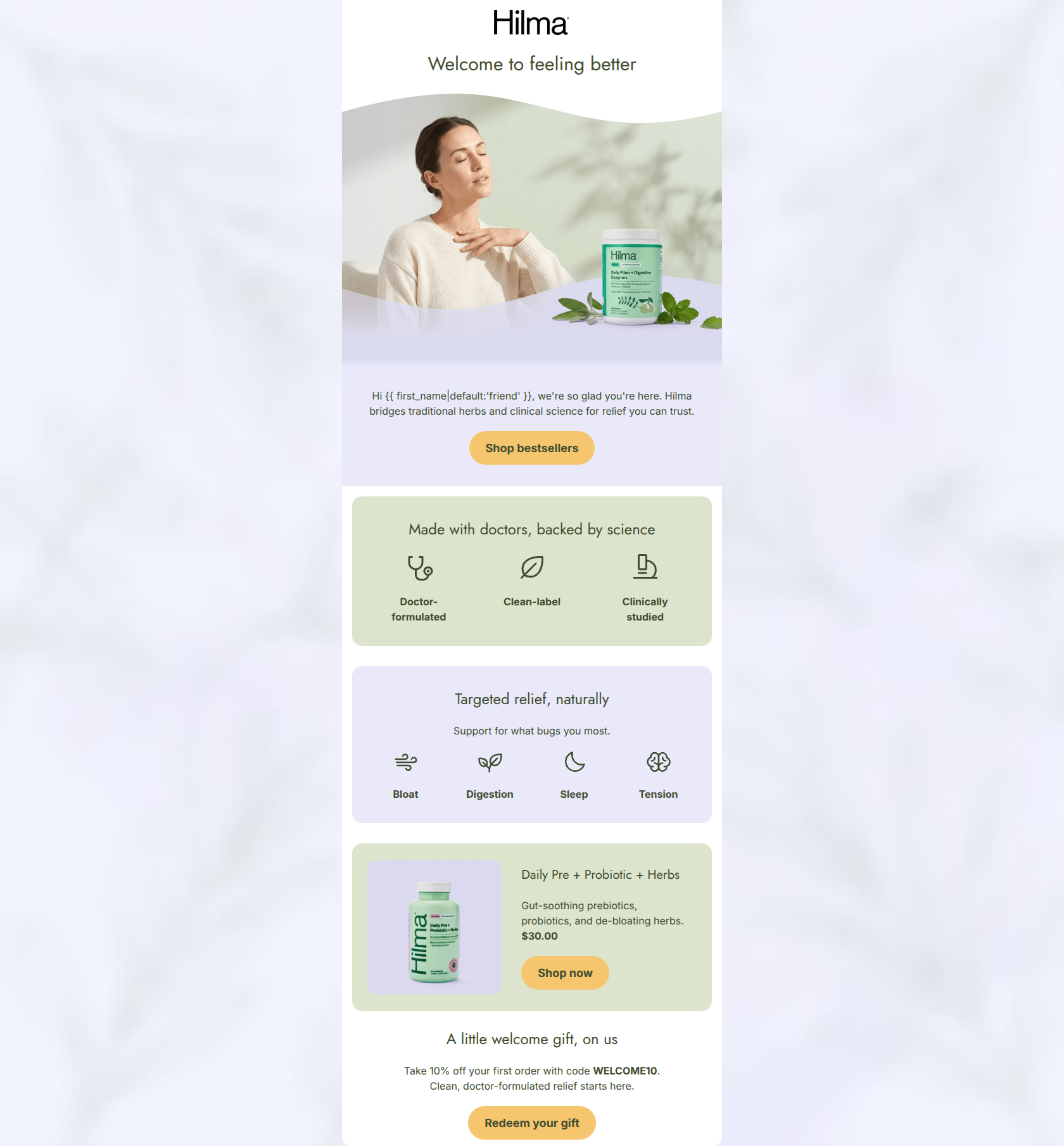
82/100This is a strong, aesthetically pleasing welcome email that effectively communicates Hilma's brand psychographics: approachable, doctor-backed, and clean. The visual hierarchy is generally clear, utilizing alternating background colors to guide the reader. The primary weakness is structural: the 10% welcome offer, which is typically the primary conversion driver in a first touchpoint, is buried at the very bottom. Additionally, while the general categories cover the full spectrum of customer pain points (digestion, sleep, tension), highlighting only a single digestive product may alienate users who signed up specifically for sleep or tension relief. Elevating the offer and diversifying the featured products would make this email highly optimized.
Create Your Own
Generate professional email designs like this one in seconds with Kopi AI.
Email Details
- Subject Line
- Welcome to Hilma — so glad you're here
- Brand
- Hilma
- Industry
- Health & Wellness
- Email Type
- Welcome
- Created
- June 18, 2026
Brand Colors
Email Copy
Preview text: Doctor-formulated, clean-label relief for digestion, sleep, and tension. Here's where to start.
Welcome to feeling better
Hi friend, we're so glad you're here. Hilma bridges traditional herbs and clinical science for relief you can trust.
→ Shop bestsellers
Made with doctors, backed by science
Doctor-formulated
Clean-label
Clinically studied
Targeted relief, naturally
Support for what bugs you most.
Bloat
Digestion
Sleep
Tension
Daily Pre + Probiotic + Herbs
Gut-soothing prebiotics, probiotics, and de-bloating herbs. $30.00
→ Shop now
A little welcome gift, on us
Take 10% off your first order with code WELCOME10. Clean, doctor-formulated relief starts here.
→ Redeem your gift
Why This Email Works
This is a strong, aesthetically pleasing welcome email that effectively communicates Hilma's brand psychographics: approachable, doctor-backed, and clean. The visual hierarchy is generally clear, utilizing alternating background colors to guide the reader. The primary weakness is structural: the 10% welcome offer, which is typically the primary conversion driver in a first touchpoint, is buried at the very bottom. Additionally, while the general categories cover the full spectrum of customer pain points (digestion, sleep, tension), highlighting only a single digestive product may alienate users who signed up specifically for sleep or tension relief. Elevating the offer and diversifying the featured products would make this email highly optimized.
Hero (top/initial part) Impact
75/100- Authentic, calming lifestyle imagery fits the brand psychographics perfectly.
- Subcopy efficiently bridges the gap between 'traditional herbs' and 'clinical science'.
Content Structure & Flow
78/100- Excellent use of distinct thematic blocks (Authority, Categories, Product, Offer).
- Clear progression from broad brand promises to specific ailments.
Visual Hierarchy & Layout
85/100- Intentional use of alternating background colors (#FFFFFF, #E9E9FA, #DCE4CE) creates a scannable rhythm.
- Icon size and placement in the 'Made with doctors' and 'Targeted relief' sections are perfectly balanced.
Call-to-Action Strength
90/100- Consistent destination URL across all buttons reinforces the primary action.
- High-contrast gold buttons (#F6C66F) easily pass the squint test.
Message Clarity & Tone
88/100- Perfect alignment with the brand voice: authoritative but warm.
- Simplifies complex value props ('Clinically studied', 'Clean-label') into easily digestible icons and short phrases.
Readability & Scannability
88/100- No walls of text; highly optimized for quick scanning.
- Excellent use of icons to communicate concepts visually before the user reads the text.
Offer & Value Proposition
75/100- Brand differentiators are explicitly stated and given their own dedicated section.
- Clear pricing on the product card reduces click hesitation.
Personalization & Audience Fit
80/100- Directly addresses the psychographic desire for clean, non-toxic, and effective solutions.
- Uses first-name personalization in the intro copy.
Copy Conciseness & Word Economy
86/100- Zero fluff in the body copy; highly distilled and intentional messaging.
- Product description is extremely concise ('Gut-soothing prebiotics...').
Quick Wins
- Move the 10% welcome offer block higher up in the email, preferably right beneath the intro text.
- Rewrite the hero H1 to be more specific (e.g., 'Welcome to natural, doctor-backed relief').
- Bold or highlight the promo code 'WELCOME10' to make it easier to spot and copy.
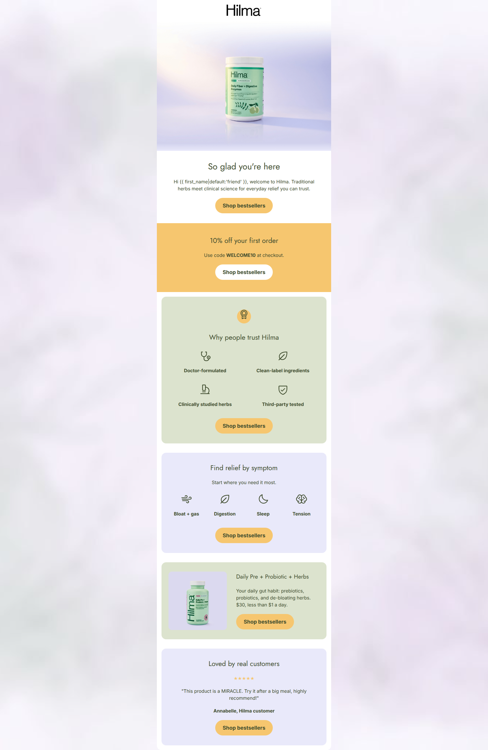
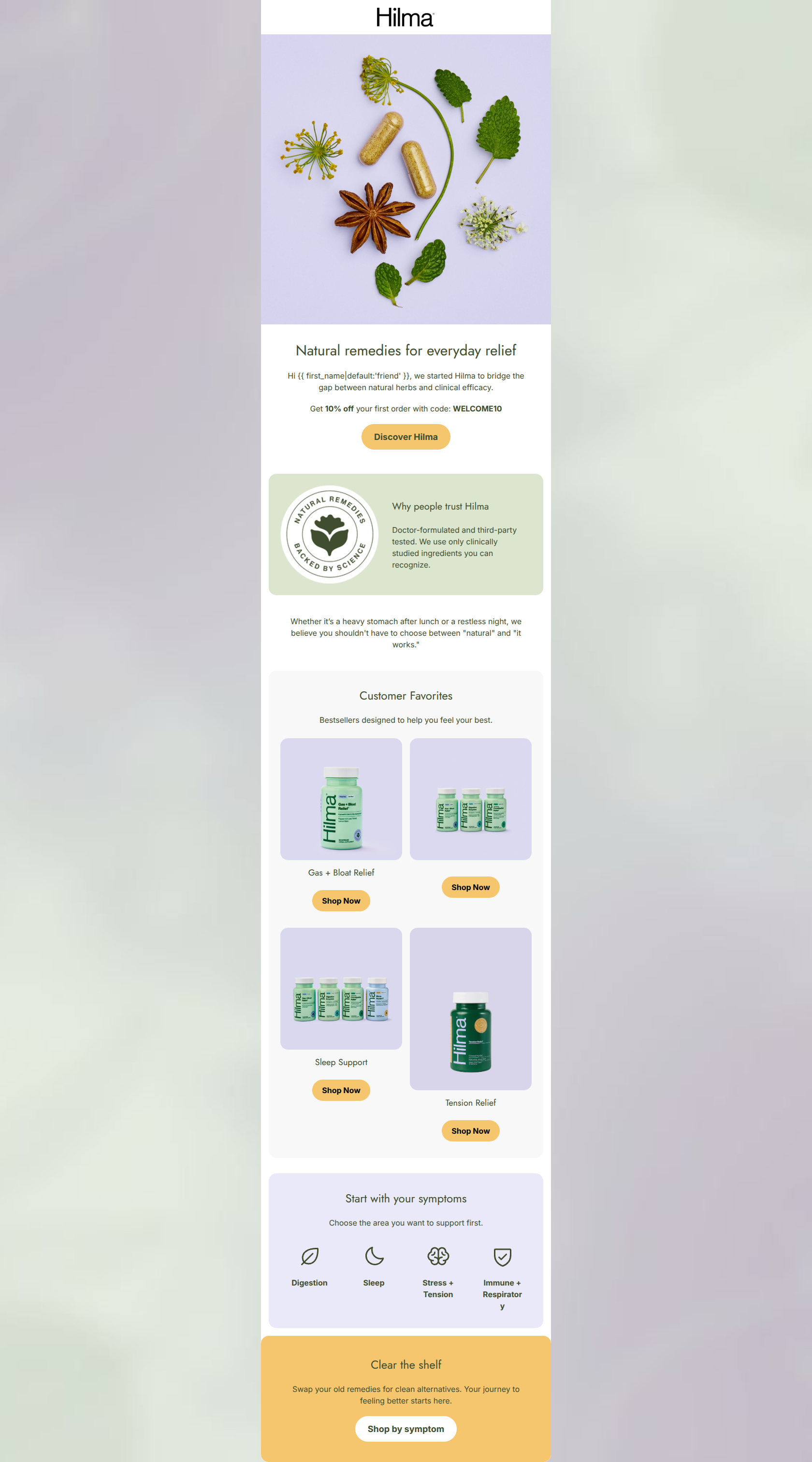
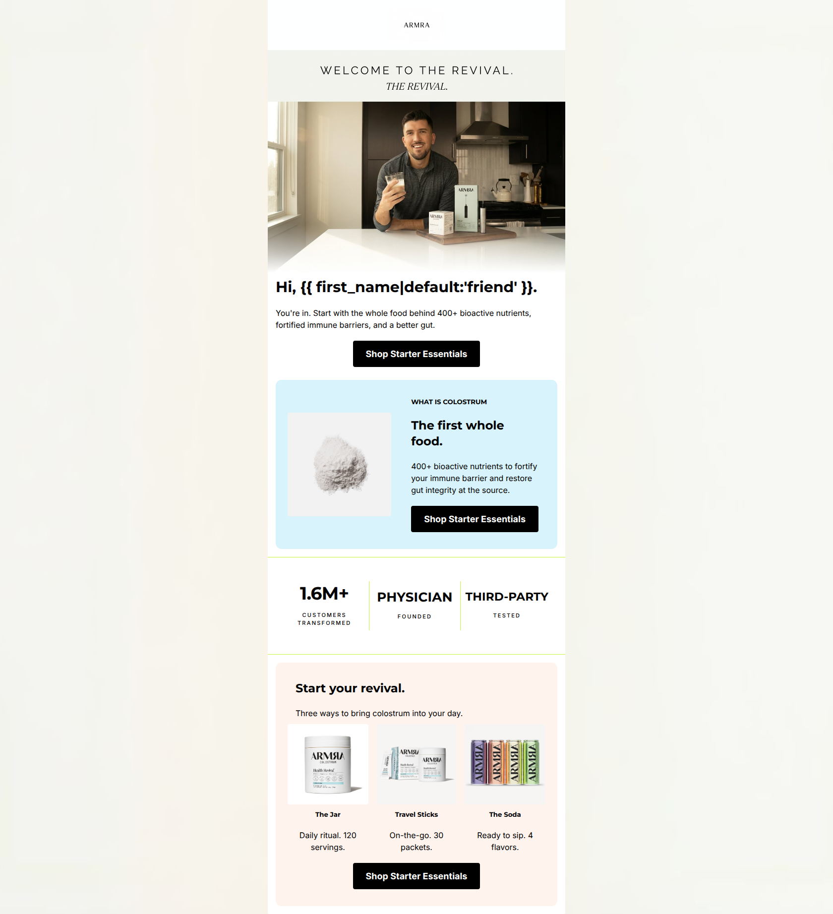
Create Professional Email Designs
Generate beautiful, on-brand email designs in seconds. Just enter your brand URL and let AI do the rest.