Food & Beverage Welcome Email Template
“Welcome to the Candy Crew! 🍭 (Gift Inside)”
Design Score
81/100This is a strong, on-brand welcome email that effectively leverages the founder's personality and visual identity. The primary conversion path is clear, but the email suffers from offer ambiguity (assuming the user knows what 'WELCOME20' provides) and some dense text blocks that slow down the scanning experience.
Create Your Own
Generate professional email designs like this one in seconds with Kopi AI.
Email Details
- Subject Line
- Welcome to the Candy Crew! 🍭 (Gift Inside)
- Brand
- JOYRIDE
- Industry
- Food & Beverage
- Email Type
- Welcome
- Created
- January 11, 2026
Brand Colors
Email Copy
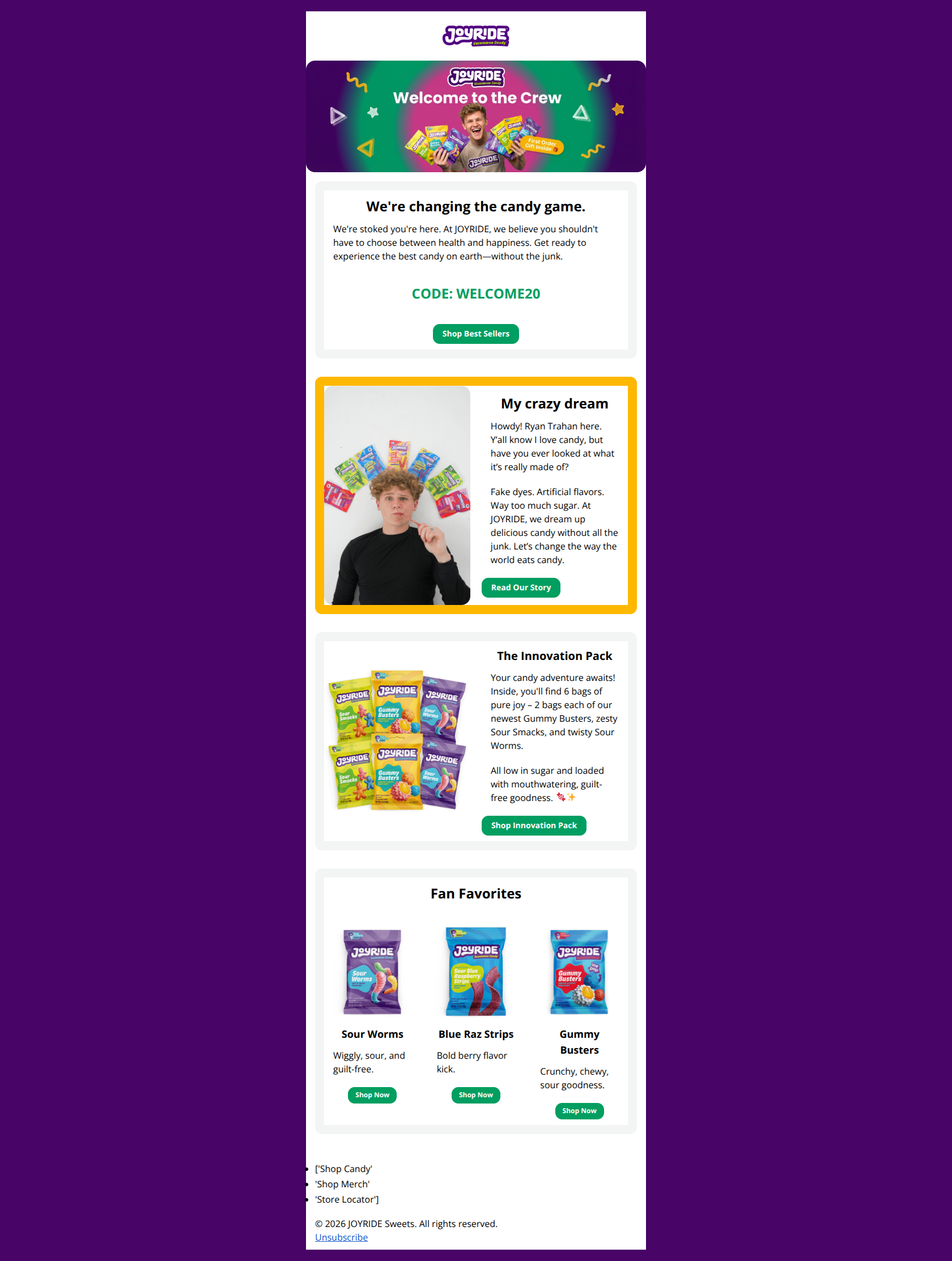
We're changing the candy game.
We're stoked you're here. At JOYRIDE, we believe you shouldn't have to choose between health and happiness. Get ready to experience the best candy on earth—without the junk.
CODE: WELCOME20
→ Shop Best Sellers
My crazy dream
Howdy! Ryan Trahan here. Y’all know I love candy, but have you ever looked at what it’s really made of?
Fake dyes. Artificial flavors. Way too much sugar. At JOYRIDE, we dream up delicious candy without all the junk. Let’s change the way the world eats candy.
→ Read Our Story
The Innovation Pack
Your candy adventure awaits! Inside, you'll find 6 bags of pure joy – 2 bags each of our newest Gummy Busters, zesty Sour Smacks, and twisty Sour Worms.
All low in sugar and loaded with mouthwatering, guilt-free goodness. 🍬✨
→ Shop Innovation Pack
Fan Favorites
Sour Worms
Wiggly, sour, and guilt-free.
→ Shop Now
Blue Raz Strips
Bold berry flavor kick.
→ Shop Now
Gummy Busters
Crunchy, chewy, sour goodness.
→ Shop Now
- ['Shop Candy'
- 'Shop Merch'
- 'Store Locator']
© 2026 JOYRIDE Sweets. All rights reserved. Unsubscribe
Why This Email Works
This is a strong, on-brand welcome email that effectively leverages the founder's personality and visual identity. The primary conversion path is clear, but the email suffers from offer ambiguity (assuming the user knows what 'WELCOME20' provides) and some dense text blocks that slow down the scanning experience.
Hero Impact
85/100- Vibrant, high-quality imagery that perfectly matches the brand tone.
- Clear headline 'Welcome to the Crew' establishes the relationship immediately.
Content Structure & Flow
80/100- Distinct sectioning helps guide the eye down the page.
- Logical progression from brand introduction to product education.
Visual Hierarchy & Layout
82/100- Strong color blocking creates a modern, clean look.
- Primary CTA buttons are distinct and easy to locate.
Call-to-Action Strength
78/100- Action-oriented copy on the main button ('Shop Best Sellers').
- Buttons use a consistent high-contrast color (green) to denote interactivity.
Message Clarity & Tone
85/100- Authentic voice ('Howdy! Ryan Trahan here') builds immediate trust.
- Clear value propositions ('Low sugar', 'Plant-based') are woven well into the narrative.
Readability & Scannability
75/100- Good use of font hierarchy (H2 vs Body).
- Short sentence structures keep the reading level accessible.
Offer & Value Proposition
75/100- The code is isolated and easy to find.
- The 'First Order Gift' hook in the hero is compelling.
Personalization & Audience Fit
85/100- Founder-led storytelling creates a personal connection.
- Visual style aligns perfectly with the target audience's aesthetic.
Quick Wins
- Add text 'Get 20% OFF' above the 'CODE: WELCOME20' line to remove ambiguity.
- Convert the paragraph text in the 'Innovation Pack' section into a bulleted list for faster scanning.
- Change the generic 'Shop Now' buttons in the product grid to 'Add to Cart' or 'Shop [Flavor]'.
- Bold the key problem statements ('Fake dyes', 'Artificial flavors') in the founder story text block.
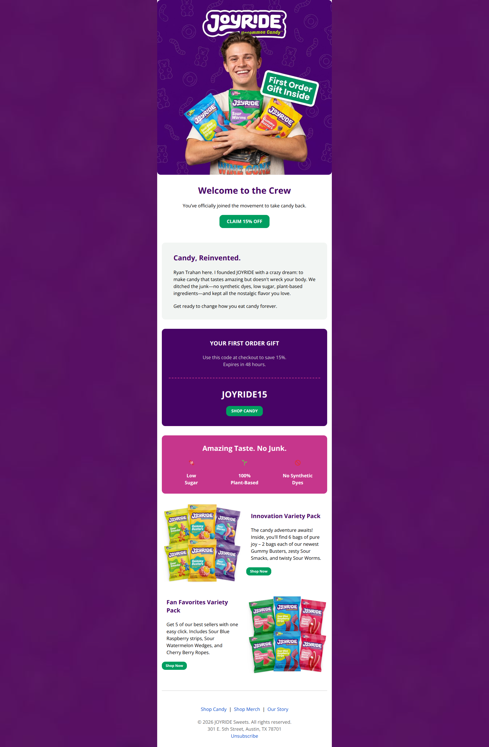
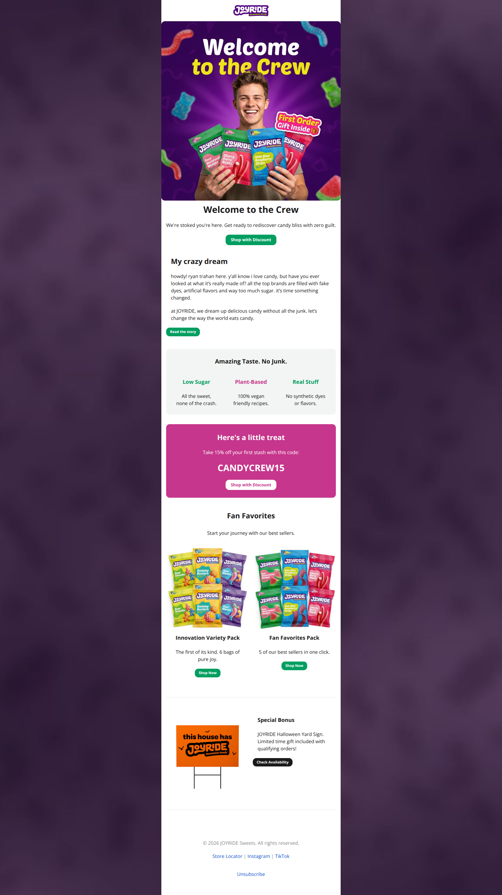
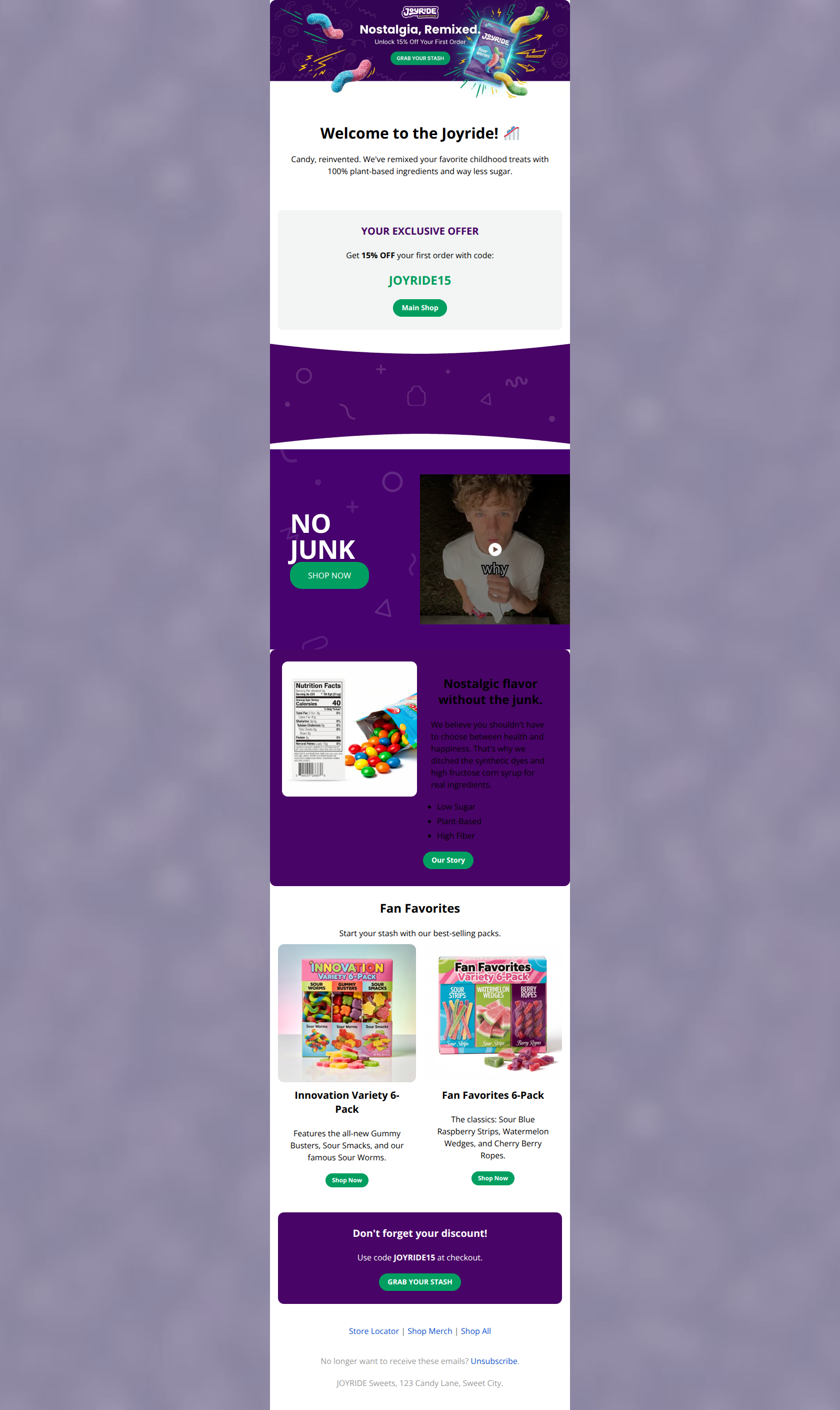

Create Professional Email Designs
Generate beautiful, on-brand email designs in seconds. Just enter your brand URL and let AI do the rest.