Food & Beverage Welcome Email Template
“Welcome to the JOYRIDE! 🎢 (+ Gift Inside)”
Design Score
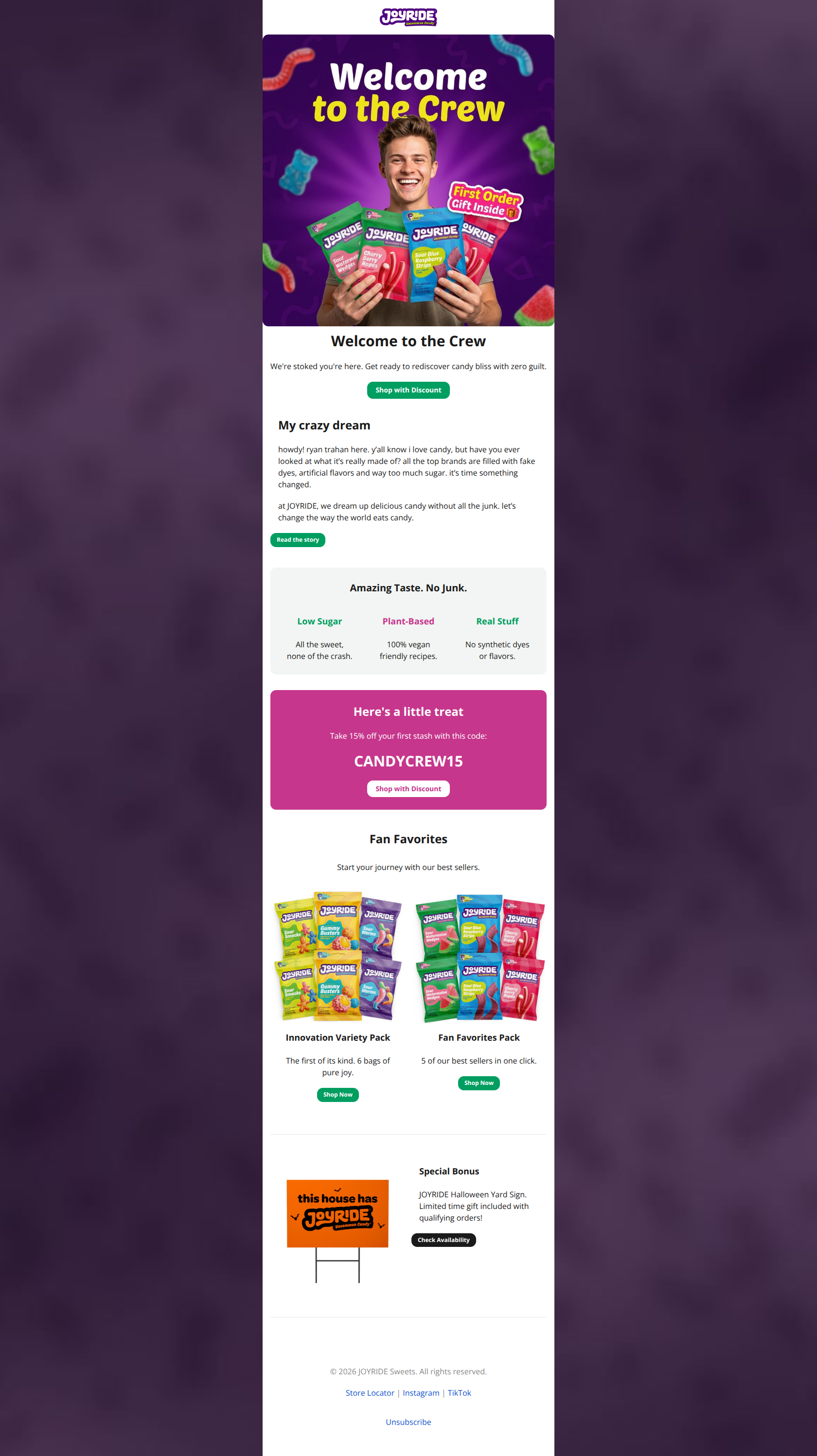
81/100This is a strong welcome email that leverages founder authenticity and vibrant branding effectively. The visual hierarchy is generally excellent, particularly the high-contrast discount section. However, the email suffers from 'offer ambiguity': the Hero promises a 'Gift Inside,' but the actual physical gift is buried at the bottom with vague qualifying terms, while the primary CTA leads only to a discount. Clarifying the offer mechanics and plugging the conversion leak in the founder section would push this into the 90s.
Create Your Own
Generate professional email designs like this one in seconds with Kopi AI.
Email Details
- Subject Line
- Welcome to the JOYRIDE! 🎢 (+ Gift Inside)
- Brand
- JOYRIDE
- Industry
- Food & Beverage
- Email Type
- Welcome
- Created
- February 13, 2026
Brand Colors
Email Copy
Welcome to the Crew
We're stoked you're here. Get ready to rediscover candy bliss with zero guilt.
→ Shop with Discount
My crazy dream
howdy! ryan trahan here. y’all know i love candy, but have you ever looked at what it’s really made of? all the top brands are filled with fake dyes, artificial flavors and way too much sugar. it’s time something changed.
at JOYRIDE, we dream up delicious candy without all the junk. let’s change the way the world eats candy.
→ Read the story
Amazing Taste. No Junk.
Low Sugar
All the sweet, none of the crash.
Plant-Based
100% vegan friendly recipes.
Real Stuff
No synthetic dyes or flavors.
Here's a little treat
Take 15% off your first stash with this code:
CANDYCREW15
→ Shop with Discount
Fan Favorites
Start your journey with our best sellers.
Innovation Variety Pack
The first of its kind. 6 bags of pure joy.
→ Shop Now
Fan Favorites Pack
5 of our best sellers in one click.
→ Shop Now
Special Bonus
JOYRIDE Halloween Yard Sign. Limited time gift included with qualifying orders!
→ Check Availability
© 2026 JOYRIDE Sweets. All rights reserved.
Store Locator | Instagram | TikTok
Unsubscribe
Why This Email Works
This is a strong welcome email that leverages founder authenticity and vibrant branding effectively. The visual hierarchy is generally excellent, particularly the high-contrast discount section. However, the email suffers from 'offer ambiguity': the Hero promises a 'Gift Inside,' but the actual physical gift is buried at the bottom with vague qualifying terms, while the primary CTA leads only to a discount. Clarifying the offer mechanics and plugging the conversion leak in the founder section would push this into the 90s.
Hero (top/initial part) Impact
85/100- High-energy photography that perfectly matches the brand voice.
- Clear, benefit-driven primary CTA ('Shop with Discount').
Content Structure & Flow
80/100- Strong storytelling element with the founder intro, building trust early.
- Clear separation between the brand story and the commercial offer.
Visual Hierarchy & Layout
88/100- The discount code section (pink background) pops aggressively against the white content, drawing the eye exactly where it needs to go.
- Clean, spacious layout that prevents the vibrant colors from feeling cluttered.
Call-to-Action Strength
78/100- Primary buttons use the brand green effectively to stand out.
- Button copy like 'Shop with Discount' reinforces the benefit rather than just the action.
Message Clarity & Tone
85/100- Consistent brand voice that feels authentic to the influencer/founder roots.
- Value prop icons ('Low Sugar', 'Plant-Based') are easily scannable.
Readability & Scannability
85/100- Good use of whitespace between sections.
- Short, punchy headlines.
Offer & Value Proposition
65/100- The 15% discount code is presented clearly with a dedicated copy-paste visual.
- The 'No Junk' promise is well-articulated.
Personalization & Audience Fit
85/100- Direct address from the founder ('ryan trahan here') builds immediate parasocial connection.
- Visual style perfectly matches the 'healthy nostalgia' demographic.
Quick Wins
- Change the 'Read the story' CTA to 'Shop Ryan's Favorites' to keep users in the purchase funnel.
- Add the specific spend threshold to the Yard Sign section (e.g., 'Free on orders $50+') to remove ambiguity.
- Change the Yard Sign CTA from 'Check Availability' to 'Claim Free Gift'.
- Bold the code 'CANDYCREW15' in the body text or add a 'Copy Code' implication.


Create Professional Email Designs
Generate beautiful, on-brand email designs in seconds. Just enter your brand URL and let AI do the rest.