Food & Beverage Welcome Email Template
“Welcome to the Joyride! 🎢 (Your 15% Off is inside”
Design Score
85/100This is a strong, cohesive Welcome email that effectively introduces the brand voice and delivers the core value proposition immediately. The visual hierarchy is clear, guiding the user from the offer to the products. The primary weakness lies in the CTA labeling, which is occasionally vague ('Main Shop') or distracting (sending users to a Story page rather than a collection), and the lack of visible pricing in the product grid which adds friction.
Create Your Own
Generate professional email designs like this one in seconds with Kopi AI.
Email Details
- Subject Line
- Welcome to the Joyride! 🎢 (Your 15% Off is inside
- Brand
- JOYRIDE
- Industry
- Food & Beverage
- Email Type
- Welcome
- Created
- February 13, 2026
Brand Colors
Email Copy
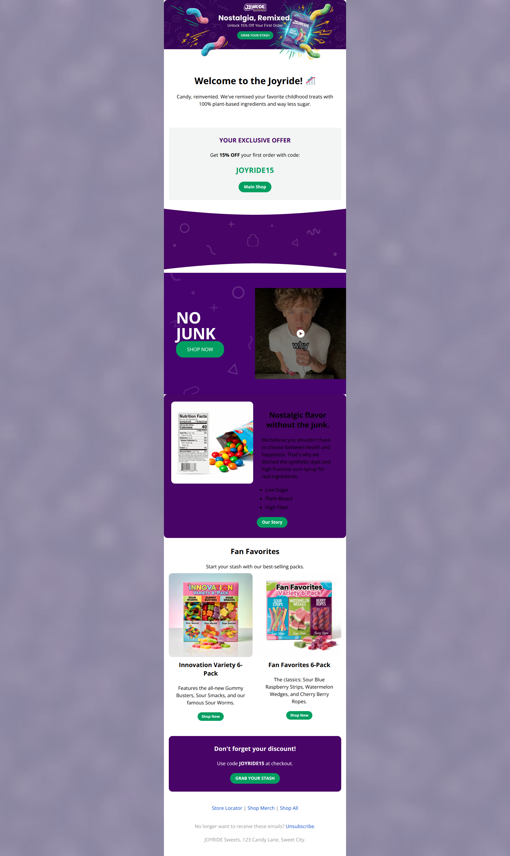
Welcome to the Joyride! 🎢
Candy, reinvented. We've remixed your favorite childhood treats with 100% plant-based ingredients and way less sugar.
YOUR EXCLUSIVE OFFER
Get 15% OFF your first order with code:
JOYRIDE15
→ Main Shop
NO JUNK
→ SHOP NOW
Fan Favorites
Start your stash with our best-selling packs.
Innovation Variety 6-Pack
Features the all-new Gummy Busters, Sour Smacks, and our famous Sour Worms.
→ Shop Now
Fan Favorites 6-Pack
The classics: Sour Blue Raspberry Strips, Watermelon Wedges, and Cherry Berry Ropes.
→ Shop Now
Don't forget your discount!
Use code JOYRIDE15 at checkout.
→ GRAB YOUR STASH
Store Locator | Shop Merch | Shop All
No longer want to receive these emails? Unsubscribe.
JOYRIDE Sweets, 123 Candy Lane, Sweet City.
Why This Email Works
This is a strong, cohesive Welcome email that effectively introduces the brand voice and delivers the core value proposition immediately. The visual hierarchy is clear, guiding the user from the offer to the products. The primary weakness lies in the CTA labeling, which is occasionally vague ('Main Shop') or distracting (sending users to a Story page rather than a collection), and the lack of visible pricing in the product grid which adds friction.
Hero (top/initial part) Impact
90/100- Strong use of brand imagery that perfectly captures the 'playful' and 'nostalgic' tone.
- Headline clearly communicates the value proposition.
Content Structure & Flow
85/100- Logical progression from brand intro to hard offer.
- Good use of section breaks (dividers and background colors) to segment content.
Visual Hierarchy & Layout
85/100- Excellent prominence given to the discount code.
- Clean, uncluttered card designs for the product variety packs.
Call-to-Action Strength
75/100- Primary CTAs use the brand green effectively against white/purple backgrounds.
- The final CTA 'GRAB YOUR STASH' is excellent brand-voice copy.
Message Clarity & Tone
90/100- Consistent, playful tone that doesn't sacrifice clarity.
- Excellent translation of 'healthy' features into 'tasty' benefits.
Readability & Scannability
85/100- Short paragraphs prevent wall-of-text fatigue.
- Good use of bolding to highlight key phrases.
Offer & Value Proposition
90/100- The offer is unambiguous and easy to copy/paste.
- The 'Why Buy' is clear: 100% plant-based, low sugar.
Personalization & Audience Fit
80/100- The content perfectly matches the 'Health-Conscious Millennial' persona.
Quick Wins
- Rename the 'Main Shop' button to 'Redeem 15% Off' to drive urgency.
- Add pricing (e.g., '$29.99') to the product grid cards to reduce click hesitation.
- Change the 'Our Story' button link to point to a 'Best Sellers' collection instead of a text-heavy story page.
- Bold the expiration terms (if any) or add 'Limited Time' near the code to create urgency.


Create Professional Email Designs
Generate beautiful, on-brand email designs in seconds. Just enter your brand URL and let AI do the rest.