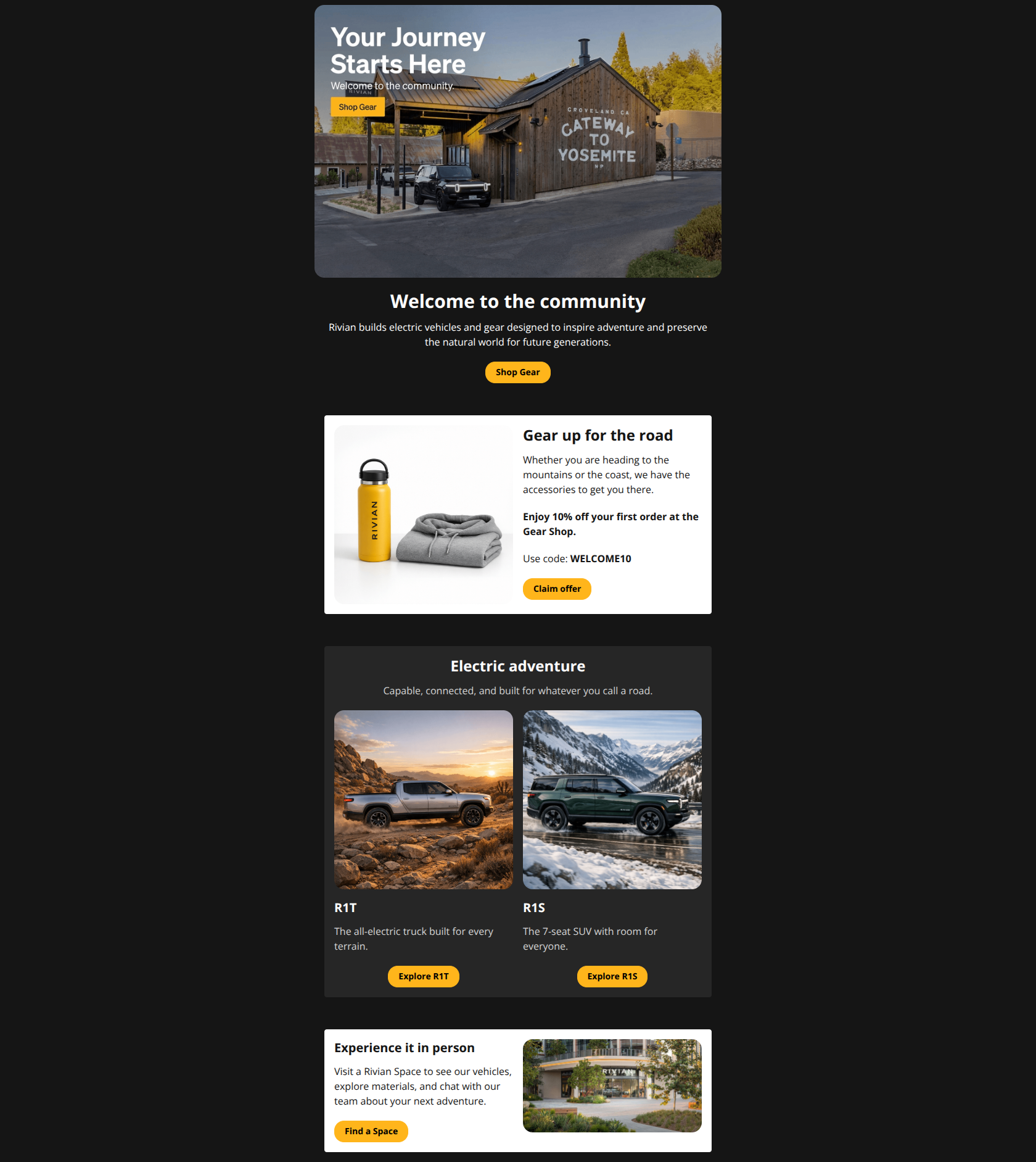
Design Score
82/100This is a visually stunning, premium execution that leans heavily on Rivian's strong brand aesthetic. The dark-mode palette and high-contrast yellow CTAs create an excellent visual hierarchy that guides the eye effortlessly. However, the copy—particularly in the Hero—is passive and corporate-focused ('Rivian builds...') rather than user-centric, missing a chance to immediately hook the reader with the 10% discount buried in the second section.
Create Your Own
Generate professional email designs like this one in seconds with Kopi AI.
Email Details
- Subject Line
- Welcome to Rivian! ⚡
- Brand
- Rivian
- Industry
- Automotive
- Email Type
- Welcome
- Created
- December 24, 2025
Brand Colors
Email Copy
Welcome to the community
Rivian builds electric vehicles and gear designed to inspire adventure and preserve the natural world for future generations.
→ Shop Gear
Gear up for the road
Whether you are heading to the mountains or the coast, we have the accessories to get you there.
Enjoy 10% off your first order at the Gear Shop.
Use code: WELCOME10
→ Claim offer
Electric adventure
Capable, connected, and built for whatever you call a road.
R1T
The all-electric truck built for every terrain.
→ Explore R1T
R1S
The 7-seat SUV with room for everyone.
→ Explore R1S
Experience it in person
Visit a Rivian Space to see our vehicles, explore materials, and chat with our team about your next adventure.
→ Find a Space
Why This Email Works
This is a visually stunning, premium execution that leans heavily on Rivian's strong brand aesthetic. The dark-mode palette and high-contrast yellow CTAs create an excellent visual hierarchy that guides the eye effortlessly. However, the copy—particularly in the Hero—is passive and corporate-focused ('Rivian builds...') rather than user-centric, missing a chance to immediately hook the reader with the 10% discount buried in the second section.
Hero (top/initial part) Impact
75/100- High-quality imagery clearly sets the adventure context immediately.
- Primary CTA 'Shop Gear' stands out vividly against the dark background.
Content Structure & Flow
85/100- Smart pivot from low-ticket items (gear) to high-ticket items (vehicles) without overwhelming the user.
- Clear delineation between sections using card backgrounds.
Visual Hierarchy & Layout
90/100- Yellow CTAs pop aggressively against the black/dark grey, making the action path obvious.
- Two-column layouts in the body maintain readability without feeling cluttered.
Call-to-Action Strength
85/100- Button design (pill shape, bright yellow) passes the squint test easily.
- 'Claim offer' is a strong, benefit-oriented command.
Message Clarity & Tone
80/100- The gear discount offer (10% off) is explained clearly with the code WELCOME10 prominently displayed.
- Consistent voice that aligns with the premium nature of the product.
Readability & Scannability
90/100- Short paragraphs (1-2 sentences) make skimming effortless.
- High contrast text (white on black, black on white) prevents eye strain.
Offer & Value Proposition
80/100- Concrete value (10% off) is offered immediately to new subscribers.
- The offer is isolated in its own white card, making it feel like a physical ticket or coupon.
Personalization & Audience Fit
75/100- The content mix (Gear + Cars + Retail) covers the bases for both owners and aspirants.
Quick Wins
- **Rewrite Hero Subhead:** Change 'Rivian builds electric vehicles...' (company-centric) to 'Start your journey with gear designed for the wild' (user-centric).
- **Sharpen Vehicle Header:** Rename 'Electric adventure' to 'Meet Your Vehicle' or 'Find Your Rivian' to sound more actionable.
- **Add Urgency to Offer:** Add a small line under 'Claim offer' that says 'Valid for your first order only' to prompt immediate action.
Create Professional Email Designs
Generate beautiful, on-brand email designs in seconds. Just enter your brand URL and let AI do the rest.