Health & Wellness Welcome Email Template
“Welcome to next-level hydration.”
Design Score
87/100This is a highly effective, beautifully structured welcome email that acts as a frictionless conversion bridge. It leverages the brand's energetic aesthetic, uses excellent visual hierarchy to guide the eye, and executes the primary rule of email CTAs flawlessly by repeating the exact same, high-intent action ('Shop Best Sellers') throughout the entire scroll. The word economy is superb, relying on punchy icons and concise copy to deliver the value proposition. The primary missed opportunity is the absence of an explicit welcome incentive (discount or free shipping threshold) to nudge the user toward their first purchase, and the hero headline could be slightly more benefit-driven.
Create Your Own
Generate professional email designs like this one in seconds with Kopi AI.
Email Details
- Subject Line
- Welcome to next-level hydration.
- Brand
- Liquid I.V.
- Industry
- Health & Wellness
- Email Type
- Welcome
- Created
- May 21, 2026
Brand Colors
Email Copy
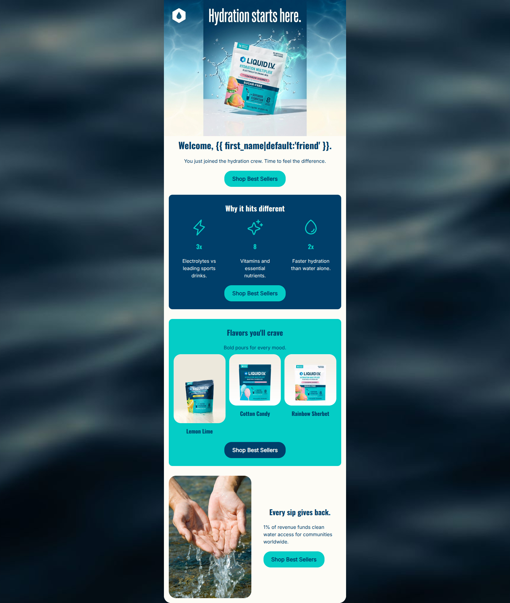
Welcome, friend.
You just joined the hydration crew. Time to feel the difference.
→ Shop Best Sellers
Why it hits different
3x
Electrolytes vs leading sports drinks.
8
Vitamins and essential nutrients.
2x
Faster hydration than water alone.
→ Shop Best Sellers
Flavors you'll crave
Bold pours for every mood.
Lemon Lime
Cotton Candy
Rainbow Sherbet
→ Shop Best Sellers
Every sip gives back.
1% of revenue funds clean water access for communities worldwide.
→ Shop Best Sellers
Why This Email Works
This is a highly effective, beautifully structured welcome email that acts as a frictionless conversion bridge. It leverages the brand's energetic aesthetic, uses excellent visual hierarchy to guide the eye, and executes the primary rule of email CTAs flawlessly by repeating the exact same, high-intent action ('Shop Best Sellers') throughout the entire scroll. The word economy is superb, relying on punchy icons and concise copy to deliver the value proposition. The primary missed opportunity is the absence of an explicit welcome incentive (discount or free shipping threshold) to nudge the user toward their first purchase, and the hero headline could be slightly more benefit-driven.
Hero Impact
82/100- Uses dynamic personalization right out of the gate.
- Aspirational, high-energy imagery fits the brand perfectly.
- Clear, immediate path to purchase above the fold.
Content Structure & Flow
92/100- Perfect narrative sequence that answers 'Who are you?', 'Why should I care?', and 'What should I buy?'.
- Excellent use of distinct, color-blocked sections to separate thoughts.
- Each section ends with a conversion opportunity.
Visual Hierarchy & Layout
88/100- Strong use of the alternating color palette (White -> Dark Blue -> Cyan -> White) keeps the user engaged.
- The 3-column value prop section is perfectly balanced.
- Generous padding and whitespace prevent the email from feeling cluttered.
Call-to-Action Strength
100/100- All four buttons share the same destination, concentrating all click energy into the primary goal.
- The button copy ('Shop Best Sellers') is high-intent and reduces choice paralysis for a new user.
- Smart adjustment of the button color in the cyan section to maintain contrast.
Message Clarity & Tone
88/100- Consistent, authentic brand voice.
- Avoids generic corporate speak in favor of dynamic, energetic phrasing.
- The mission statement ('Every sip gives back') is distilled into one simple, impactful sentence.
Readability & Scannability
94/100- Brilliant use of icons to anchor key statistics.
- Short, punchy sentences that respect the reader's time.
- High-contrast text pairings throughout the entire email.
Offer & Value Proposition
75/100- Clearly quantifiable product benefits (3x, 8, 2x) eliminate vague marketing fluff.
- The mission statement adds an emotional value layer to the functional product benefits.
Personalization & Audience Fit
82/100- Uses the subscriber's name in the opening line.
- Speaks to outcomes the audience cares about ('faster hydration', 'feel the difference').
Copy Conciseness & Word Economy
95/100- Distills complex nutritional info into highly scannable bullet points.
- Avoids paragraphs entirely in favor of one- or two-sentence text blocks.
- No repetitive messaging between sections.
Quick Wins
- Add a prominent banner or text block near the hero explicitly stating your 'Free Shipping on Orders Over $40' policy or a first-purchase discount code.
- Tweak the hero headline to be benefit-driven rather than purely a greeting (e.g., 'Welcome to Your Best Hydration').
- Slightly increase the font size of the product names (Lemon Lime, etc.) in the flavors section for better balance.
Create Professional Email Designs
Generate beautiful, on-brand email designs in seconds. Just enter your brand URL and let AI do the rest.