Coffee & Tea Welcome Email Template
“Welcome to Matcha Mob! Your 10% Off Code”
Design Score
74/100This email succeeds at establishing a premium, organic aesthetic with high-quality imagery and a clear value proposition (10% off). However, it falls short on conversion mechanics: the Call-to-Action buttons in the body are visually indistinct and too small for mobile tapping, and the offer redemption process creates unnecessary friction for the user.
Create Your Own
Generate professional email designs like this one in seconds with Kopi AI.
Email Details
- Subject Line
- Welcome to Matcha Mob! Your 10% Off Code
- Brand
- Nami Matcha
- Industry
- Coffee & Tea
- Email Type
- Welcome
- Created
- January 10, 2026
Brand Colors
Email Copy
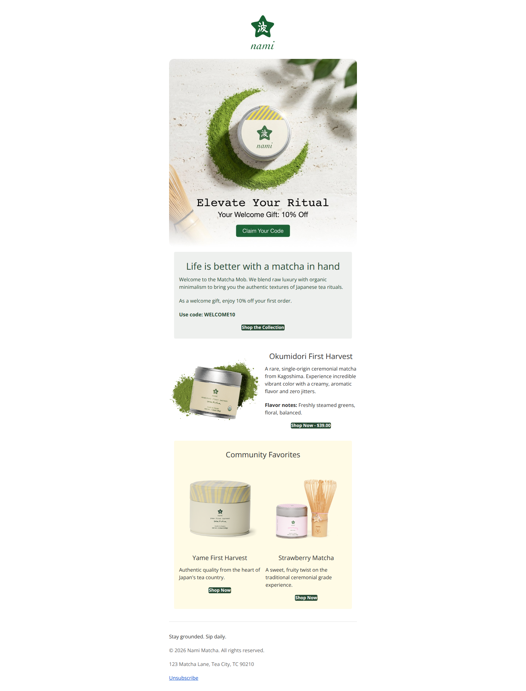
Life is better with a matcha in hand
Welcome to the Matcha Mob. We blend raw luxury with organic minimalism to bring you the authentic textures of Japanese tea rituals.
As a welcome gift, enjoy 10% off your first order.
Use code: WELCOME10
→ Shop the Collection
Okumidori First Harvest
A rare, single-origin ceremonial matcha from Kagoshima. Experience incredible vibrant color with a creamy, aromatic flavor and zero jitters.
Flavor notes: Freshly steamed greens, floral, balanced.
→ Shop Now - $39.00
Community Favorites
Yame First Harvest
Authentic quality from the heart of Japan's tea country.
→ Shop Now
Strawberry Matcha
A sweet, fruity twist on the traditional ceremonial grade experience.
→ Shop Now
Stay grounded. Sip daily.
© 2026 Nami Matcha. All rights reserved.
123 Matcha Lane, Tea City, TC 90210
Unsubscribe
Why This Email Works
This email succeeds at establishing a premium, organic aesthetic with high-quality imagery and a clear value proposition (10% off). However, it falls short on conversion mechanics: the Call-to-Action buttons in the body are visually indistinct and too small for mobile tapping, and the offer redemption process creates unnecessary friction for the user.
Hero Impact
85/100- High-quality photography clearly conveys the 'organic luxury' aesthetic.
- The value proposition (10% Off) is front and center, giving a clear reason to engage.
Content Structure & Flow
80/100- The layout effectively alternates between text-heavy storytelling and product-focused visuals.
- Ends with a clear 'Community Favorites' section that leverages social proof principles.
Visual Hierarchy & Layout
70/100- Effective use of background colors (#eef0ee and #FFFBE6) to break up the vertical flow.
- Product imagery is crisp and well-staged.
Call-to-Action Strength
55/100- The primary color (#2A4B36) is consistent for interactive elements.
- The single-product CTA includes price transparency ('$39.00'), which qualifies the click.
Message Clarity & Tone
85/100- Specific phrasing like 'zero jitters' and 'freshly steamed greens' effectively handles objections and sets expectations.
- Consistent tone that balances sophisticated terminology with welcoming community language.
Readability & Scannability
80/100- Good contrast between text and background colors.
- Descriptions are kept short, avoiding 'walls of text'.
Offer & Value Proposition
75/100- The 10% incentive is introduced immediately in the hero.
- Product value props (e.g., 'First Harvest', 'Ceremonial') justify the premium positioning.
Personalization & Audience Fit
60/100- The content perfectly matches the 'premium/health-conscious' persona targeted by the brand.
Quick Wins
- Add CSS padding (e.g., 15px 30px) to all 'Shop Now' buttons to make them look like clickable buttons, not just highlighted text.
- Left-align the paragraph text in the 'Life is better' section for improved readability.
- Change the 'Okumidori' section layout to stack the 'Flavor notes' vertically with bullet points.
- Make the 'WELCOME10' code text larger or clickable to auto-apply the discount.


Create Professional Email Designs
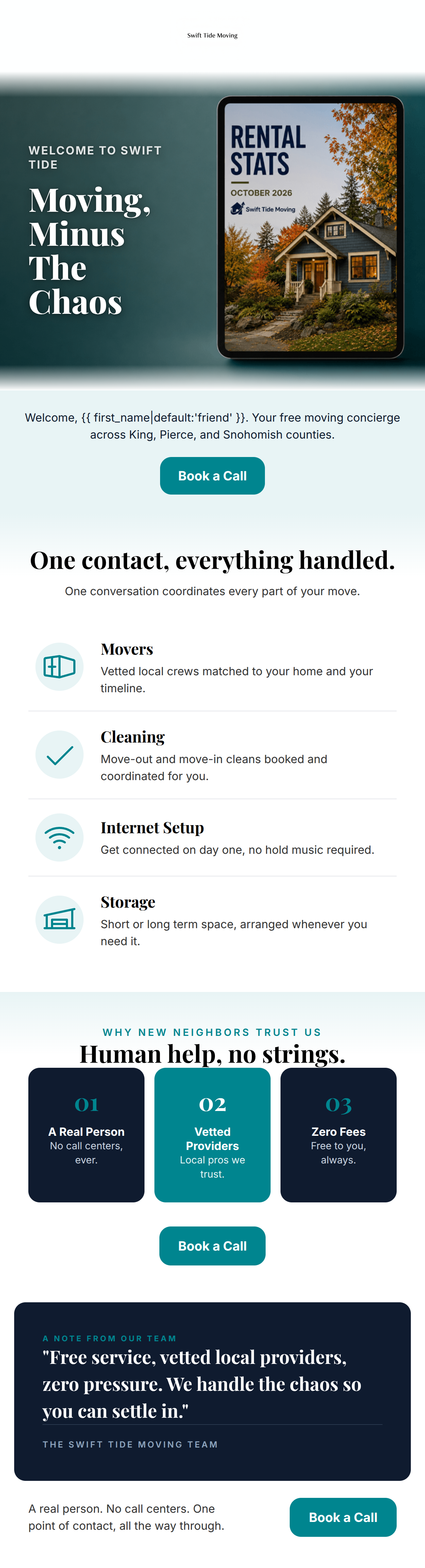
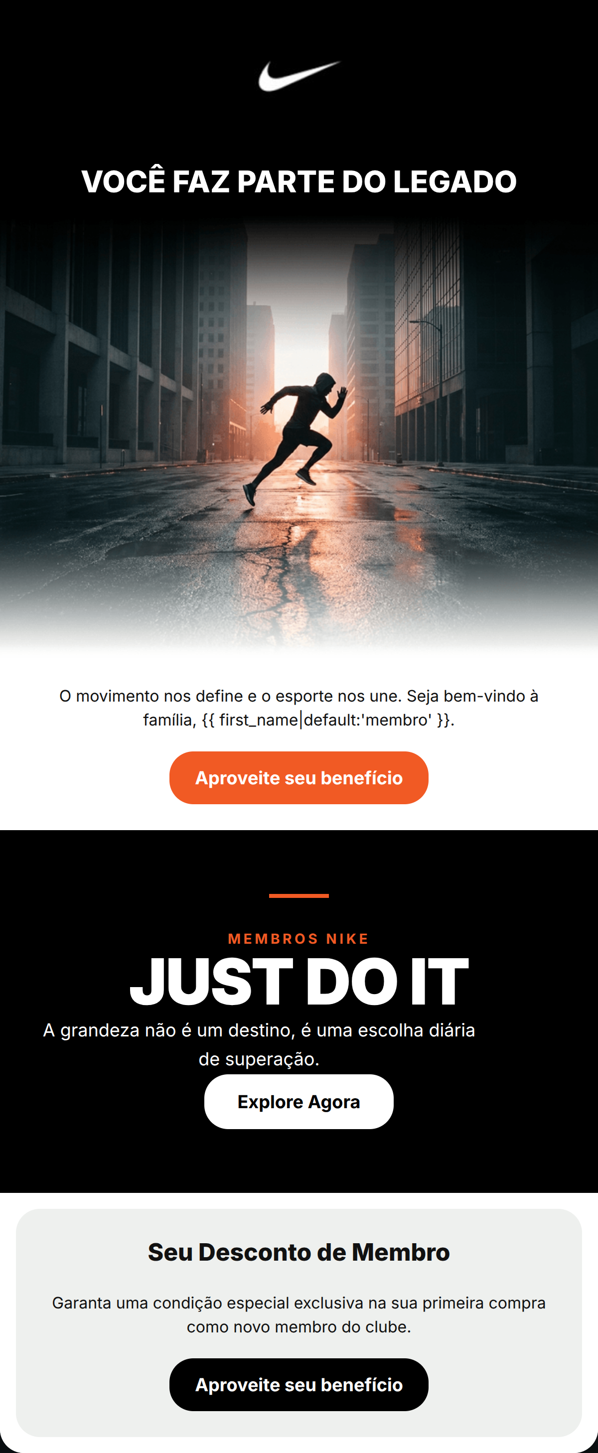
Generate beautiful, on-brand email designs in seconds. Just enter your brand URL and let AI do the rest.