Food & Beverage Welcome Email Template
“Welcome to JOYRIDE! Your sweet deal awaits 🍭”
Design Score
82/100This is a strong, brand-forward email that succeeds in building a connection through the founder's story and a punchy visual style. The tone is excellent—energetic and distinct. However, the email relies too heavily on image-based text (especially in the Hero), which threatens accessibility and conversion if images fail to load, and some color pairings hover dangerously close to failing accessibility standards.
Create Your Own
Generate professional email designs like this one in seconds with Kopi AI.
Email Details
- Subject Line
- Welcome to JOYRIDE! Your sweet deal awaits 🍭
- Brand
- JOYRIDE
- Industry
- Food & Beverage
- Email Type
- Welcome
- Created
- January 11, 2026
Brand Colors
Email Copy
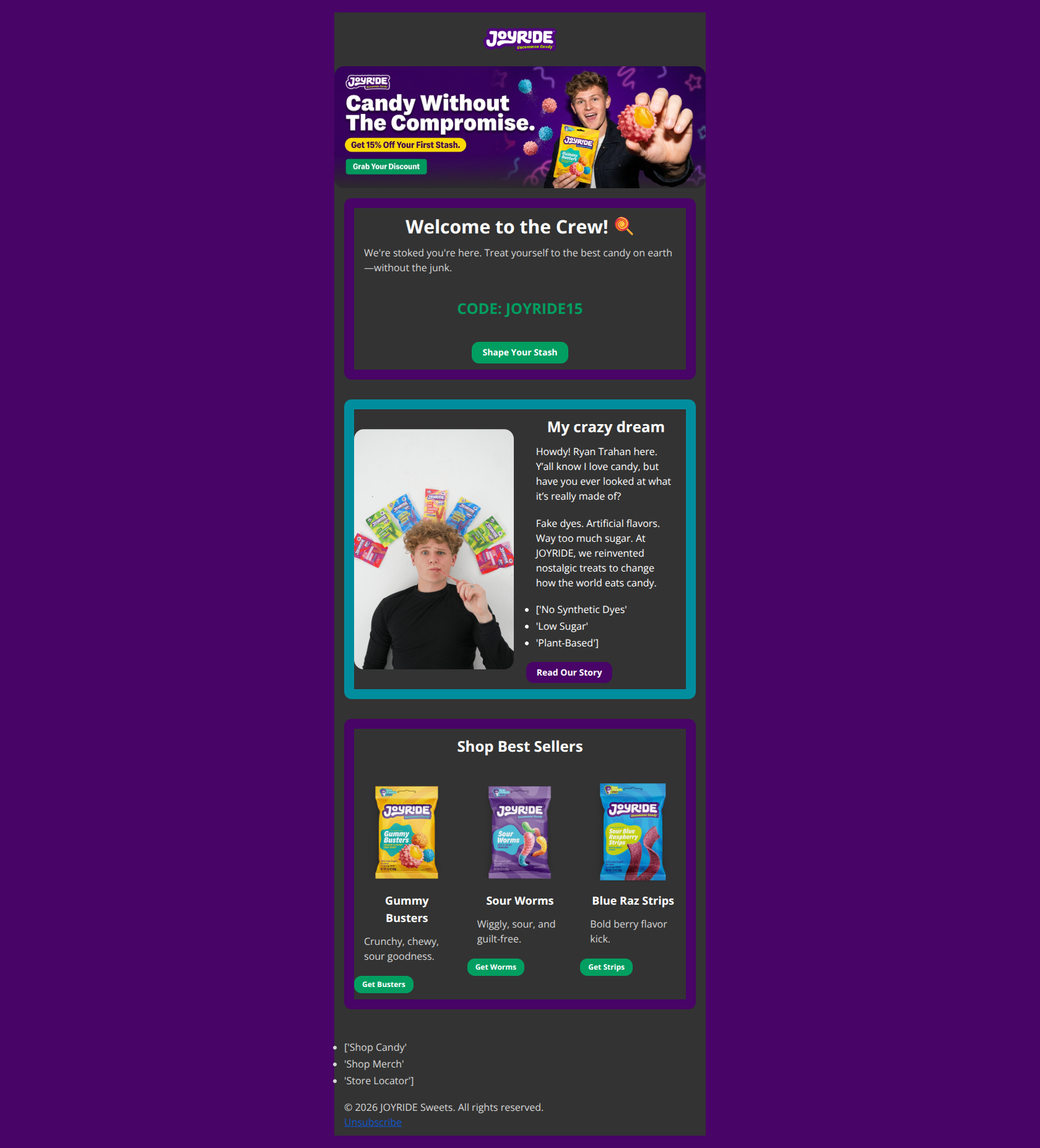
Welcome to the Crew! 🍭
We're stoked you're here. Treat yourself to the best candy on earth—without the junk.
CODE: JOYRIDE15
→ Shape Your Stash
My crazy dream
Howdy! Ryan Trahan here. Y’all know I love candy, but have you ever looked at what it’s really made of?
Fake dyes. Artificial flavors. Way too much sugar. At JOYRIDE, we reinvented nostalgic treats to change how the world eats candy.
- ['No Synthetic Dyes'
- 'Low Sugar'
- 'Plant-Based']
→ Read Our Story
Shop Best Sellers
Gummy Busters
Crunchy, chewy, sour goodness.
→ Get Busters
Sour Worms
Wiggly, sour, and guilt-free.
→ Get Worms
Blue Raz Strips
Bold berry flavor kick.
→ Get Strips
- ['Shop Candy'
- 'Shop Merch'
- 'Store Locator']
© 2026 JOYRIDE Sweets. All rights reserved. Unsubscribe
Why This Email Works
This is a strong, brand-forward email that succeeds in building a connection through the founder's story and a punchy visual style. The tone is excellent—energetic and distinct. However, the email relies too heavily on image-based text (especially in the Hero), which threatens accessibility and conversion if images fail to load, and some color pairings hover dangerously close to failing accessibility standards.
Hero (top/initial part) Impact
80/100- Strong, human-centric imagery (founder + product) builds immediate trust.
- Headline 'Candy Without The Compromise' is a perfect hook.
Content Structure & Flow
85/100- Logical progression from brand promise to direct offer to product selection.
- Distinct visual separation between the discount section and the story section.
Visual Hierarchy & Layout
75/100- Effective use of card-based layouts to group related content.
- Product grid is well-spaced and doesn't feel cluttered.
Call-to-Action Strength
78/100- Primary buttons use a high-contrast green background that stands out against the dark purple.
- The use of 'Get [Product]' is action-oriented and specific.
Message Clarity & Tone
95/100- Authentic, high-energy voice that feels personal to the founder.
- Benefit-driven claims ('Candy without the junk') are simple and memorable.
Readability & Scannability
85/100- Excellent use of bullet points to break up the founder story.
- Short, punchy sentences prevent cognitive fatigue.
Offer & Value Proposition
85/100- The offer is front-and-center without burying the brand story.
- Clear explanation of *why* the product is better (No synthetic dyes, etc.).
Personalization & Audience Fit
80/100- Perfect tone matching for the target demographic.
- Feels like a personal note from the founder rather than a corporate blast.
Quick Wins
- Change the product grid button copy from 'Get Worms' to 'Shop Worms' to avoid unappetizing linguistic associations.
- Lighten the Green text color on the 'CODE: JOYRIDE15' line to improve contrast against the dark background.
- Add a plain text link (e.g., 'Shop Now') immediately under the Hero image to capture clicks if images fail to load.
- Bold the key pain points in the story text ('Fake dyes', 'Artificial flavors') to make the problem statement scannable.

Create Professional Email Designs
Generate beautiful, on-brand email designs in seconds. Just enter your brand URL and let AI do the rest.