Fashion & Apparel Welcome Email Template

68/100Needs Work

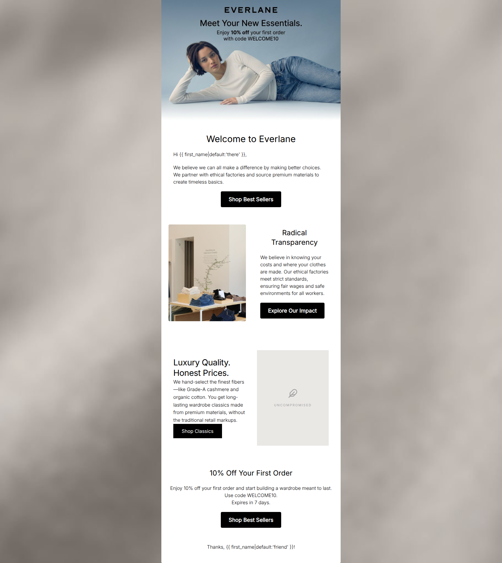
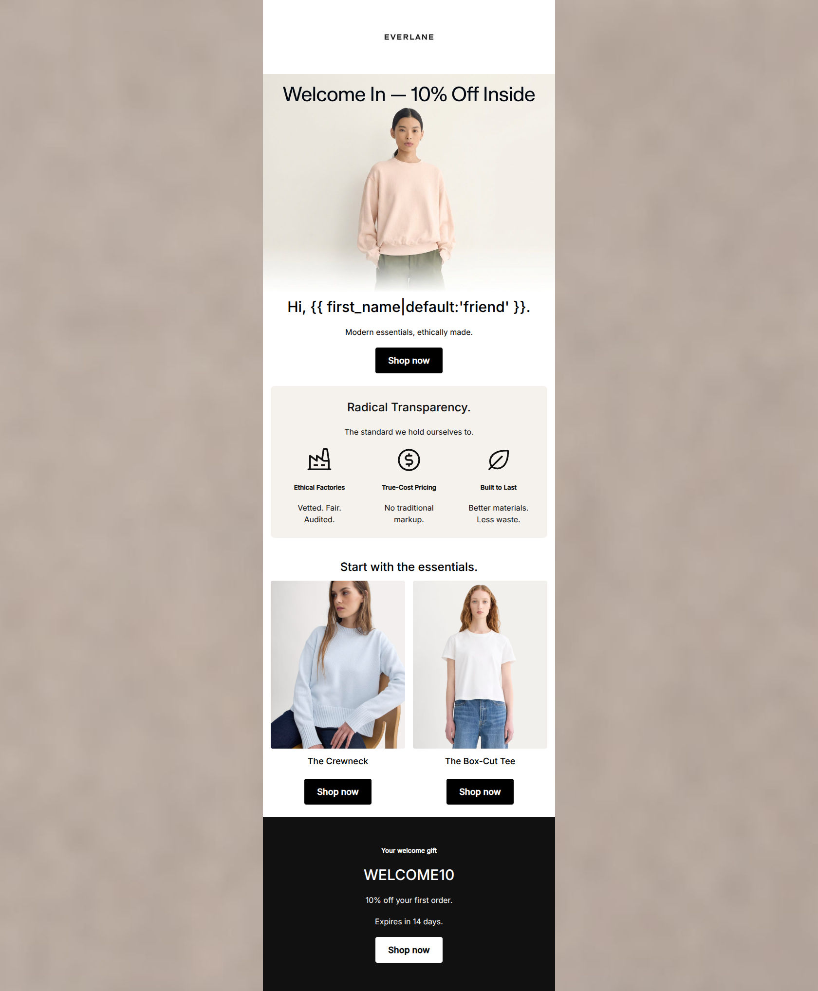
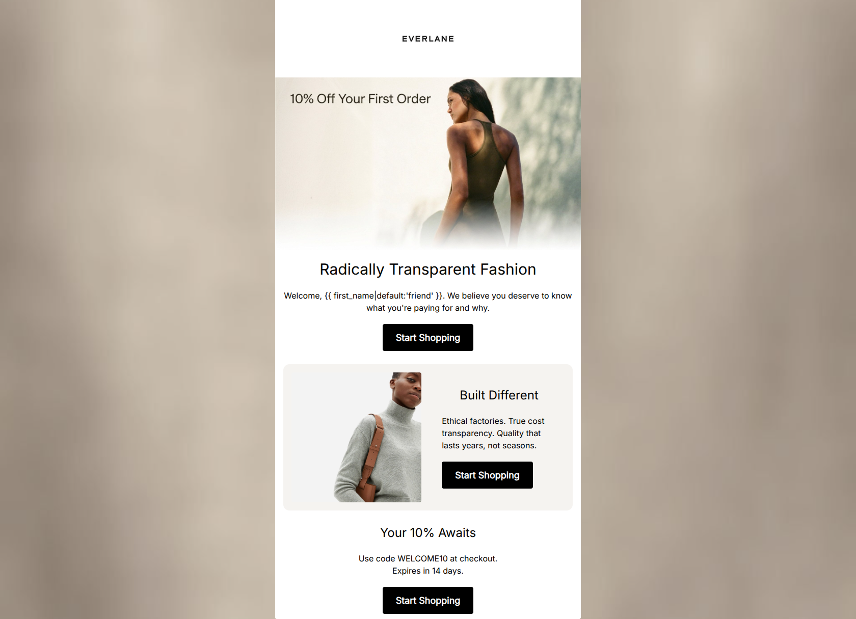
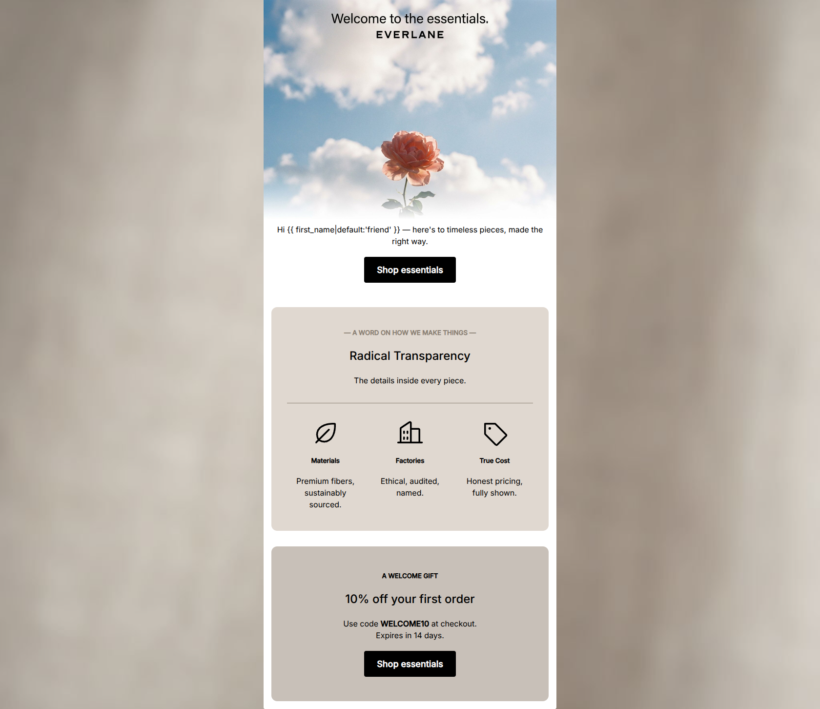
Welcome to Everlane. Enjoy 10% off inside.

Everlane [eval 2026-03-21]
Share:
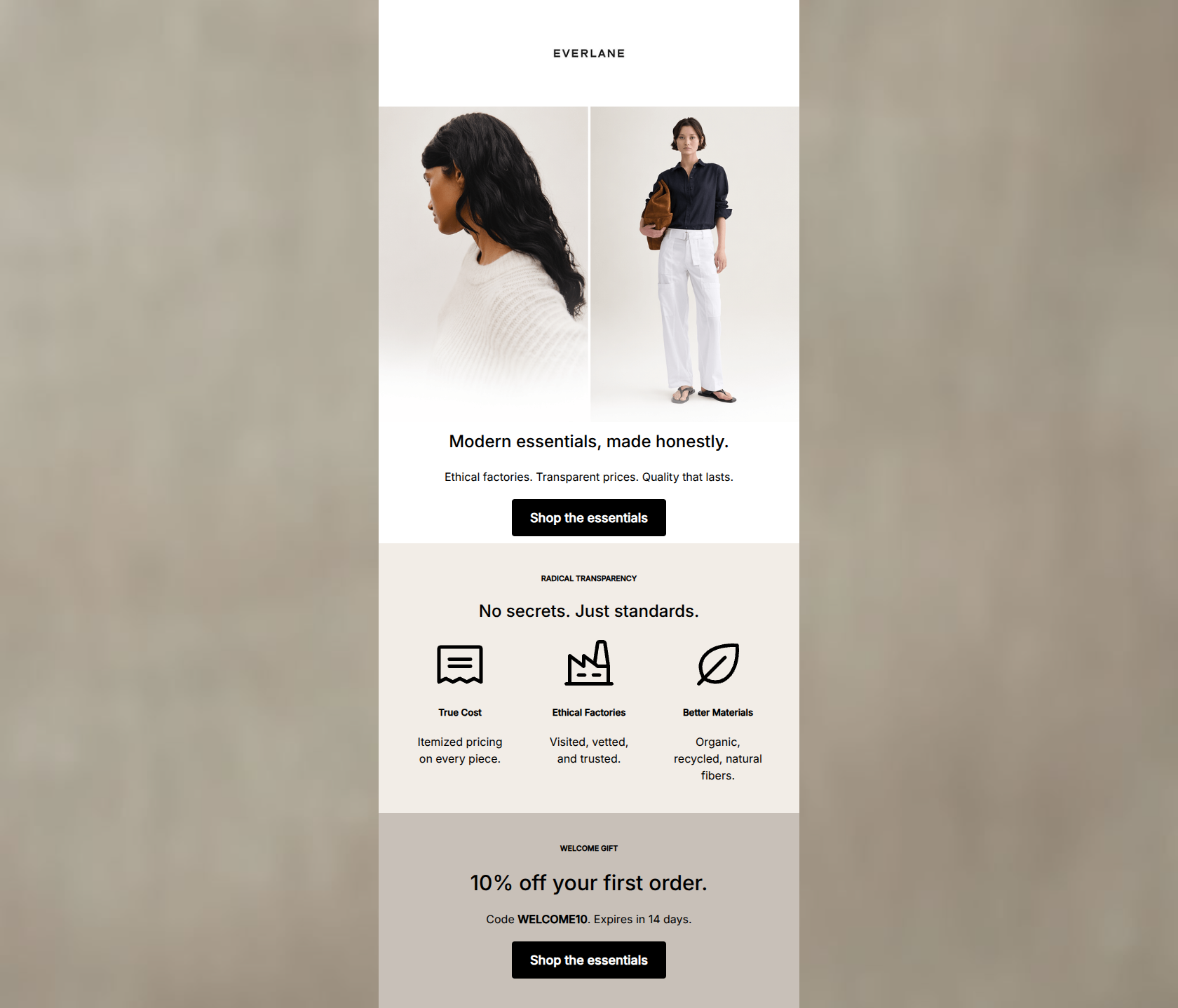
A minimalist welcome email featuring a 10% discount code, ethical factory imagery, and clean layouts.

Design Score

68/100
D - Needs Work

This welcome email establishes the Everlane brand aesthetic and core value propositions (transparency, quality, fair pricing) effectively. However, it suffers from structural and visual execution flaws that will actively depress click-through rates. The primary offer is split between an un-selectable hero image and a block buried at the very bottom, forcing the user to hunt for the code. Furthermore, a broken placeholder image severely undercuts the 'clean luxury' vibe. Finally, presenting three visually identical, high-contrast primary buttons for different actions ('Shop', 'Explore', 'Shop') creates cognitive friction and distracts from the core conversion goal of making a first purchase.

Create Your Own

Generate professional email designs like this one in seconds with Kopi AI.

Start Creating

Email Details

Subject Line
Welcome to Everlane. Enjoy 10% off inside.
Brand
Everlane [eval 2026-03-21]
Industry
Fashion & Apparel
Email Type
Welcome
Created
March 21, 2026

Brand Colors

Email Copy

Welcome to Everlane

Hi there,

We believe we can all make a difference by making better choices. We partner with ethical factories and source premium materials to create timeless basics.

Shop Best Sellers

Radical Transparency

We believe in knowing your costs and where your clothes are made. Our ethical factories meet strict standards, ensuring fair wages and safe environments for all workers.

Explore Our Impact

10% Off Your First Order

Enjoy 10% off your first order and start building a wardrobe meant to last. Use code WELCOME10. Expires in 7 days.

Shop Best Sellers

Thanks, friend!

Why This Email Works

This welcome email establishes the Everlane brand aesthetic and core value propositions (transparency, quality, fair pricing) effectively. However, it suffers from structural and visual execution flaws that will actively depress click-through rates. The primary offer is split between an un-selectable hero image and a block buried at the very bottom, forcing the user to hunt for the code. Furthermore, a broken placeholder image severely undercuts the 'clean luxury' vibe. Finally, presenting three visually identical, high-contrast primary buttons for different actions ('Shop', 'Explore', 'Shop') creates cognitive friction and distracts from the core conversion goal of making a first purchase.

Hero (top/initial part) Impact

60/100
  • Strong, aspirational lifestyle imagery that matches the 'clean luxury' brand identity.
  • Immediately surfaces the 10% welcome offer.

Content Structure & Flow

65/100
  • Breaks down the brand story into digestible, thematic chunks.
  • Avoids overwhelming the user with a massive grid of products right away.

Visual Hierarchy & Layout

50/100
  • Generous whitespace aligns well with the brand's minimalist aesthetic.
  • Good use of a simple 1-column to 2-column alternating structure to create rhythm.

Call-to-Action Strength

65/100
  • Buttons are high-contrast and easy to spot against the white and light grey backgrounds.
  • Action-oriented verbs ('Shop', 'Explore') clearly set expectations.

Message Clarity & Tone

80/100
  • Succinctly explains complex value props (ethics, pricing model) without being overly dense.
  • Tone is consistently understated and sophisticated.

Readability & Scannability

75/100
  • Paragraphs are kept brief (2-3 sentences max), preventing wall-of-text fatigue.
  • Strong contrast between the black text and white/light grey backgrounds.

Offer & Value Proposition

75/100
  • Clear, tangible welcome incentive.
  • Surrounds the monetary offer with strong qualitative reasons to buy.

Personalization & Audience Fit

70/100
  • Messaging perfectly aligns with the conscious consumer demographic.
  • Aesthetic choices strongly signal the 'premium mid-range' market positioning.

Quick Wins

  • Fix the broken placeholder image in the 'Luxury Quality' section immediately.
  • Demote the 'Explore Our Impact' button to a text link or secondary button style to prioritize shopping clicks.
  • Left-align the text in the 'Welcome to Everlane' section to match the alignment of the headers and paragraphs below it.

Create Professional Email Designs

Generate beautiful, on-brand email designs in seconds. Just enter your brand URL and let AI do the rest.

Start Creating for Free