Fashion & Apparel Welcome Email Template
“Welcome to Everlane. Here's 10% off.”
Design Score
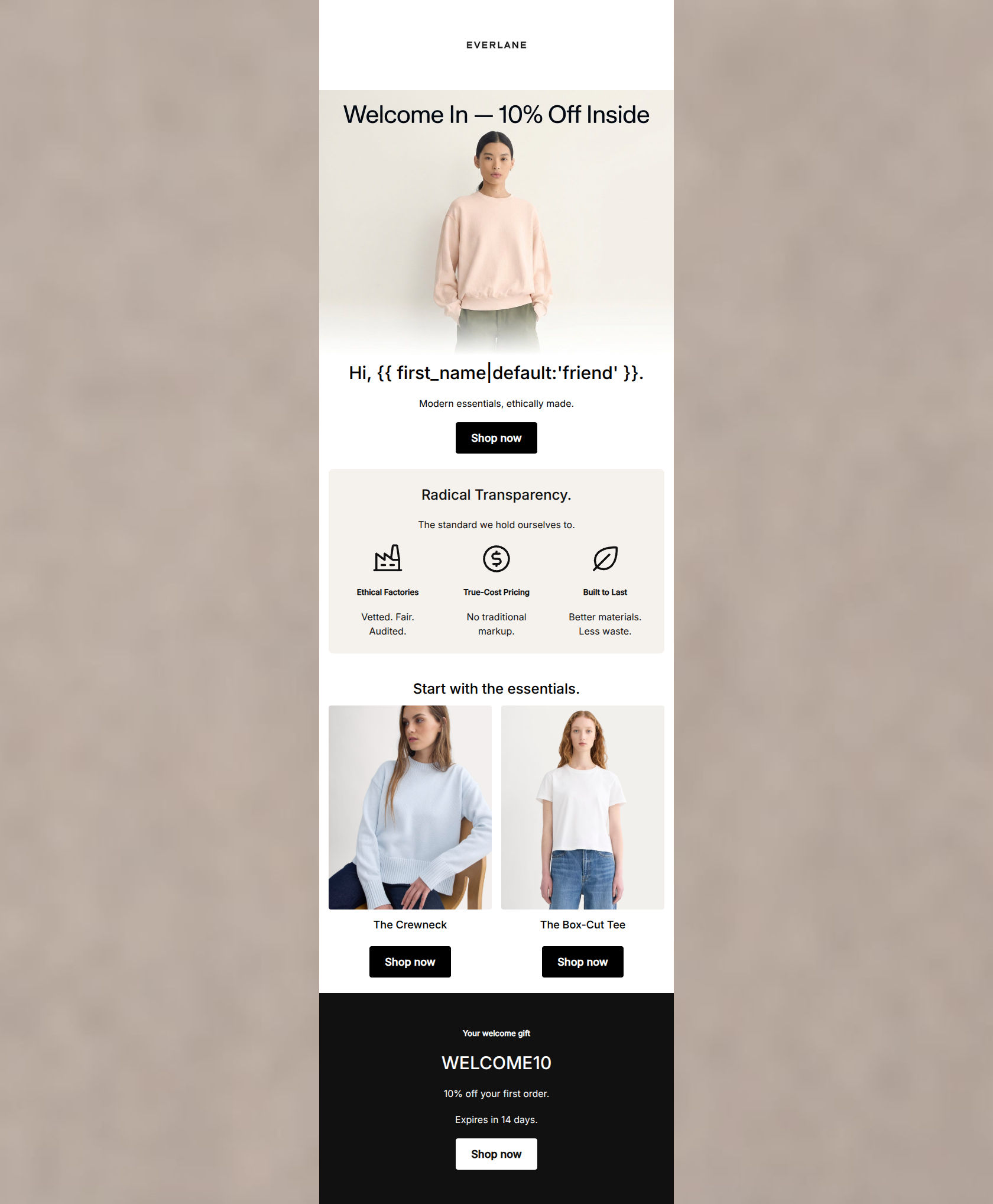
80/100This welcome email is visually pristine and perfectly captures Everlane's minimalist aesthetic and 'Radical Transparency' positioning. The copy is incredibly tight, and the strict adherence to a single primary CTA destination is commendable. However, the email suffers from two significant conversion leaks. First, it teases a 10% discount in the hero but buries the actual code at the very bottom, meaning highly motivated users who click the first 'Shop now' button will leave without their incentive. Second, it hardcodes all links to women's new arrivals despite a generic greeting, alienating the male segment of their audience.
Create Your Own
Generate professional email designs like this one in seconds with Kopi AI.
Email Details
- Subject Line
- Welcome to Everlane. Here's 10% off.
- Brand
- Everlane [eval-prod 2026-05-07]
- Industry
- Fashion & Apparel
- Email Type
- Welcome
- Created
- May 7, 2026
Brand Colors
Email Copy
Hi, friend.
Modern essentials, ethically made.
→ Shop now
Radical Transparency.
The standard we hold ourselves to.
Ethical Factories
Vetted. Fair. Audited.
True-Cost Pricing
No traditional markup.
Built to Last
Better materials. Less waste.
Start with the essentials.
The Crewneck
→ Shop now
The Box-Cut Tee
→ Shop now
Your welcome gift
WELCOME10
10% off your first order.
Expires in 14 days.
→ Shop now
Why This Email Works
This welcome email is visually pristine and perfectly captures Everlane's minimalist aesthetic and 'Radical Transparency' positioning. The copy is incredibly tight, and the strict adherence to a single primary CTA destination is commendable. However, the email suffers from two significant conversion leaks. First, it teases a 10% discount in the hero but buries the actual code at the very bottom, meaning highly motivated users who click the first 'Shop now' button will leave without their incentive. Second, it hardcodes all links to women's new arrivals despite a generic greeting, alienating the male segment of their audience.
Hero (top/initial part) Impact
74/100- High-quality, on-brand editorial photography.
- Clear, immediate establishment of brand identity.
- Use of a dynamic first-name tag for immediate personalization.
Content Structure & Flow
75/100- Distinct, easily digestible sections (Hero, Values, Products, Offer).
- Excellent use of single-column/Z-pattern layout for easy downward scrolling.
Visual Hierarchy & Layout
88/100- Masterful use of negative space to allow content to breathe.
- High contrast between the primary CTAs and the background.
- The dark footer block effectively draws the eye to the final conversion point.
Call-to-Action Strength
96/100- Unwavering consistency in CTA destination (all point to the same href).
- High visual prominence of all buttons.
- Excellent repetition to capture clicks at different stages of the scroll.
Message Clarity & Tone
90/100- Authentic, unpretentious brand voice.
- Complex concepts (supply chain ethics) distilled into simple, punchy statements.
- Zero filler adjectives.
Readability & Scannability
94/100- Excellent use of iconography to break up text.
- Headings and subheadings create a clear outline of the email's content.
- High contrast between text and background colors.
Offer & Value Proposition
68/100- Clear expiration timeline ('Expires in 14 days') creates necessary urgency.
- Strong core brand value propositions articulated clearly in the middle block.
Personalization & Audience Fit
60/100- Aesthetic and messaging perfectly align with the target 'conscious consumer' psychographic.
- Safe and friendly fallback ('friend') for missing name data.
Copy Conciseness & Word Economy
95/100- Ruthless editing; no wasted words.
- Punchy, memorable micro-copy ('No traditional markup').
- Respects the reader's time by getting straight to the point.
Quick Wins
- Move the 'WELCOME10' promo code up into the hero section to ensure users clicking the first CTA have their discount ready.
- Add a brief, benefit-driven material descriptor under the product grid items (e.g., '100% Organic Cotton').




Create Professional Email Designs
Generate beautiful, on-brand email designs in seconds. Just enter your brand URL and let AI do the rest.