Fashion & Apparel Welcome Email Template
“Welcome. Here's 10% off.”
Design Score
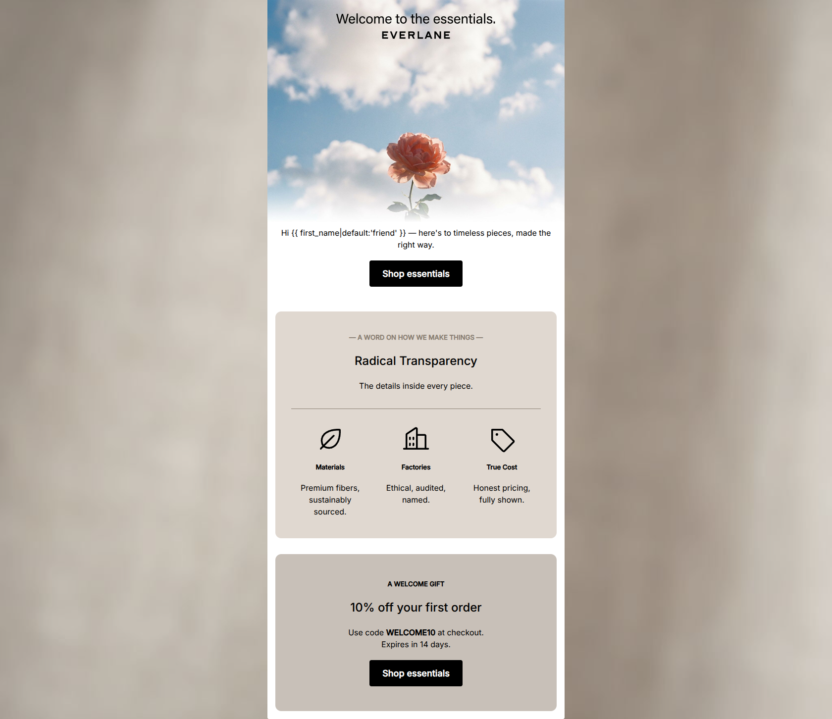
82/100This welcome email effectively communicates Everlane's core differentiator—Radical Transparency—with a tone and aesthetic that strongly aligns with the brand's 'quiet luxury' and conscious consumer positioning. The copy is tight, scannable, and respectful of the reader's time. However, the email leaves conversion potential on the table by leading with highly abstract imagery rather than product photography, and by burying the primary conversion driver (the 10% off welcome offer) at the very bottom of the email.
Create Your Own
Generate professional email designs like this one in seconds with Kopi AI.
Email Details
- Subject Line
- Welcome. Here's 10% off.
- Brand
- Everlane [eval-prod 2026-05-06]
- Industry
- Fashion & Apparel
- Email Type
- Welcome
- Created
- May 6, 2026
Brand Colors
Email Copy
Hi friend — here's to timeless pieces, made the right way.
→ Shop essentials
— A WORD ON HOW WE MAKE THINGS —
Radical Transparency
The details inside every piece.
Materials
Premium fibers, sustainably sourced.
Factories
Ethical, audited, named.
True Cost
Honest pricing, fully shown.
A WELCOME GIFT
10% off your first order
Use code WELCOME10 at checkout. Expires in 14 days.
→ Shop essentials
Why This Email Works
This welcome email effectively communicates Everlane's core differentiator—Radical Transparency—with a tone and aesthetic that strongly aligns with the brand's 'quiet luxury' and conscious consumer positioning. The copy is tight, scannable, and respectful of the reader's time. However, the email leaves conversion potential on the table by leading with highly abstract imagery rather than product photography, and by burying the primary conversion driver (the 10% off welcome offer) at the very bottom of the email.
Hero Impact
65/100- Clean, minimalist layout with generous negative space.
- Welcoming, on-brand copy ('Welcome to the essentials').
Content Structure & Flow
80/100- Clear progression from introduction to value proposition to offer.
- Discrete sections prevent the content from blending into a single wall of text.
Visual Hierarchy & Layout
75/100- Excellent use of the 3-column grid for the 'Radical Transparency' pillars.
- Consistent center-alignment creates a calm, balanced editorial aesthetic.
Call-to-Action Strength
95/100- Perfect repetition of the primary CTA, reinforcing the desired action.
- High-contrast black buttons stand out clearly against the lighter backgrounds.
Message Clarity & Tone
90/100- Strong alignment with the brand's 'transparent' and 'honest' voice.
- Avoids cheap urgency or loud promotional language.
Readability & Scannability
88/100- Iconography effectively anchors the three value pillars.
- Short, punchy sentences make for effortless reading.
Offer & Value Proposition
80/100- Clear articulation of the 'Radical Transparency' differentiator.
- Promo code and expiration terms are stated plainly without hidden catches.
Personalization & Audience Fit
92/100- Use of first-name personalization in the opening line.
- Perfect alignment with the target audience's values and pain points.
Copy Conciseness & Word Economy
95/100- Zero filler phrases or throat-clearing sentences.
- Punchy, noun-heavy descriptions ('Ethical, audited, named').
Quick Wins
- Change the background color of the 'Welcome Gift' section to pure white to ensure it doesn't blend into the canvas.
- Add a small 'Enjoy 10% off' teaser above the hero image to immediately establish the value of opening the email.
- Remove the hyperlinks from the informational icons to keep all clicks directed toward the primary shopping destination.




Create Professional Email Designs
Generate beautiful, on-brand email designs in seconds. Just enter your brand URL and let AI do the rest.