Fashion & Apparel Welcome Email Template
“Welcome to Everlane.”
Design Score
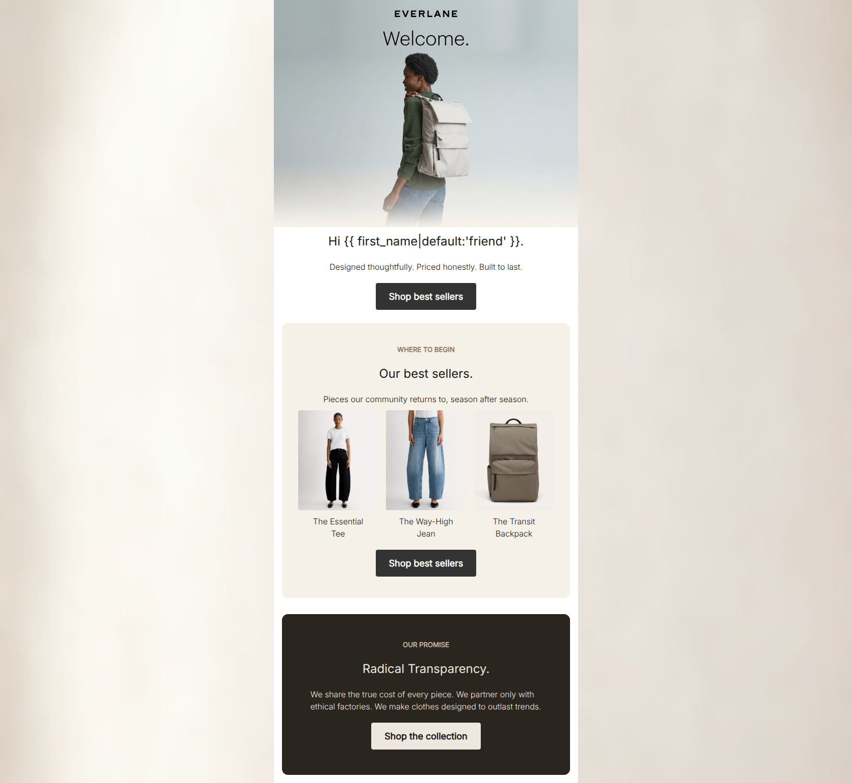
78/100This welcome email succeeds visually, perfectly capturing Everlane's 'Clean Luxury' aesthetic through minimalist design, muted tones, and crisp editorial photography. The messaging is delightfully concise and tone-appropriate, avoiding the trap of over-explaining the brand. However, it completely misses the mark on direct response conversion by omitting the standard 20% off welcome offer (present on the website), relying entirely on brand ethos to drive that crucial first click. While the structure and repetitive CTAs are excellent, the lack of a tangible incentive leaves money on the table.
Create Your Own
Generate professional email designs like this one in seconds with Kopi AI.
Email Details
- Subject Line
- Welcome to Everlane.
- Brand
- Everlane [eval-prod 2026-06-04]
- Industry
- Fashion & Apparel
- Email Type
- Welcome
- Created
- June 4, 2026
Brand Colors
Email Copy
Preview text: Modern essentials, made to last. Here's where to begin.
Hi friend.
Designed thoughtfully. Priced honestly. Built to last.
→ Shop best sellers
WHERE TO BEGIN
Our best sellers.
Pieces our community returns to, season after season.
The Essential Tee
The Way-High Jean
The Transit Backpack
→ Shop best sellers
OUR PROMISE
Radical Transparency.
We share the true cost of every piece. We partner only with ethical factories. We make clothes designed to outlast trends.
→ Shop the collection
Why This Email Works
This welcome email succeeds visually, perfectly capturing Everlane's 'Clean Luxury' aesthetic through minimalist design, muted tones, and crisp editorial photography. The messaging is delightfully concise and tone-appropriate, avoiding the trap of over-explaining the brand. However, it completely misses the mark on direct response conversion by omitting the standard 20% off welcome offer (present on the website), relying entirely on brand ethos to drive that crucial first click. While the structure and repetitive CTAs are excellent, the lack of a tangible incentive leaves money on the table.
Hero Impact
70/100- High-quality, on-brand editorial image that visually communicates 'Clean Luxury'.
- The subcopy ('Designed thoughtfully. Priced honestly. Built to last.') acts as a strong, concise elevator pitch.
Content Structure & Flow
88/100- Clear, distinct sections that don't compete with one another.
- Excellent pacing; moving from general brand introduction straight into high-intent product categories.
Visual Hierarchy & Layout
85/100- Superb use of alternating background colors (#F5F0E8 and #2B2520) to define distinct content zones.
- The three-column product grid is perfectly balanced and easy to scan.
Call-to-Action Strength
95/100- Multiple CTAs that all share the same primary destination URL.
- High-contrast button styling that ensures the action stands out clearly against every background color.
Message Clarity & Tone
92/100- Unpretentious, direct phrasing that aligns perfectly with the brand's 'Radical Transparency' ethos.
- Consistently sophisticated vocabulary ('thoughtfully', 'honestly', 'outlast').
Readability & Scannability
90/100- Excellent contrast between text and background colors in every section.
- Clear typographic hierarchy (Eyebrow -> Headline -> Body) makes skimming effortless.
Offer & Value Proposition
45/100- Clearly communicates the brand's non-monetary value pillars (ethical factories, true cost).
Personalization & Audience Fit
80/100- Product selection (Tee, Jean, Backpack) represents the ideal 'capsule wardrobe' starter kit desired by this demographic.
- The imagery reflects the effortless, functional aesthetic the target audience aspires to.
Copy Conciseness & Word Economy
95/100- The phrasing 'Pieces our community returns to, season after season' communicates popularity, quality, and community in just nine words.
- Zero filler adjectives; the copy relies on strong verbs and concrete nouns.
Quick Wins
- Center-align the body text ('We share the true cost...') in the dark bottom block to match the alignment of the headings above it.
- Change the final button text to 'Shop best sellers' to perfectly mirror the other two CTAs.


Create Professional Email Designs
Generate beautiful, on-brand email designs in seconds. Just enter your brand URL and let AI do the rest.