Pets Welcome Email Template
“Welcome — essentials for pets and homes”
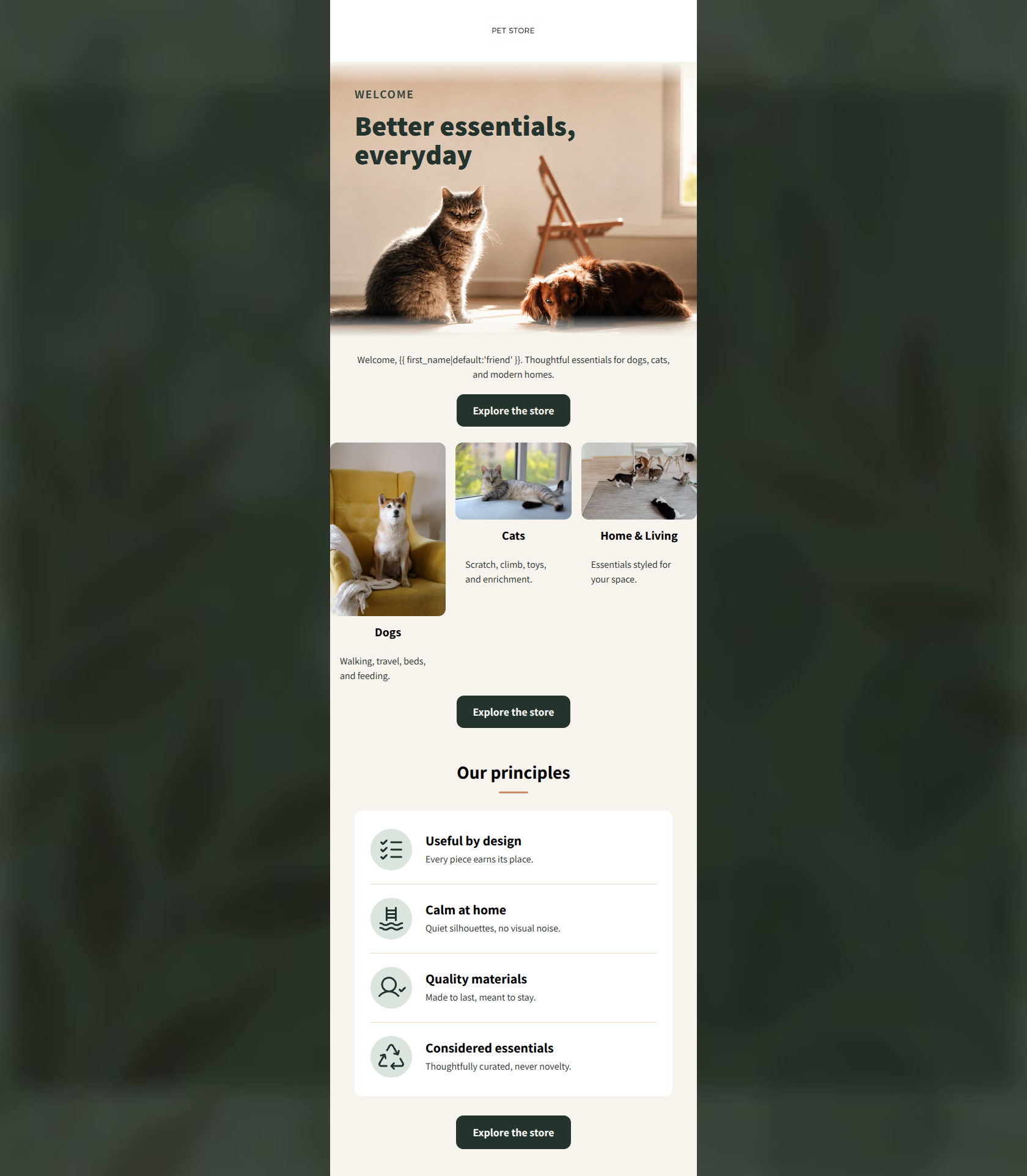
Design Score
82/100This welcome email establishes a strong, premium brand identity with excellent tone and word economy. The 'quiet luxury' aesthetic is well-represented in the typography and color choices, and the strict adherence to a single, repeated CTA ('Explore the store') provides a clear conversion path. However, the email's visual flow is disrupted by an unaligned category grid, and the lack of an actionable element within the hero section misses an opportunity to capture immediate clicks from non-scrollers.
Create Your Own
Generate professional email designs like this one in seconds with Kopi AI.
Email Details
- Subject Line
- Welcome — essentials for pets and homes
- Brand
- PET STORE
- Industry
- Pets
- Email Type
- Welcome
- Created
- July 16, 2026
Brand Colors
Email Copy
Welcome, friend. Thoughtful essentials for dogs, cats, and modern homes.
→ Explore the store
Dogs
Walking, travel, beds, and feeding.
Cats
Scratch, climb, toys, and enrichment.
Home & Living
Essentials styled for your space.
→ Explore the store
Why This Email Works
This welcome email establishes a strong, premium brand identity with excellent tone and word economy. The 'quiet luxury' aesthetic is well-represented in the typography and color choices, and the strict adherence to a single, repeated CTA ('Explore the store') provides a clear conversion path. However, the email's visual flow is disrupted by an unaligned category grid, and the lack of an actionable element within the hero section misses an opportunity to capture immediate clicks from non-scrollers.
Hero Impact
75/100- High-quality, contextual lifestyle imagery that immediately communicates the brand's 'pets in beautiful spaces' angle.
- Clear, punchy headline ('Better essentials, everyday') that sets a premium tone.
Content Structure & Flow
80/100- Logical narrative progression from brand introduction to specific shopping categories, ending with trust-building brand principles.
- Repeated use of the primary CTA anchors the structure and gives readers multiple opportunities to act.
Visual Hierarchy & Layout
70/100- The 'Our principles' section uses excellent whitespace and custom iconography, creating a strong editorial feel.
- Brand colors (forest green, cream, terracotta) are used consistently to guide the eye.
Call-to-Action Strength
95/100- Perfect consistency in CTA phrasing and intent.
- High-contrast button design (dark green on light backgrounds) ensures the CTA pops in a squint test.
Message Clarity & Tone
88/100- Strong alignment with the brand's 'quiet luxury' psychographics.
- Focuses heavily on outcomes (a beautiful home) rather than just product features.
Readability & Scannability
85/100- Excellent use of the icon-list format for the brand principles.
- High contrast between the dark body text and the cream background.
Offer & Value Proposition
75/100- The qualitative brand value ('Useful by design', 'Calm at home') is articulated brilliantly.
- Clearly positions the brand against mass-market 'novelty' pet items.
Personalization & Audience Fit
85/100- Imagery perfectly reflects the target customer's desired lifestyle and aesthetic.
- Language respects the intelligence and stylistic standards of the audience.
Copy Conciseness & Word Economy
88/100- Punchy, impactful microcopy ('Every piece earns its place').
- No unnecessary 'throat-clearing' or long paragraphs.
Quick Wins
- Force all images in the three-column category grid to a uniform 1:1 aspect ratio to fix the misaligned layout.
- Eliminate the redundant welcome text block below the hero image.
- Move the first 'Explore the store' CTA button up to sit immediately below the hero image (or inside it).




Create Professional Email Designs
Generate beautiful, on-brand email designs in seconds. Just enter your brand URL and let AI do the rest.