Other Welcome Email Template
“Welcome to Drive! Your 15% Off Awaits 🎉”
Design Score
77/100Polished, brand-forward welcome email with clear sections, strong social proof, and repeated primary CTA. Biggest conversion gaps: the 15% offer isn’t anchored in the hero, lacks redemption details/urgency, and CTAs could be more benefit-led and purpose-specific. Add a short process explainer and light personalization to reduce friction and raise response rates.
Create Your Own
Generate professional email designs like this one in seconds with Kopi AI.
Email Details
- Subject Line
- Welcome to Drive! Your 15% Off Awaits 🎉
- Brand
- Drive Marketing Group
- Industry
- Other
- Email Type
- Welcome
- Created
- November 12, 2025
Brand Colors
Email Copy
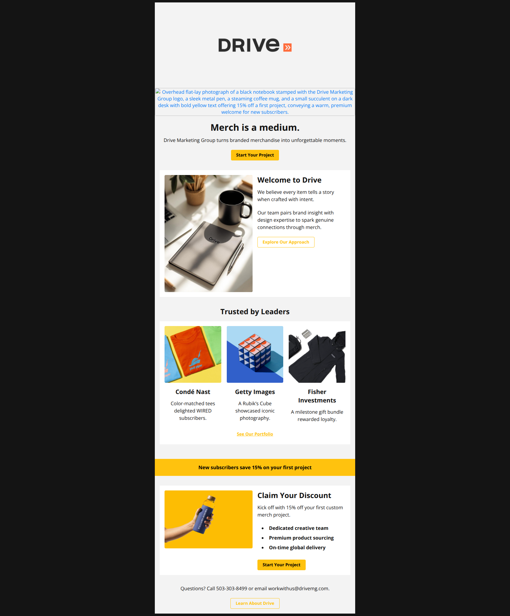
Merch is a medium.
Drive Marketing Group turns branded merchandise into unforgettable moments.
→ Start Your Project
Welcome to Drive
We believe every item tells a story when crafted with intent.
Our team pairs brand insight with design expertise to spark genuine connections through merch.
→ Explore Our Approach
Trusted by Leaders
Condé Nast
Color-matched tees delighted WIRED subscribers.
Getty Images
A Rubik’s Cube showcased iconic photography.
Fisher Investments
A milestone gift bundle rewarded loyalty.
See Our Portfolio
New subscribers save 15% on your first project
Claim Your Discount
Kick off with 15% off your first custom merch project.
- Dedicated creative team
- Premium product sourcing
- On-time global delivery
→ Start Your Project
Questions? Call 503-303-8499 or email workwithus@drivemg.com.
→ Learn About Drive
Why This Email Works
Polished, brand-forward welcome email with clear sections, strong social proof, and repeated primary CTA. Biggest conversion gaps: the 15% offer isn’t anchored in the hero, lacks redemption details/urgency, and CTAs could be more benefit-led and purpose-specific. Add a short process explainer and light personalization to reduce friction and raise response rates.
Hero (top/initial part) Impact
78/100- Strong, succinct headline and supportive subhead establish brand POV quickly.
- Primary CTA is visible and action-oriented above the fold.
Content Structure & Flow
83/100- Clear, modular sections that guide the reader to a decision.
- Logical placement of social proof before the promotional section.
Visual Hierarchy & Layout
85/100- Consistent spacing and clear section headers aid scanning.
- High-contrast accents draw attention to key areas without clutter.
Call-to-Action Strength
75/100- Clear, repeated primary CTA increases the chance of a click.
- Secondary CTAs support discovery for those not yet ready to convert.
Message Clarity & Tone
80/100- Brand voice is consistent and aligns with premium positioning.
- Social proof summaries are short and concrete (e.g., “Color-matched tees delighted WIRED subscribers.”).
Readability & Scannability
88/100- Bulleted benefits in the offer block aid quick comprehension.
- Section headers clearly introduce what follows.
Offer & Value Proposition
70/100- Clear benefit headline: “New subscribers save 15% on your first project.”
- Benefits list (creative team, sourcing, delivery) reinforces end-to-end value.
Personalization & Audience Fit
60/100- Broad appeal through diverse brand examples.
- Contact options (“Call… or email…”) reduce barriers for different preferences.
Quick Wins
- Add the offer callout to the hero subhead and update the hero CTA to “Start Your Project — Get 15% Off.”
- Turn “See Our Portfolio” into a button to improve click prominence.
- Append UTMs and an offer parameter to all CTAs and link directly to the contact form anchor.
- Add fine-print under the offer banner: expiry, eligibility, and any minimums.
- Add a single sentence of reassurance near the primary CTA: “We’ll respond within 1 business day.”


Create Professional Email Designs
Generate beautiful, on-brand email designs in seconds. Just enter your brand URL and let AI do the rest.