Health & Wellness Welcome Email Template
“Welcome to ARMRA — 30% off inside”
Design Score
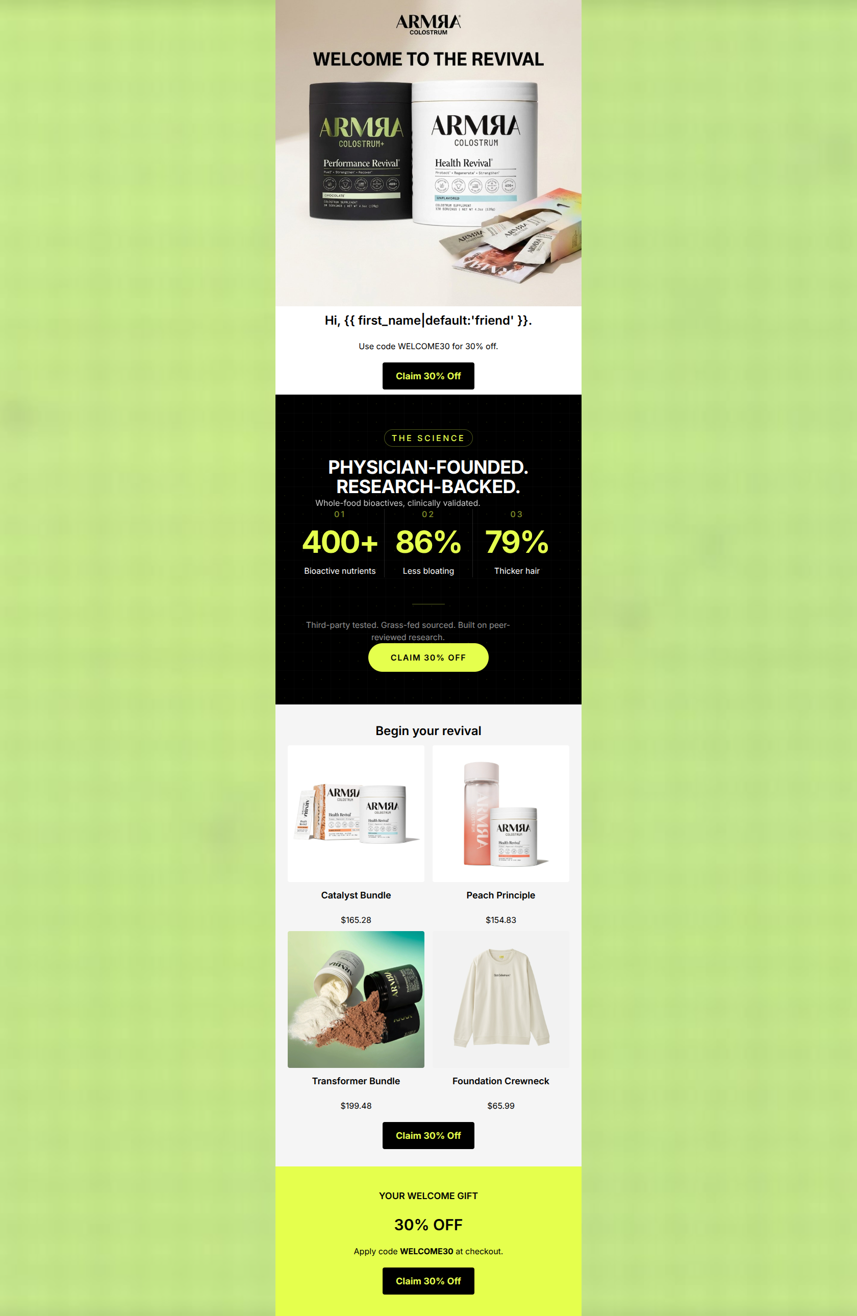
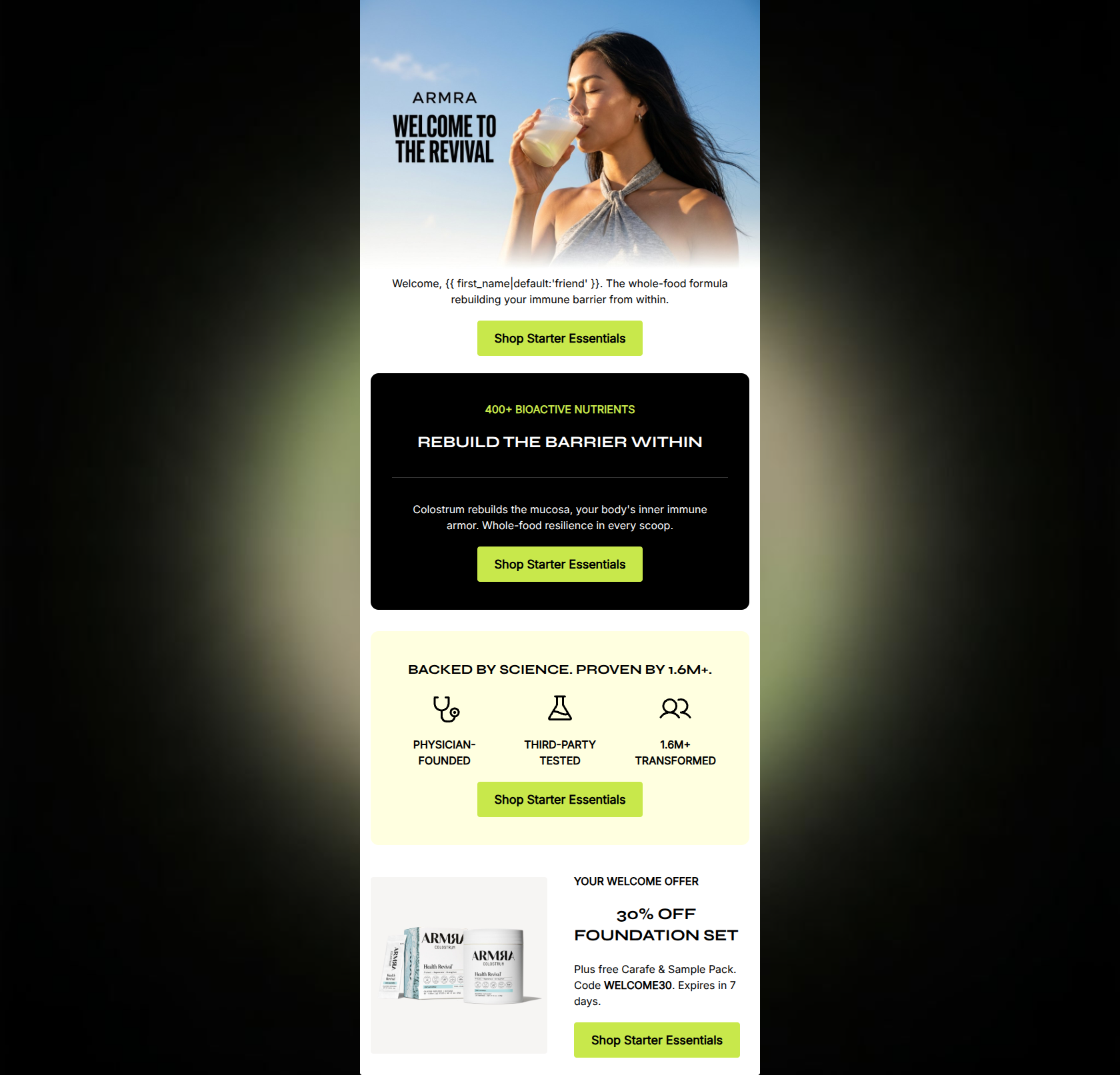
86/100This is a highly effective, premium welcome email that strongly aligns with the brand's clinical, bio-hacking aesthetic. The layout is exceptionally scannable, relying on bold typography and high-contrast numerical data rather than dense paragraphs. The inverted pyramid flow logically guides the reader from a strong offer to scientific validation, and finally to product discovery. However, the email leaves a bit of money on the table by assuming the user already fully understands the product's function in the hero, and by introducing cognitive friction in the product grid where the visual offerings don't perfectly align with the single CTA destination. Overall, it is a top-tier execution with minor strategic refinements needed.
Create Your Own
Generate professional email designs like this one in seconds with Kopi AI.
Email Details
- Subject Line
- Welcome to ARMRA — 30% off inside
- Brand
- ARMRA
- Industry
- Health & Wellness
- Email Type
- Welcome
- Created
- May 1, 2026
Brand Colors
Email Copy
Preview text: Your invitation to physician-founded, bioactive revival. Code WELCOME30 is waiting.
Hi, friend.
Use code WELCOME30 for 30% off.
→ Claim 30% Off
Begin your revival
Catalyst Bundle
$165.28
Peach Principle
$154.83
Transformer Bundle
$199.48
Foundation Crewneck
$65.99
→ Claim 30% Off
YOUR WELCOME GIFT
30% OFF
Apply code WELCOME30 at checkout.
→ Claim 30% Off
Why This Email Works
This is a highly effective, premium welcome email that strongly aligns with the brand's clinical, bio-hacking aesthetic. The layout is exceptionally scannable, relying on bold typography and high-contrast numerical data rather than dense paragraphs. The inverted pyramid flow logically guides the reader from a strong offer to scientific validation, and finally to product discovery. However, the email leaves a bit of money on the table by assuming the user already fully understands the product's function in the hero, and by introducing cognitive friction in the product grid where the visual offerings don't perfectly align with the single CTA destination. Overall, it is a top-tier execution with minor strategic refinements needed.
Hero (top/initial part) Impact
82/100- Stunning, high-quality product photography that clearly shows both the jar and travel stick formats.
- The primary offer is immediately visible above the fold.
- Clean, distraction-free layout pulls the eye straight to the CTA.
Content Structure & Flow
85/100- Perfect execution of the inverted pyramid structure.
- Use of a dark-mode block for the 'Science' section creates a natural pacing break that forces the user to pause and read the stats.
Visual Hierarchy & Layout
88/100- Flawless use of negative space to convey a premium brand feel.
- The stark contrast between the white, black, and electric lime sections guides the eye seamlessly down the page.
- Typography scale creates a perfect, predictable scan path.
Call-to-Action Strength
82/100- Excellent repetition of the primary CTA; zero competing actions or 'Learn More' distractions.
- High-contrast button design (black on lime, or lime on black) makes every interaction point pop.
Message Clarity & Tone
90/100- Authoritative, objective tone avoids hype and relies on data.
- Focus on specific, tangible outcomes (less bloating, thicker hair) directly addresses customer pain points and dreams.
Readability & Scannability
95/100- Zero walls of text; highly disciplined word count.
- Crucial information is prioritized via font size and weight.
- The three-column stat layout is an incredibly efficient way to communicate value.
Offer & Value Proposition
88/100- Strong, quantified financial incentive.
- Value proposition is backed by specific, data-driven outcomes.
Personalization & Audience Fit
80/100- Deeply respects the audience's intelligence by leading with clinical validation rather than emotional fluff.
- Aesthetic choices directly appeal to the premium wellness/bio-hacking demographic.
Copy Conciseness & Word Economy
92/100- Fierce editing; absolutely no throat-clearing or filler adjectives.
- Labels under the statistics ('Less bloating') are distilled to their most potent, two-word essence.
Quick Wins
- Remove the 'Hi, {{ first_name }}.' greeting and replace it with a one-sentence product benefit explainer.
- Style the 'WELCOME30' text visually (e.g., bold within a border) so it stands out instantly as a promo code.
- Swap out the 'Foundation Crewneck' in the product grid for a core supplement product to keep the focus on the primary health outcomes.
Create Professional Email Designs
Generate beautiful, on-brand email designs in seconds. Just enter your brand URL and let AI do the rest.