Fashion & Apparel Welcome Email Template
“Welcome. Quality over everything.”
Design Score
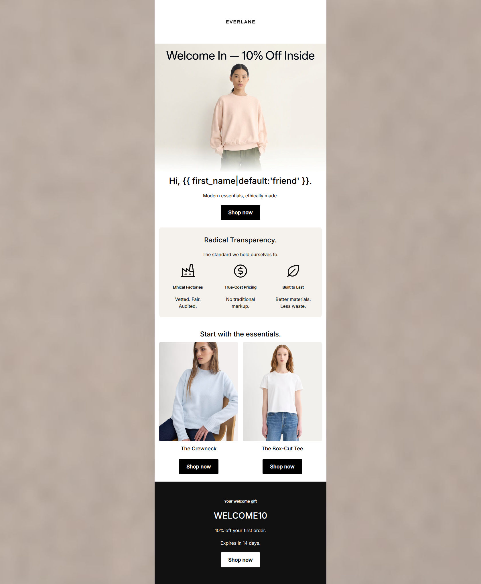
76/100This welcome email effectively establishes Everlane's core brand identity with a clean, minimalist aesthetic and strong, declarative copy regarding 'Radical Transparency' and quality. However, as a conversion vehicle, it falls short by acting more like a brand manifesto than a shopping catalyst. The absence of specific product features, combined with generic or contradictory calls-to-action (CTAs), forces the user to do too much work to figure out what to buy. Introducing product imagery and sharpening the CTAs to align with the copy will turn this from a pleasant introduction into a revenue driver.
Create Your Own
Generate professional email designs like this one in seconds with Kopi AI.
Email Details
- Subject Line
- Welcome. Quality over everything.
- Brand
- Everlane [eval-prod 2026-03-26]
- Industry
- Fashion & Apparel
- Email Type
- Welcome
- Created
- March 26, 2026
Brand Colors
Email Copy
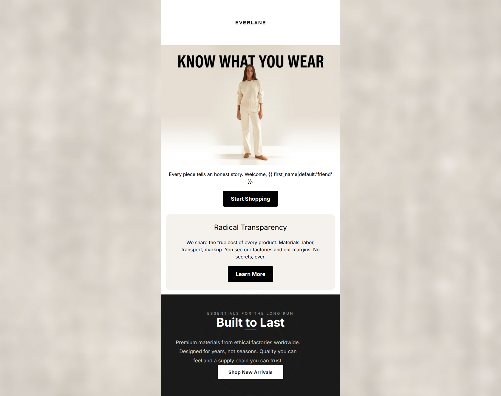
Every piece tells an honest story. Welcome, friend.
→ Start Shopping
Radical Transparency
We share the true cost of every product. Materials, labor, transport, markup. You see our factories and our margins. No secrets, ever.
→ Learn More
Why This Email Works
This welcome email effectively establishes Everlane's core brand identity with a clean, minimalist aesthetic and strong, declarative copy regarding 'Radical Transparency' and quality. However, as a conversion vehicle, it falls short by acting more like a brand manifesto than a shopping catalyst. The absence of specific product features, combined with generic or contradictory calls-to-action (CTAs), forces the user to do too much work to figure out what to buy. Introducing product imagery and sharpening the CTAs to align with the copy will turn this from a pleasant introduction into a revenue driver.
Hero (top/initial part) Impact
75/100- The overarching headline 'KNOW WHAT YOU WEAR' immediately communicates the brand's unique value proposition.
- The minimalist image styling perfectly matches the 'Quiet Luxury' aesthetic of the brand.
Content Structure & Flow
70/100- Distinct background colors effectively separate the content into digestible, bite-sized sections.
- The progression of messaging is logical, building brand trust step-by-step.
Visual Hierarchy & Layout
80/100- Excellent use of negative space prevents cognitive overload.
- The high-contrast, alternating section backgrounds naturally draw the eye down the page.
Call-to-Action Strength
60/100- Buttons are visually prominent and pass the contrast 'squint test' effortlessly.
- There is no competition within sections; each block has a single, clear action.
Message Clarity & Tone
88/100- The explanation of Radical Transparency ('Materials, labor, transport, markup') is succinct and highly effective.
- The phrasing is declarative and confident, establishing immediate authority.
Readability & Scannability
85/100- Sentence structures are short and punchy.
- Font sizing provides a clear distinction between headers and body copy.
Offer & Value Proposition
65/100- The intrinsic value of the products (ethical, durable) is clearly articulated.
Personalization & Audience Fit
75/100- The vocabulary ('ethical factories', 'supply chain you can trust') acts as a powerful dog-whistle for the target demographic.
Copy Conciseness & Word Economy
90/100- Zero filler words or throat-clearing openers.
- 'Designed for years, not seasons' is a masterclass in concise, benefit-driven copywriting.
Quick Wins
- Change the 'Shop New Arrivals' CTA to 'Shop Essentials' to avoid contradicting the 'not seasons' messaging.
- Update the generic 'Start Shopping' hero CTA to a more specific destination, like 'Shop Bestsellers'.
- Ensure the hero image links to a curated, high-converting collection rather than just the homepage.
Create Professional Email Designs
Generate beautiful, on-brand email designs in seconds. Just enter your brand URL and let AI do the rest.