Apparel & Fashion Promotional Email Template
“Welcome. Here's what makes us different.”
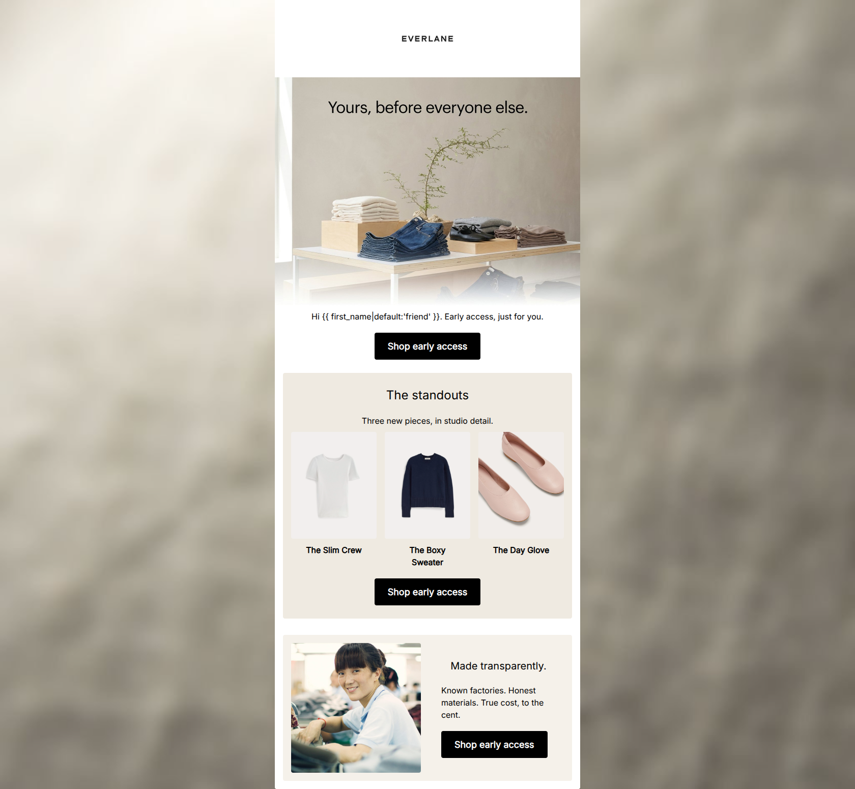
![Apparel & Fashion Promotional email design for Everlane [eval-prod 2026-06-04] — "Welcome. Here's what makes us different."](https://file.rendit.io/n/ac7c30b243ee.png)
Design Score
72/100The email effectively communicates Everlane's core value proposition of 'Radical Transparency' through a visually clean pricing breakdown and solid lifestyle imagery. However, the top of the funnel is severely compromised by a disjointed hero layout and egregious copy repetition. The execution is competent in the lower sections, but the opening experience leaves a lot of money on the table due to poor visual hierarchy and word economy.
Create Your Own
Generate professional email designs like this one in seconds with Kopi AI.
Email Details
- Subject Line
- Welcome. Here's what makes us different.
- Brand
- Everlane [eval-prod 2026-06-04]
- Industry
- Apparel & Fashion
- Email Type
- Promotional
- Created
- July 14, 2026
Brand Colors
Email Copy
Welcome, friend. Radically transparent essentials, built to last from the first wear.
→ Shop best sellers
Why This Email Works
The email effectively communicates Everlane's core value proposition of 'Radical Transparency' through a visually clean pricing breakdown and solid lifestyle imagery. However, the top of the funnel is severely compromised by a disjointed hero layout and egregious copy repetition. The execution is competent in the lower sections, but the opening experience leaves a lot of money on the table due to poor visual hierarchy and word economy.
Hero Impact
45/100- The lifestyle image itself strongly aligns with the brand's minimalist and effortless aesthetic.
Content Structure & Flow
75/100- Logical progression from product feature to value proposition (transparent pricing).
- The testimonial serves as an effective closing argument before the final CTA.
Visual Hierarchy & Layout
65/100- Generous whitespace throughout the body prevents cognitive overload.
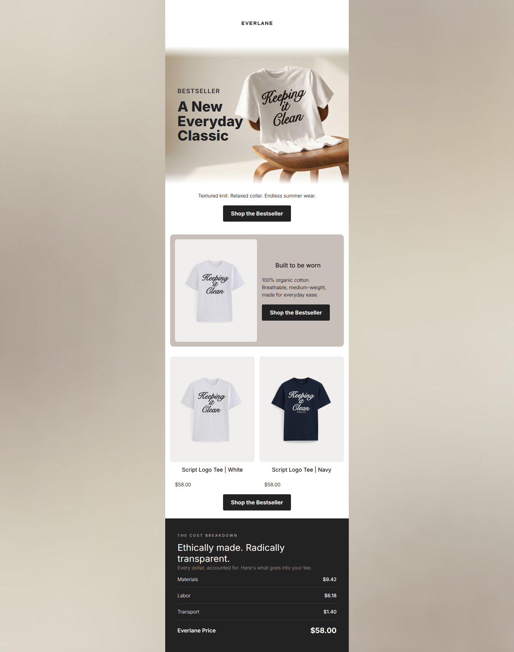
- The cost breakdown uses hairline dividers and bold typography to create a highly readable, structured list.
Call-to-Action Strength
85/100- Excellent repetition of the primary CTA destination and copy.
- High contrast (white text on solid black) ensures the buttons pop against the white/light grey backgrounds.
Message Clarity & Tone
78/100- The phrase 'Ethical factories. Fair prices. Nothing hidden.' is an exceptionally clear encapsulation of the brand's positioning.
- The testimonial adds a credible, human voice that reinforces the product's quality.
Readability & Scannability
82/100- Excellent use of short, punchy paragraphs and bullet-style layouts.
- High contrast between standard body text (black) and the background (white/grey).
Offer & Value Proposition
88/100- Directly addresses consumer pain points regarding opaque pricing and fast fashion ethics.
- Presents the value proposition in a visual, easy-to-understand format rather than a wall of text.
Personalization & Audience Fit
80/100- Visuals and copy directly speak to the target audience's desire for high-quality, ethically made basics.
- The minimal layout matches the 'conscious consumerism' psychographic perfectly.
Copy Conciseness & Word Economy
55/100- The lower half of the email is incredibly tight, using only the necessary words to convey price, quality, and social proof.
Quick Wins
- Delete the secondary text block ('Welcome, {{ first_name... }}') to eliminate the jarring copy repetition at the top of the email.
- Fix the color contrast on the '01' element in the product card by changing it to a darker grey or black so it is visible against the light background.
- Apply proper heading styles (size and weight) to the 'Basics, done honestly' text so it acts as a true focal point rather than floating body copy.
Create Professional Email Designs
Generate beautiful, on-brand email designs in seconds. Just enter your brand URL and let AI do the rest.