Fashion & Apparel Promotional Email Template
“Early access: the new collection”
Design Score
82/100This is a strong, on-brand promotional email that effectively leverages Everlane's minimalist aesthetic and 'Radical Transparency' positioning. The layout is clean, the visual hierarchy is clear, and the repetition of a single, unambiguous primary CTA is excellent for driving clicks. However, the email leans slightly too heavily on visuals, missing opportunities to articulate the specific benefits or features of the highlighted products, and features some minor copy redundancies in the hero section.
Create Your Own
Generate professional email designs like this one in seconds with Kopi AI.
Email Details
- Subject Line
- Early access: the new collection
- Brand
- Everlane [eval-prod 2026-05-22]
- Industry
- Fashion & Apparel
- Email Type
- Promotional
- Created
- May 22, 2026
Brand Colors
Email Copy
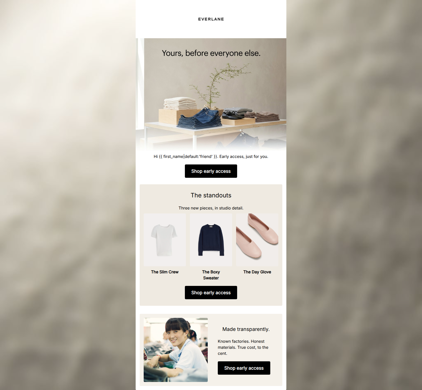
Hi friend. Early access, just for you.
→ Shop early access
The standouts
Three new pieces, in studio detail.
The Slim Crew
The Boxy Sweater
The Day Glove
→ Shop early access
Made transparently.
Known factories. Honest materials. True cost, to the cent.
→ Shop early access
Why This Email Works
This is a strong, on-brand promotional email that effectively leverages Everlane's minimalist aesthetic and 'Radical Transparency' positioning. The layout is clean, the visual hierarchy is clear, and the repetition of a single, unambiguous primary CTA is excellent for driving clicks. However, the email leans slightly too heavily on visuals, missing opportunities to articulate the specific benefits or features of the highlighted products, and features some minor copy redundancies in the hero section.
Hero (top/initial part) Impact
72/100- Strong, visually appealing lifestyle image that fits the brand identity.
- Immediately answers 'Why should I care?' with the exclusivity hook.
Content Structure & Flow
88/100- Excellent progression from hook -> proof -> brand value -> action.
- The three-column product grid breaks up the vertical flow nicely and encourages scanning.
Visual Hierarchy & Layout
85/100- Clear section delineation using subtle background blocks (#EFEAE1 and #F5F1EA).
- High-contrast black CTA buttons immediately draw the eye against the light backgrounds.
Call-to-Action Strength
95/100- Consistent button copy across all touchpoints.
- High visual prominence of the buttons.
- Unambiguous direction for the user.
Message Clarity & Tone
82/100- Avoids flashy, hyped-up marketing jargon.
- The 'Made transparently' section perfectly encapsulates the brand's unique positioning.
Readability & Scannability
86/100- Short, punchy sentences.
- Effective use of bolding for product names ('The Slim Crew', etc.).
Offer & Value Proposition
75/100- Leverages exclusivity effectively to drive clicks without sacrificing margin.
- The final section reinforces the overarching brand value proposition of ethical manufacturing.
Personalization & Audience Fit
82/100- Directly speaks to the audience's desire for ethical production and transparency.
- The minimalist aesthetic matches the target demographic's preferences.
Copy Conciseness & Word Economy
85/100- Punchy, zero-fluff copy in the transparency block.
- Does not rely on long paragraphs to convey information.
Quick Wins
- Rewrite the sub-copy under the hero image to remove the redundancy with the image text.
- Add a brief, 3-5 word descriptor under each product name in the 3-up grid to highlight a specific benefit or material.




Create Professional Email Designs
Generate beautiful, on-brand email designs in seconds. Just enter your brand URL and let AI do the rest.