Apparel & Fashion Promotional Email Template
“Welcome. Here's what makes us different.”
![Apparel & Fashion Promotional email design for Everlane [eval-prod 2026-06-04] — "Welcome. Here's what makes us different."](https://file.rendit.io/n/ac0b685cb007.png)
Design Score
68/100The email features a conceptually strong narrative arc—introducing the brand, highlighting a hero product, providing transparent 'receipts', and offering a collection to shop. The 'Radical Transparency' section is a masterclass in on-brand, high-conversion design. However, the execution is severely hampered by a broken hero section lacking a primary CTA, exact-match repetitive copy, and an exhausting visual layout that features the identical white t-shirt image five times.
Create Your Own
Generate professional email designs like this one in seconds with Kopi AI.
Email Details
- Subject Line
- Welcome. Here's what makes us different.
- Brand
- Everlane [eval-prod 2026-06-04]
- Industry
- Apparel & Fashion
- Email Type
- Promotional
- Created
- July 14, 2026
Brand Colors
Email Copy
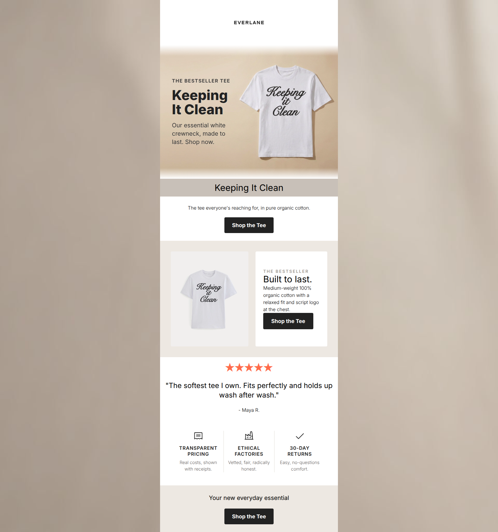
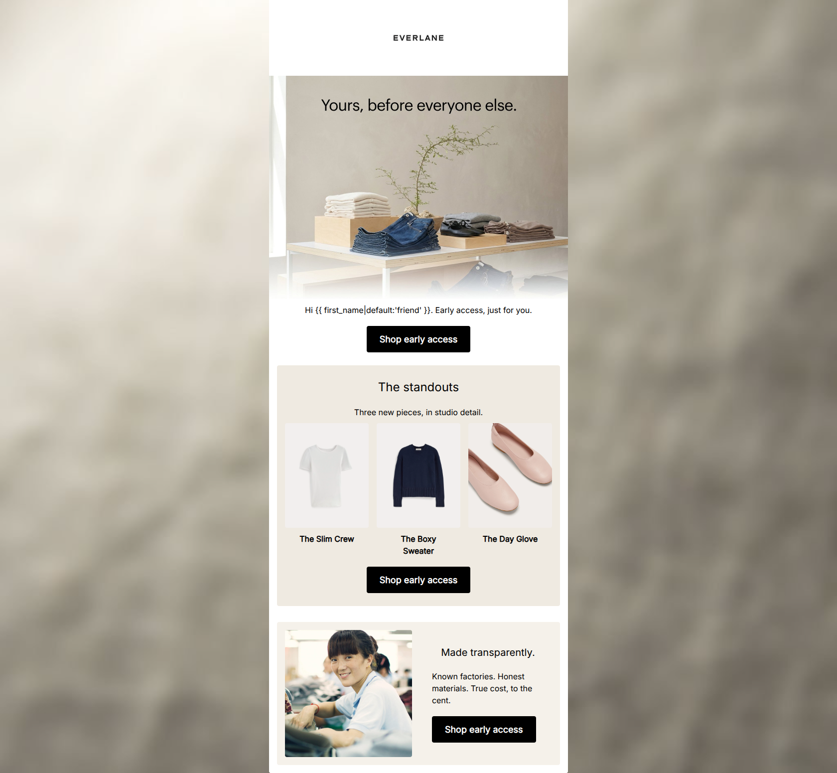
Welcome, friend. Quality essentials, built to last and made with radical transparency.
→ Shop best sellers
Start your wardrobe
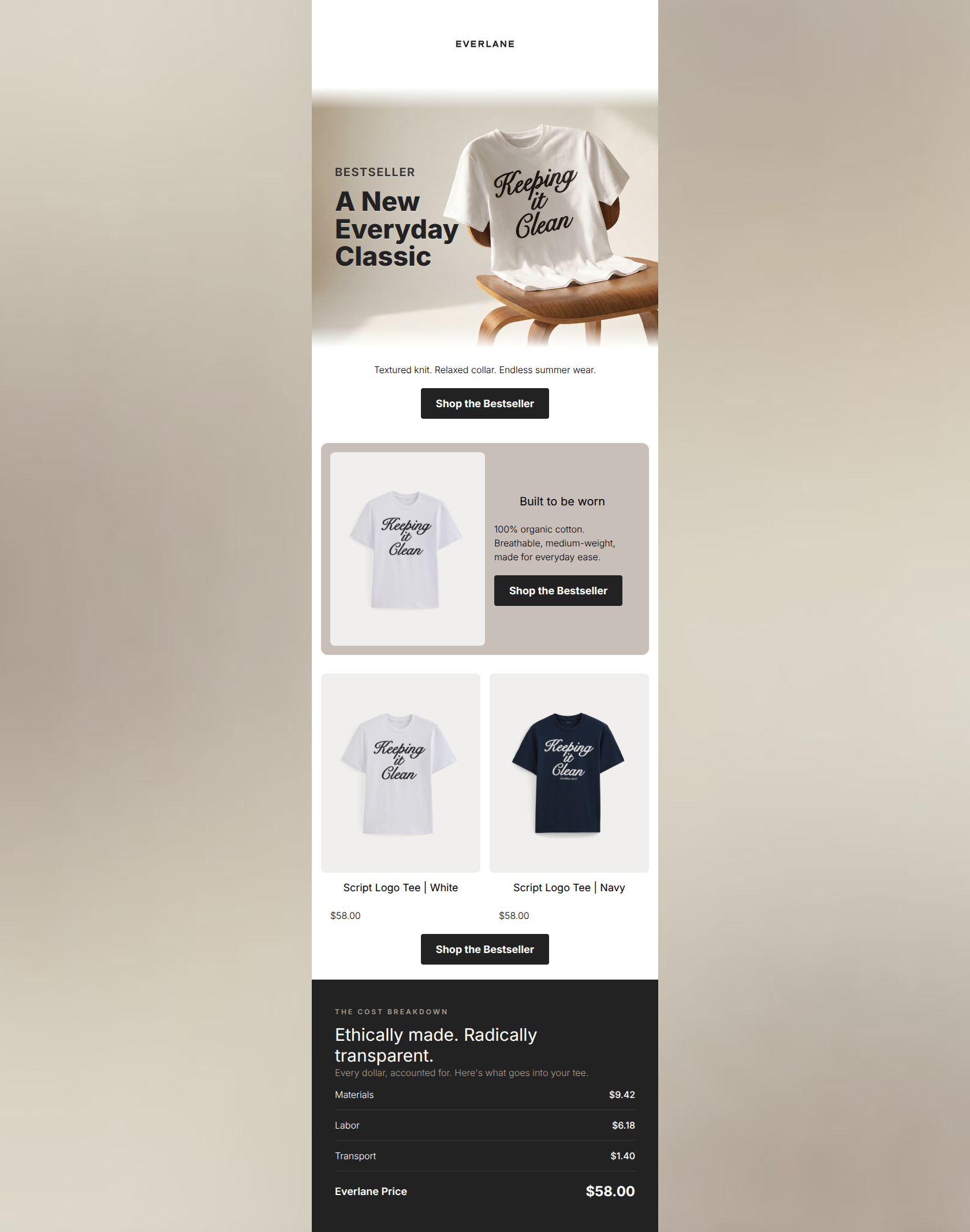
Script Logo Tee | White ($58.00)
Medium-weight organic cotton with an easy, relaxed fit.
Script Logo Tee | White ($58.00)
The everyday staple, built to outlast trends.
Script Logo Baby Tee | White ($48.00)
A slimmer babydoll fit in soft organic cotton.
→ Shop best sellers
Why This Email Works
The email features a conceptually strong narrative arc—introducing the brand, highlighting a hero product, providing transparent 'receipts', and offering a collection to shop. The 'Radical Transparency' section is a masterclass in on-brand, high-conversion design. However, the execution is severely hampered by a broken hero section lacking a primary CTA, exact-match repetitive copy, and an exhausting visual layout that features the identical white t-shirt image five times.
Hero Impact
35/100- The minimalist hero image itself aligns perfectly with the brand's stark, clean aesthetic.
Content Structure & Flow
65/100- The inclusion of 'The Receipt' seamlessly bridges brand values with product marketing without interrupting the shopping flow.
Visual Hierarchy & Layout
60/100- The 'Receipt' section is beautifully laid out, using thin hairlines and bold totals to naturally draw the eye down to the 'True Cost'.
Call-to-Action Strength
90/100- Perfect consistency in primary action—no competing verbs or distracting secondary offers.
- Dark charcoal buttons on white/taupe backgrounds pass the squint test effortlessly.
Message Clarity & Tone
95/100- The 'Radical Transparency' copy is documentary in feel, avoiding marketing fluff.
- Language directly addresses the customer's desire for longevity and ethical consumption.
Readability & Scannability
75/100- Excellent use of monospaced/tracked-out fonts in 'The Receipt' to signal a data-driven, factual layout.
Offer & Value Proposition
92/100- Turns the brand's business model (transparency) into a tangible, visual feature.
Personalization & Audience Fit
85/100- The minimalist visual language perfectly aligns with the target audience's desire for unpretentious style.
Copy Conciseness & Word Economy
45/100- The bullet points in the 'Meet the hero' section (100% organic cotton, relaxed fit) are punchy and benefit-driven.
Quick Wins
- Delete the text block immediately following the hero that repeats the 'Quality essentials...' sentence.
- Add a 'Shop best sellers' CTA button directly inside the hero image container.
- Fix the CSS/formatting on the hero text overlays so they are legible and centrally composed.
Create Professional Email Designs
Generate beautiful, on-brand email designs in seconds. Just enter your brand URL and let AI do the rest.