Food & Beverage Welcome Email Template
“Welcome! 15% Off Your First Order 🎉”
Design Score
80/100Strong welcome email with a clear 15% offer, appetizing imagery, and simple sections that are easy to scan. Biggest opportunities: sharpen the hero message with unique brand proof, strengthen and streamline CTAs, add urgency/social proof, and make the discount frictionless with an auto-applied link. Color choices are largely accessible and on-brand, with a minor opportunity to standardize CTA color usage for consistency and emphasis.
Create Your Own
Generate professional email designs like this one in seconds with Kopi AI.
Email Details
- Subject Line
- Welcome! 15% Off Your First Order 🎉
- Brand
- Actual Veggies
- Industry
- Food & Beverage
- Email Type
- Welcome
- Created
- November 18, 2025
Brand Colors
Email Copy
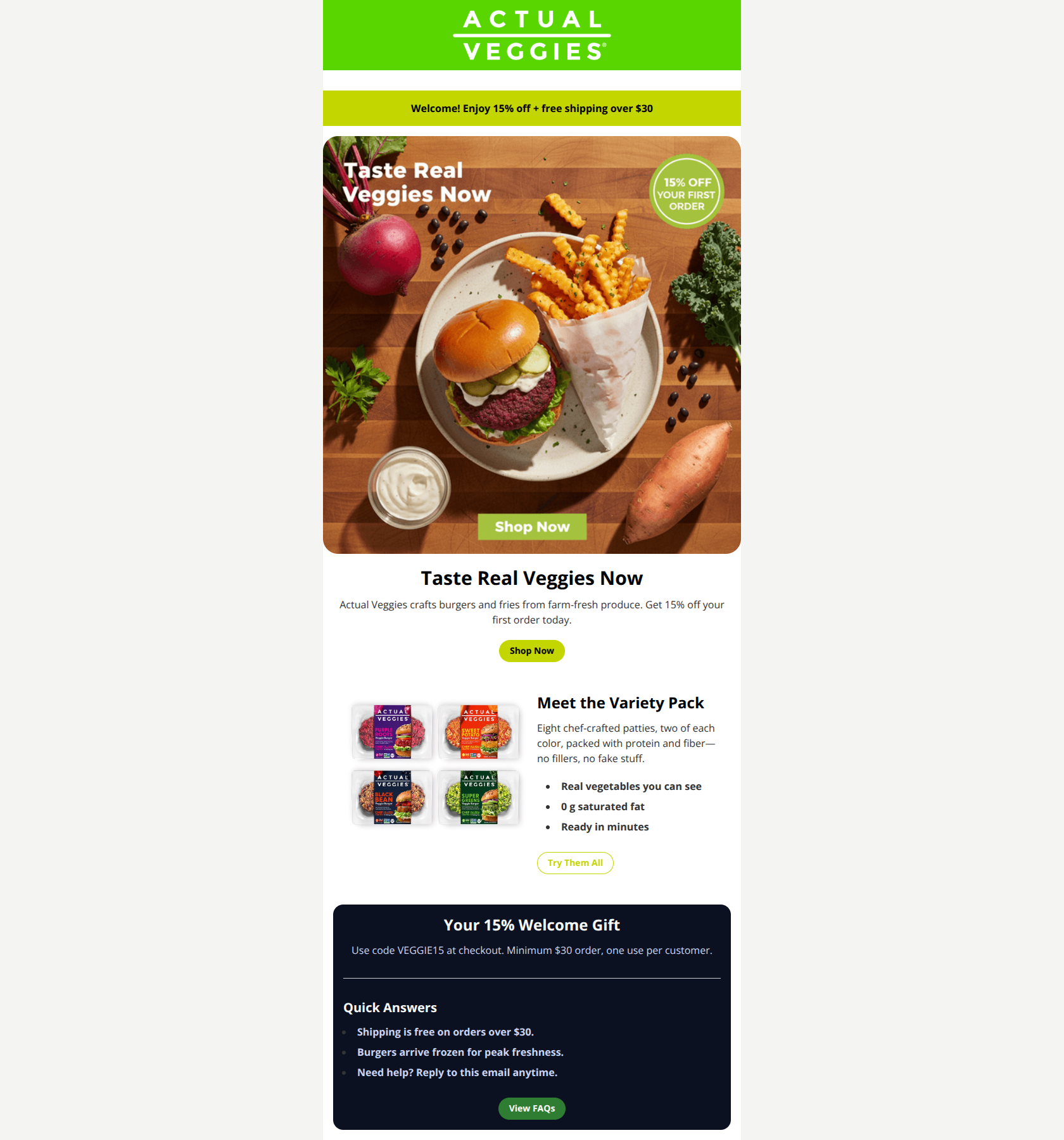
Welcome! Enjoy 15% off + free shipping over $30
Taste Real Veggies Now
Actual Veggies crafts burgers and fries from farm-fresh produce. Get 15% off your first order today.
→ Shop Now
Meet the Variety Pack
Eight chef-crafted patties, two of each color, packed with protein and fiber—no fillers, no fake stuff.
- Real vegetables you can see
- 0 g saturated fat
- Ready in minutes
→ Try Them All
Your 15% Welcome Gift
Use code VEGGIE15 at checkout. Minimum $30 order, one use per customer.
Quick Answers
- Shipping is free on orders over $30.
- Burgers arrive frozen for peak freshness.
- Need help? Reply to this email anytime.
→ View FAQs
Why This Email Works
Strong welcome email with a clear 15% offer, appetizing imagery, and simple sections that are easy to scan. Biggest opportunities: sharpen the hero message with unique brand proof, strengthen and streamline CTAs, add urgency/social proof, and make the discount frictionless with an auto-applied link. Color choices are largely accessible and on-brand, with a minor opportunity to standardize CTA color usage for consistency and emphasis.
Hero (top/initial part) Impact
84/100- Appetizing, high-quality hero image that clearly shows product and fries.
- Immediate value bar communicates discount + free shipping threshold.
Content Structure & Flow
85/100- Single-column layout with clear section separation and concise copy.
- Helpful “Quick Answers” section reduces purchase anxiety.
Visual Hierarchy & Layout
82/100- Consistent spacing and clean typographic hierarchy.
- The dark card creates a distinct emphasis zone without overwhelming the layout.
Call-to-Action Strength
78/100- Primary CTA appears early and is easy to spot.
- Secondary CTAs (“Try Them All,” “View FAQs”) support different intents.
Message Clarity & Tone
83/100- Clear value statement and uncomplicated copy throughout.
- Concise bullets increase clarity and reduce cognitive load.
Readability & Scannability
90/100- Effective use of bullets in both product and FAQ sections.
- Balanced white space supports fast reading.
Offer & Value Proposition
80/100- Offer mechanics are explicit: code, threshold, and one-use limit.
- ‘Quick Answers’ reinforces shipping and fulfillment expectations.
Personalization & Audience Fit
60/100- Clear welcome framing via the promo bar signals this is a first-order incentive.
- Content focuses on beginner-friendly info (“Quick Answers”).
Quick Wins
- Auto-apply the discount in CTA links using ?discount=VEGGIE15 and add UTM parameters for attribution.
- Use a filled primary button for “Try Them All” and add a final “Redeem 15% Off” CTA at the bottom.
- Move or repeat the code VEGGIE15 near the hero CTA to reduce friction.
- Add one line of urgency (“Limited-time welcome gift”) to prompt action.
- Standardize bullet styling (e.g., “0g saturated fat”) and tighten intro copy.

Create Professional Email Designs
Generate beautiful, on-brand email designs in seconds. Just enter your brand URL and let AI do the rest.