Food & Beverage Welcome Email Template
“Welcome! 15% Off Your First Order”
Design Score
75/100Strong welcome offer with appetizing visuals and clear, friendly copy. Biggest opportunities are CTA strength and redemption clarity: make the primary CTAs bolder, ensure the code auto-applies, and add quick paths by diet or store. Add light urgency and product proof points to lift conversions.
Create Your Own
Generate professional email designs like this one in seconds with Kopi AI.
Email Details
- Subject Line
- Welcome! 15% Off Your First Order
- Brand
- Dr. Praeger's
- Industry
- Food & Beverage
- Email Type
- Welcome
- Created
- November 18, 2025
Brand Colors
Email Copy
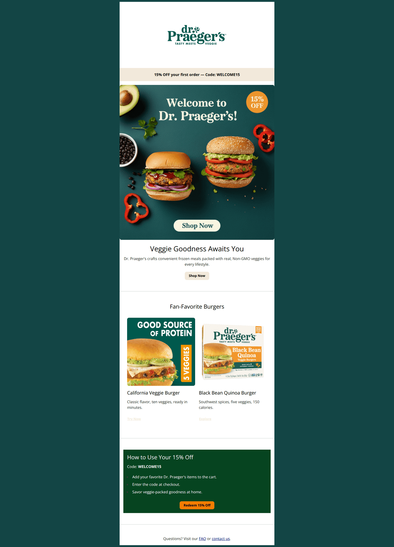
15% OFF your first order — Code: WELCOME15
Veggie Goodness Awaits You
Dr. Praeger's crafts convenient frozen meals packed with real, Non-GMO veggies for every lifestyle.
→ Shop Now
Fan-Favorite Burgers
California Veggie Burger
Classic flavor, ten veggies, ready in minutes.
Try Now
Black Bean Quinoa Burger
Southwest spices, five veggies, 150 calories.
Explore
How to Use Your 15% Off
Code: WELCOME15
- Add your favorite Dr. Praeger's items to the cart.
- Enter the code at checkout.
- Savor veggie-packed goodness at home.
→ Redeem 15% Off
Questions? Visit our FAQ or contact us.
Why This Email Works
Strong welcome offer with appetizing visuals and clear, friendly copy. Biggest opportunities are CTA strength and redemption clarity: make the primary CTAs bolder, ensure the code auto-applies, and add quick paths by diet or store. Add light urgency and product proof points to lift conversions.
Hero (top/initial part) Impact
78/100- Appetite‑appeal photography clearly communicates the product.
- Offer strip with “15% OFF your first order — Code: WELCOME15” is immediately visible.
Content Structure & Flow
82/100- Clear, concise sections that are easy to scan.
- ‘How to Use Your 15% Off’ reduces friction and answers next steps.
Visual Hierarchy & Layout
80/100- Consistent use of brand colors (#F8F8F8, #F2E9DB, deep greens) organizes the content.
- The dark green promo card effectively creates a visual ‘moment’ for the offer.
Call-to-Action Strength
65/100- Multiple click opportunities (hero button and offer card).
- The “Redeem 15% Off” button in the green card is high‑contrast and clear.
Message Clarity & Tone
85/100- Concise, approachable copy that aligns with brand voice.
- Product blurbs highlight concrete benefits (ten veggies, 150 calories).
Readability & Scannability
88/100- The “How to Use” bullets are simple and scannable.
- Whitespace and section dividers keep cognitive load low.
Offer & Value Proposition
74/100- Offer is prominent in the header strip and in the dedicated how‑to section.
- Value prop emphasizes real, recognizable veggies and dietary fit.
Personalization & Audience Fit
55/100- Feature focus on burgers likely aligns with broad interest and best‑seller appeal.
Quick Wins
- Convert the hero “Shop Now” to a solid, high‑contrast button and repeat the code directly beneath it.
- Change product CTAs from subtle text links to solid buttons with explicit labels (e.g., “Shop California Veggie Burger”).
- Add a ‘Shop by diet’ link row (Vegan, Gluten‑Free, Soy‑Free, Non‑GMO) under the hero.
- Deep‑link CTAs to a collection with WELCOME15 auto‑applied to the cart.
- Add a small ‘Find a store’ text link in the footer line for retail shoppers.

Create Professional Email Designs
Generate beautiful, on-brand email designs in seconds. Just enter your brand URL and let AI do the rest.