Fashion & Apparel Announcement Email Template
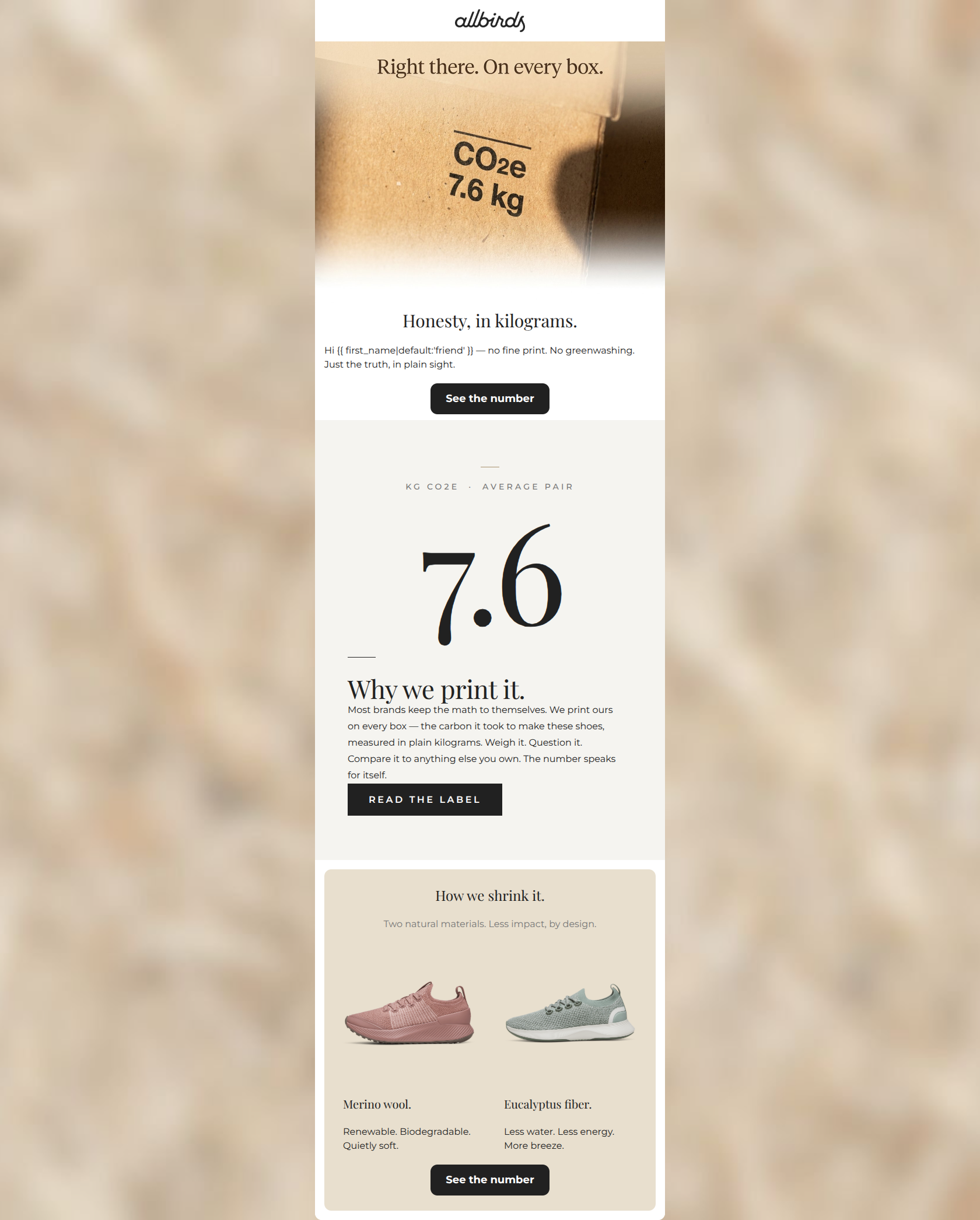
“We printed our carbon footprint on the box.”
Design Score
83/100This is a strong, brand-aligned educational email that effectively communicates Allbirds' commitment to transparency and sustainability. The visual anchor of the '7.6' numeral and the punchy, confident copy resonate perfectly with the target audience. However, the email leaves some conversion potential on the table by using a CTA ('See the number') that asks the user to click for information already prominently displayed in the email. Minor contrast issues and slight copy repetition hold it back from being outstanding.
Create Your Own
Generate professional email designs like this one in seconds with Kopi AI.
Email Details
- Subject Line
- We printed our carbon footprint on the box.
- Brand
- Kopi Agent Eval [2026-05-22]
- Industry
- Fashion & Apparel
- Email Type
- Announcement
- Created
- May 26, 2026
Brand Colors
Email Copy
Honesty, in kilograms.
Hi friend — no fine print. No greenwashing. Just the truth, in plain sight.
→ See the number
How we shrink it.
Two natural materials. Less impact, by design.
Merino wool.
Renewable. Biodegradable. Quietly soft.
Eucalyptus fiber.
Less water. Less energy. More breeze.
→ See the number
Why This Email Works
This is a strong, brand-aligned educational email that effectively communicates Allbirds' commitment to transparency and sustainability. The visual anchor of the '7.6' numeral and the punchy, confident copy resonate perfectly with the target audience. However, the email leaves some conversion potential on the table by using a CTA ('See the number') that asks the user to click for information already prominently displayed in the email. Minor contrast issues and slight copy repetition hold it back from being outstanding.
Hero (top/initial part) Impact
85/100- Striking visual that immediately establishes the theme of the email.
- Use of first-name personalization to create a conversational tone.
- Short, punchy sentences ('No fine print. No greenwashing.') build immediate trust.
Content Structure & Flow
80/100- Clear inverted pyramid structure in the materials section (Heading -> Subhead -> Product cards).
- Generous whitespace creates a premium, uncluttered feel.
Visual Hierarchy & Layout
78/100- Excellent use of scale with the '7.6' numeral to create visual hierarchy.
- Symmetrical, balanced layout in the product feature section.
Call-to-Action Strength
82/100- High contrast buttons that clearly stand out against all background colors.
- Repetition of the primary destination URL across all three CTAs, focusing the user's path.
Message Clarity & Tone
88/100- Excellent use of descriptive, brand-aligned language (e.g., 'More breeze' for eucalyptus fiber).
- The 'documentary tone' effectively combats the audience's pain point of industry greenwashing.
Readability & Scannability
75/100- Short, fragmented sentences make the copy incredibly fast to read.
- Clear typographic hierarchy distinguishes headings from body copy.
Offer & Value Proposition
85/100- Turns a potentially dry metric (carbon footprint) into a compelling brand differentiator.
- Connects the abstract concept of sustainability to tangible product materials.
Personalization & Audience Fit
90/100- Directly addresses the psychographic desire for transparency and mindful consumption.
- Treats the reader as a peer capable of making their own decisions ('so you can compare, question, and decide').
Copy Conciseness & Word Economy
85/100- Three-word descriptors for the materials ('Renewable. Biodegradable. Quietly soft.') are exceptionally punchy.
- Zero throat-clearing in the intro; gets straight to the point.
Quick Wins
- Change the `#767676` subtext in the 'How we shrink it' section to `#212121` to fix the contrast issue.
- Update the CTA text from 'See the number' to an action that makes sense given the number is already visible (e.g., 'See the breakdown' or 'Learn more').
- Standardize the CTA copy across all three buttons to reduce cognitive load.

Create Professional Email Designs
Generate beautiful, on-brand email designs in seconds. Just enter your brand URL and let AI do the rest.