Outdoor & Sports Promotional Email Template
“Help me give away this money”
Design Score
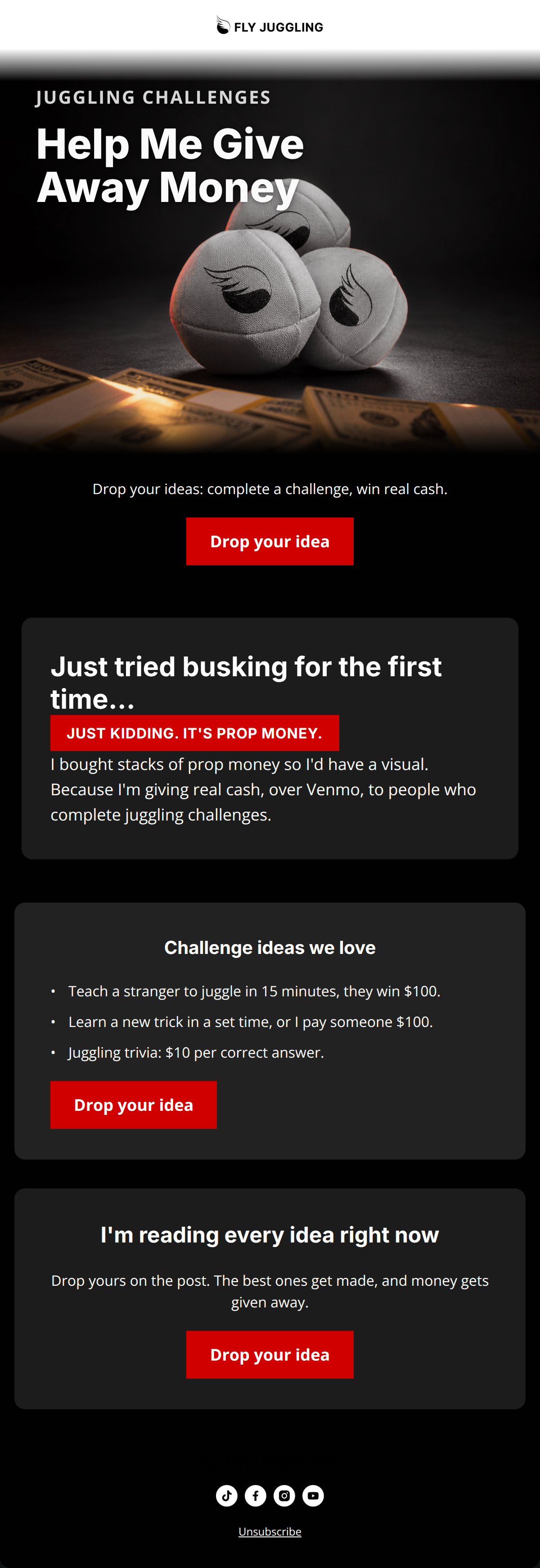
87/100This is a highly engaging, structurally sound email that perfectly matches the brand's community-driven ethos. The copy is punchy, the premise is inherently click-worthy, and the inverted pyramid structure effectively drives users toward a single goal. However, a significant visual error—styling a non-clickable text callout exactly like the primary CTA buttons—creates unnecessary cognitive friction. Fixing this and standardizing the top-of-email visual experience will push this campaign from strong to outstanding.
Create Your Own
Generate professional email designs like this one in seconds with Kopi AI.
Email Details
- Subject Line
- Help me give away this money
- Brand
- Fly Juggling
- Industry
- Outdoor & Sports
- Email Type
- Promotional
- Created
- September 27, 2026
Brand Colors
Email Copy
Drop your ideas: complete a challenge, win real cash.
→ Drop your idea
Challenge ideas we love
- Teach a stranger to juggle in 15 minutes, they win $100.
- Learn a new trick in a set time, or I pay someone $100.
- Juggling trivia: $10 per correct answer.
→ Drop your idea
I'm reading every idea right now
Drop yours on the post. The best ones get made, and money gets given away.
→ Drop your idea
Unsubscribe
Why This Email Works
This is a highly engaging, structurally sound email that perfectly matches the brand's community-driven ethos. The copy is punchy, the premise is inherently click-worthy, and the inverted pyramid structure effectively drives users toward a single goal. However, a significant visual error—styling a non-clickable text callout exactly like the primary CTA buttons—creates unnecessary cognitive friction. Fixing this and standardizing the top-of-email visual experience will push this campaign from strong to outstanding.
Hero Impact
85/100- High-contrast, provocative headline ('Help Me Give Away Money') creates an immediate curiosity gap.
- The imagery perfectly blends the product (juggling balls) with the core offer of the email (cash prizes).
Content Structure & Flow
88/100- The 'Challenge ideas we love' section perfectly bridges the gap between the concept and the action required by the user.
- Excellent use of distinct visual 'cards' (alternating shades of dark grey) to separate distinct thoughts and keep the reader scrolling.
Visual Hierarchy & Layout
70/100- Typography hierarchy is very clear; the 'Inter' headings contrast nicely with the 'Open Sans' body copy.
- The use of #1C1C1C and #222222 card backgrounds on the #010101 body background creates elegant depth.
Call-to-Action Strength
85/100- Flawless consistency in CTA copy ('Drop your idea') across all three buttons.
- The buttons feature excellent color contrast (#D00000 on dark backgrounds), making them the most prominent elements in their respective sections.
Message Clarity & Tone
92/100- Conversational copy ('Because I'm giving real cash, over Venmo') feels authentic and builds trust.
- The bold, athletic tone translates well to a community challenge context.
Readability & Scannability
94/100- Use of bullet points for the challenge ideas breaks up the text and makes the concepts instantly digestible.
- Paragraphs are kept to 1-2 sentences maximum, keeping cognitive load extremely low.
Offer & Value Proposition
88/100- The value proposition is introduced immediately in the hero kicker and reinforced in every section.
- The bulleted examples reduce the mental friction of having to come up with an idea from scratch.
Personalization & Audience Fit
90/100- Uses 'I' and 'we' effectively to create a parasocial connection between the brand/creator and the reader.
- Taps into the audience's desire for active participation rather than passive consumption.
Copy Conciseness & Word Economy
96/100- Zero filler words or throat-clearing intro paragraphs.
- The copy is punchy, direct, and distills a complex community initiative into a few easily understood sentences.
Quick Wins
- Change the styling of the 'JUST KIDDING' callout. Remove the solid red background and replace it with red text (#D00000) or a red outline so users do not mistake it for a clickable button.
- Change the white header background to #010101 (or #303030) and use a reversed-out logo to maintain the immersive dark-mode aesthetic from the very top of the email.


Create Professional Email Designs
Generate beautiful, on-brand email designs in seconds. Just enter your brand URL and let AI do the rest.