SaaS & Software Product Launch Email Template
“Unlock our newest enterprise solution with early b”
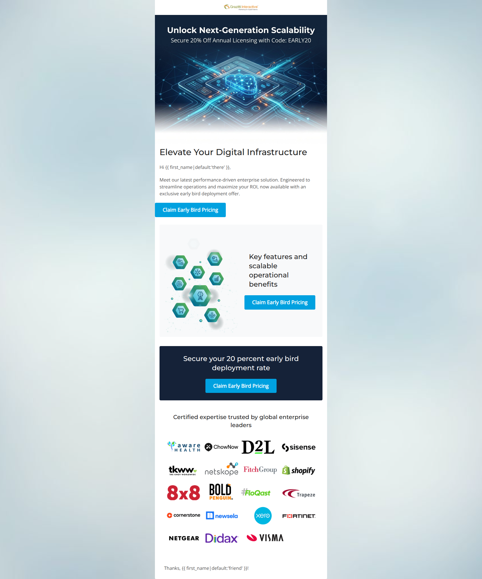
Design Score
55/100While visually clean and technically well-structured with excellent color contrast, this email suffers from a near-critical failure in message clarity by completely omitting the name and specific function of the product being launched. It relies heavily on generic enterprise buzzwords, asking users to commit to pricing before explaining the value proposition. The biggest strength is the clear visual hierarchy and strong CTA contrast; the biggest weakness is the 'mystery box' copywriting that fails to identify the product.
Create Your Own
Generate professional email designs like this one in seconds with Kopi AI.
Email Details
- Subject Line
- Unlock our newest enterprise solution with early b
- Brand
- Grazitti Interactive
- Industry
- SaaS & Software
- Email Type
- Product Launch
- Created
- March 6, 2026
Brand Colors
Email Copy
Elevate Your Digital Infrastructure
Hi there,
Meet our latest performance-driven enterprise solution. Engineered to streamline operations and maximize your ROI, now available with an exclusive early bird deployment offer.
→ Claim Early Bird Pricing
Key features and scalable operational benefits
→ Claim Early Bird Pricing
Secure your 20 percent early bird deployment rate
→ Claim Early Bird Pricing
Certified expertise trusted by global enterprise leaders
Thanks, friend!
Why This Email Works
While visually clean and technically well-structured with excellent color contrast, this email suffers from a near-critical failure in message clarity by completely omitting the name and specific function of the product being launched. It relies heavily on generic enterprise buzzwords, asking users to commit to pricing before explaining the value proposition. The biggest strength is the clear visual hierarchy and strong CTA contrast; the biggest weakness is the 'mystery box' copywriting that fails to identify the product.
Hero Impact
40/100- Clear visual hierarchy that quickly draws the eye down to the primary CTA.
- The 20% offer is stated clearly in the header graphic.
Content Structure & Flow
45/100- Logical visual banding moving from light to dark to anchor the final offer.
- Strong use of a social proof section at the end.
Visual Hierarchy & Layout
85/100- Excellent use of whitespace.
- The cyan buttons pop perfectly against both the white and deep navy backgrounds, passing all contrast checks.
Call-to-Action Strength
60/100- High visual contrast makes the buttons unmissable.
- Action-oriented verb 'Claim' is used.
Message Clarity & Tone
30/100- The tone matches the authoritative, corporate brand voice expected by enterprise leaders.
Readability & Scannability
80/100- Very short paragraphs prevent cognitive overload.
- Left-aligned text in the main body is easy to read.
Offer & Value Proposition
50/100- The 20% off early bird rate is a strong, concrete incentive.
- The promo code is clearly visible in the hero graphic.
Personalization & Audience Fit
60/100- Uses basic first-name personalization.
- Includes relevant enterprise-level social proof logos.
Quick Wins
- Add the actual product name to the hero headline and body copy.
- Add a 3-point bulleted list of specific features under the 'Key features' heading.
- Vary the CTA copy so only the bottom button aggressively asks for the sale (e.g., 'Learn More' instead of 'Claim').

Create Professional Email Designs
Generate beautiful, on-brand email designs in seconds. Just enter your brand URL and let AI do the rest.