Home & Garden Promotional Email Template
“Two easy home fixes you can do today”
Design Score
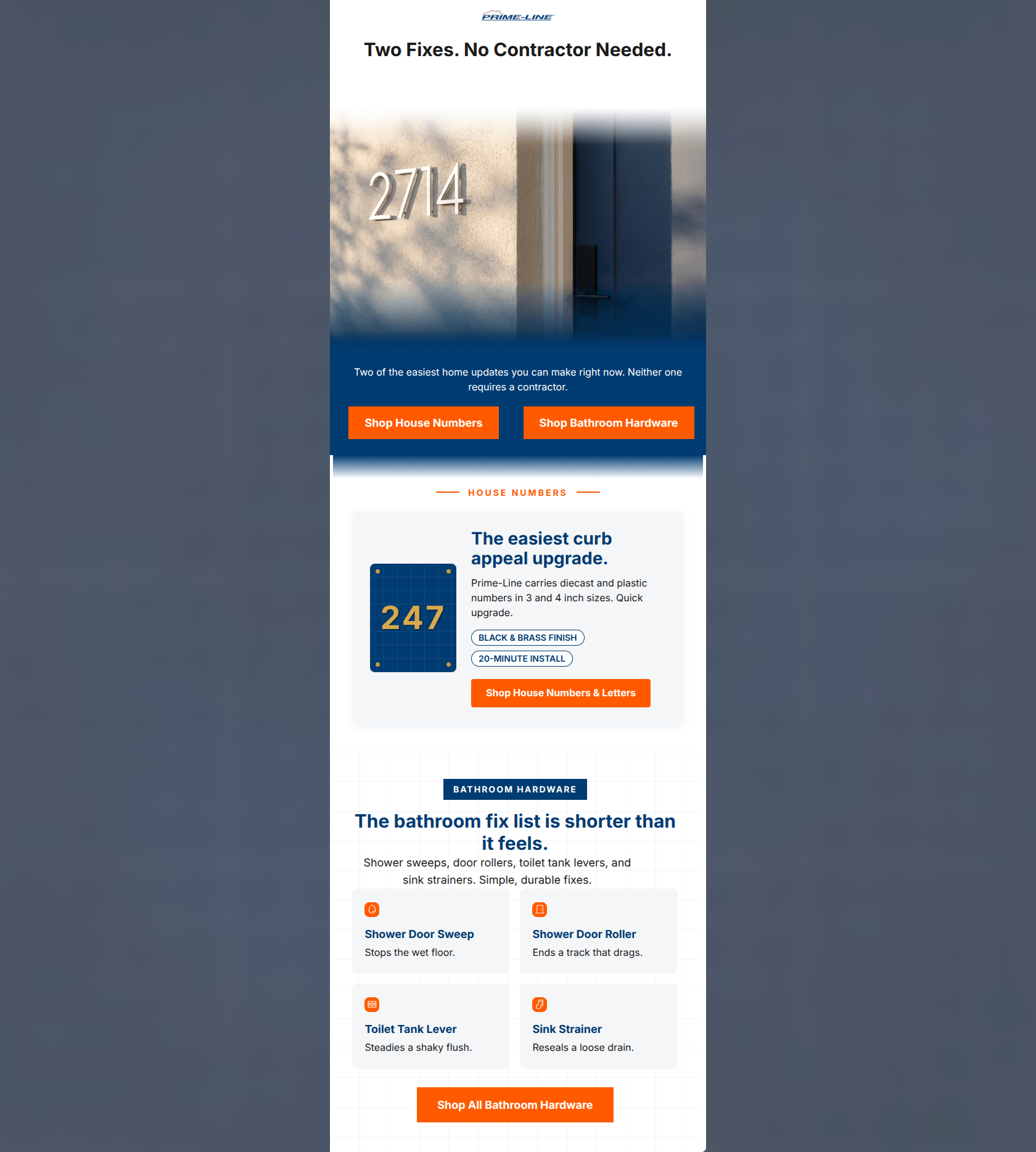
72/100This email effectively leans into the Prime-Line 'utilitarian expert' persona, leveraging a strong 'No Contractor Needed' value proposition that resonates with DIY homeowners. Visually, it is clean and professional, using the brand's navy and orange palette to create high contrast and clear scanning paths. However, the email suffers from a split-focus strategy. By presenting two entirely unrelated product categories (House Numbers and Bathroom Hardware) with equal weight and identical primary CTA styling, it increases cognitive load and risks 'choice paralysis.' Furthermore, all CTAs currently point to the generic homepage, which creates a significant friction point for a user expecting to land on a specific product category.
Create Your Own
Generate professional email designs like this one in seconds with Kopi AI.
Email Details
- Subject Line
- Two easy home fixes you can do today
- Brand
- Prime-Line
- Industry
- Home & Garden
- Email Type
- Promotional
- Created
- July 14, 2026
Brand Colors
Email Copy
Preview text: No contractor needed. These quick updates make a massive difference in your home.
Two Fixes. No Contractor Needed.
Two of the easiest home updates you can make right now. Neither one requires a contractor.
→ Shop House Numbers
→ Shop Bathroom Hardware
Why This Email Works
This email effectively leans into the Prime-Line 'utilitarian expert' persona, leveraging a strong 'No Contractor Needed' value proposition that resonates with DIY homeowners. Visually, it is clean and professional, using the brand's navy and orange palette to create high contrast and clear scanning paths. However, the email suffers from a split-focus strategy. By presenting two entirely unrelated product categories (House Numbers and Bathroom Hardware) with equal weight and identical primary CTA styling, it increases cognitive load and risks 'choice paralysis.' Furthermore, all CTAs currently point to the generic homepage, which creates a significant friction point for a user expecting to land on a specific product category.
Hero (top/initial part) Impact
88/100- Strong emotional hook in the headline.
- High-quality lifestyle image that visualizes the 'Curb Appeal' benefit.
Content Structure & Flow
75/100- Modular layout makes scanning effortless.
- Good use of white space to separate unrelated tasks.
Visual Hierarchy & Layout
82/100- Excellent use of safety-orange to highlight actions.
- Blueprint-inspired grid in the bathroom section reinforces the 'expert' brand voice.
Call-to-Action Strength
70/100- High-contrast orange buttons are impossible to miss.
- Action-oriented verb usage ('Shop').
Message Clarity & Tone
90/100- Empowering language ('No Contractor Needed').
- Clear, jargon-free explanations of product benefits ('Stops the wet floor').
Readability & Scannability
85/100- Iconography helps categorize information quickly.
- Short, punchy sentences.
Offer & Value Proposition
78/100- Strong 'DIY Hero' positioning.
- Focus on 'Easy' and '20-Minute' installs reduces friction.
Personalization & Audience Fit
65/100- Broad appeal to the 'fix-it' mentality.
Copy Conciseness & Word Economy
92/100- Zero filler or 'throat-clearing' openers.
- Benefit-centric micro-copy ('Ends a track that drags').
Quick Wins
- Update all CTA destination URLs to point directly to the House Numbers and Bathroom Hardware category pages respectively.
- Increase the contrast/font-size of the white descriptive text on the navy background for better legibility.
- Add the brand logo to the top of the header to immediately establish 'Who is this from?'
Create Professional Email Designs
Generate beautiful, on-brand email designs in seconds. Just enter your brand URL and let AI do the rest.