Health & Wellness Welcome Email Template
“This month's blueprint for whole-body revival”
Design Score
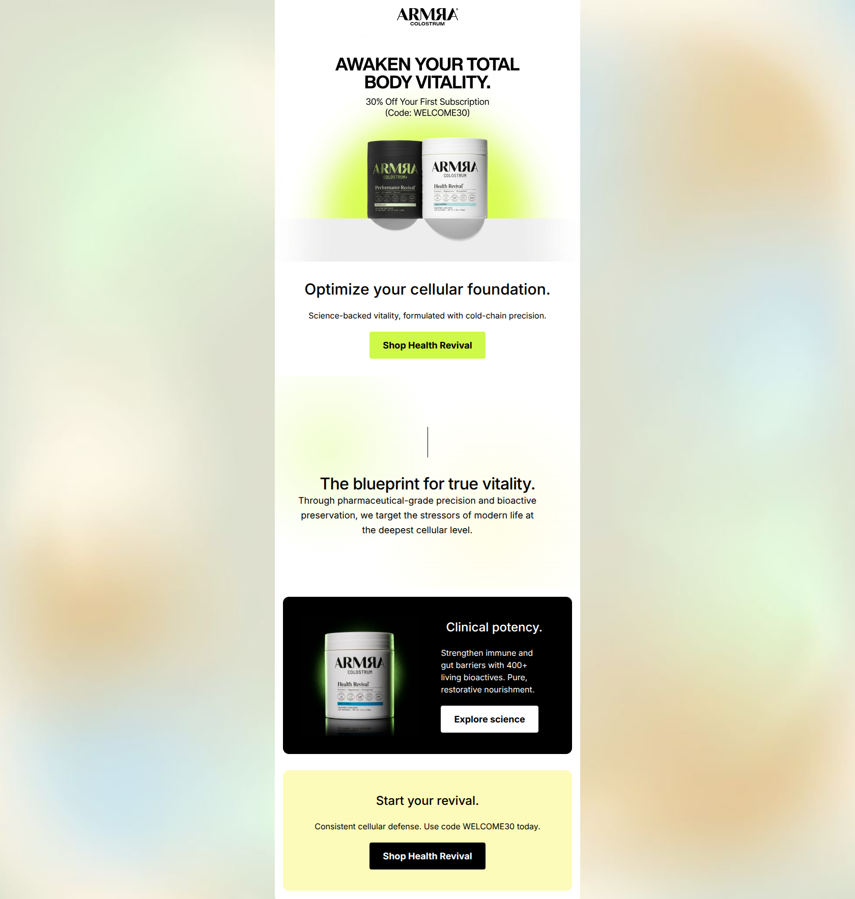
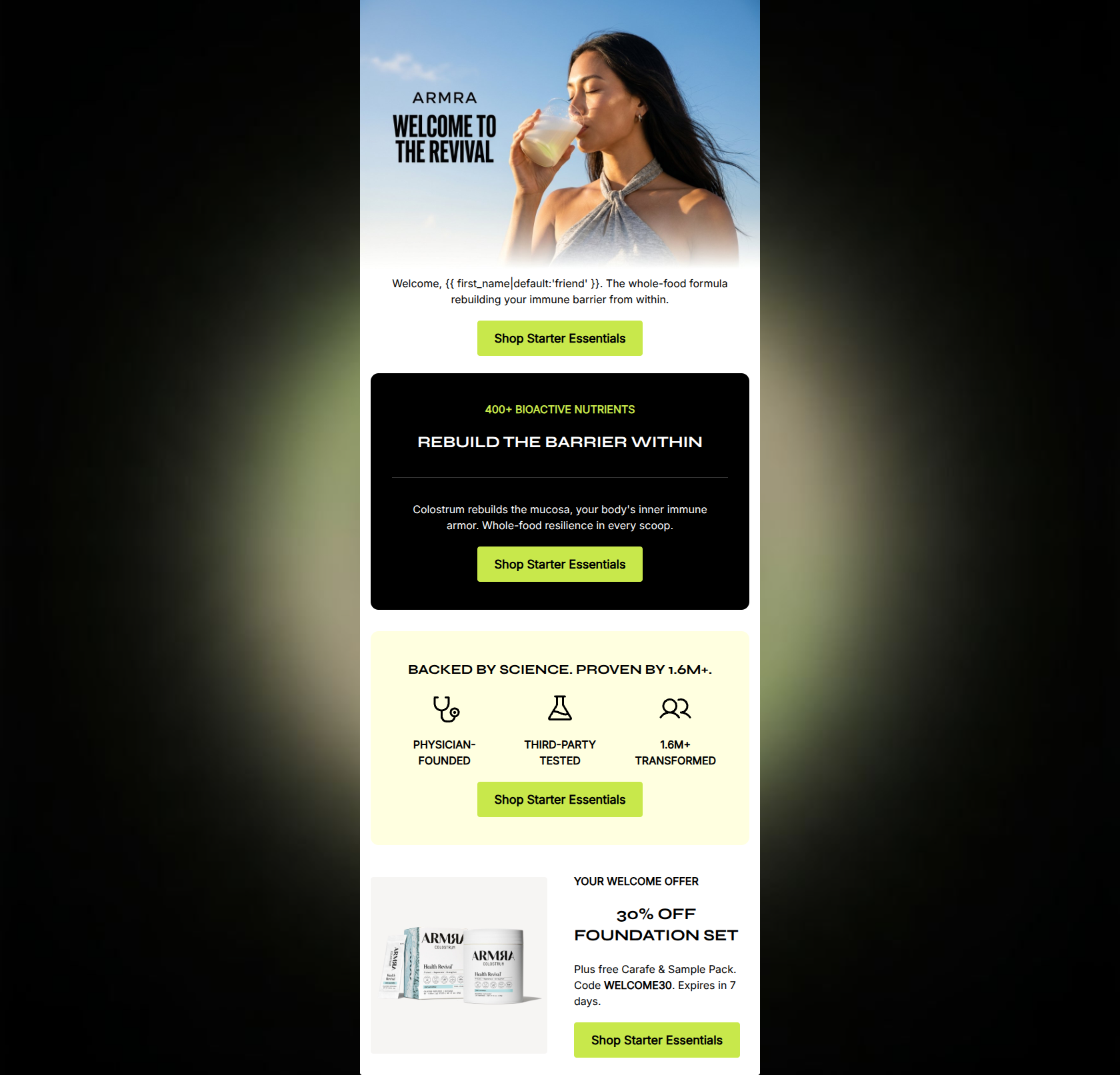
88/100This is a highly sophisticated, visually striking email that perfectly captures ARMRA's 'biotech-meets-lifestyle' positioning. The layout is clean, the typography is modern, and the copy is exceptionally tight, relying on strong, evocative language rather than dense paragraphs. The offer is compelling and bookends the email nicely. However, the email makes a fundamental conversion error by burying its strongest hook—the primary headline and the 30% discount offer—inside a single hero image asset. Moving this critical information into live HTML text will significantly improve accessibility, load-time comprehension, and overall conversion resilience.
Create Your Own
Generate professional email designs like this one in seconds with Kopi AI.
Email Details
- Subject Line
- This month's blueprint for whole-body revival
- Brand
- ARMRA [eval 2026-03-25]
- Industry
- Health & Wellness
- Email Type
- Welcome
- Created
- March 25, 2026
Brand Colors
Email Copy
Optimize your cellular foundation.
Science-backed vitality, formulated with cold-chain precision.
→ Shop Health Revival
Clinical potency.
Strengthen immune and gut barriers with 400+ living bioactives. Pure, restorative nourishment.
→ Explore science
Start your revival.
Consistent cellular defense. Use code WELCOME30 today.
→ Shop Health Revival
Why This Email Works
This is a highly sophisticated, visually striking email that perfectly captures ARMRA's 'biotech-meets-lifestyle' positioning. The layout is clean, the typography is modern, and the copy is exceptionally tight, relying on strong, evocative language rather than dense paragraphs. The offer is compelling and bookends the email nicely. However, the email makes a fundamental conversion error by burying its strongest hook—the primary headline and the 30% discount offer—inside a single hero image asset. Moving this critical information into live HTML text will significantly improve accessibility, load-time comprehension, and overall conversion resilience.
Hero Impact
78/100- Striking visual aesthetic that immediately communicates 'premium'.
- The lime green CTA button creates excellent contrast against the white background.
Content Structure & Flow
88/100- Clear delineation of sections using distinct background colors (white, gradient, black, yellow).
- Logical narrative flow from high-level outcome to scientific proof points.
Visual Hierarchy & Layout
92/100- Masterful use of contrasting background fills to separate content zones.
- The dark 'Clinical potency' card is visually magnetic and highlights the product beautifully.
Call-to-Action Strength
85/100- High color contrast on all buttons ensures they cannot be missed.
- Action-oriented verbs used in the primary CTAs.
Message Clarity & Tone
95/100- Zero fluff or hyperbole; relies on strong, authoritative vocabulary.
- Perfectly matches the 'expert mentor' brand persona.
Copy Conciseness & Word Economy
98/100- Highly scannable due to short, punchy sentence structures.
- Information is distilled down to its most potent form, mimicking the product itself.
Offer & Value Proposition
86/100- Strong, specific financial incentive to drive the first purchase.
- The promo code is clear and memorable.
Quick Wins
- Change the final CTA button text from 'Shop Health Revival' to 'Claim 30% Off' to directly tie into the promo code mentioned above it.
- Make the 'WELCOME30' code in the final block selectable, bold text so it's easily tappable/copyable on mobile.
Create Professional Email Designs
Generate beautiful, on-brand email designs in seconds. Just enter your brand URL and let AI do the rest.