Outdoor & Sports Promotional Email Template
“The Weekend Is Yours: 15% Off Everything”
Design Score
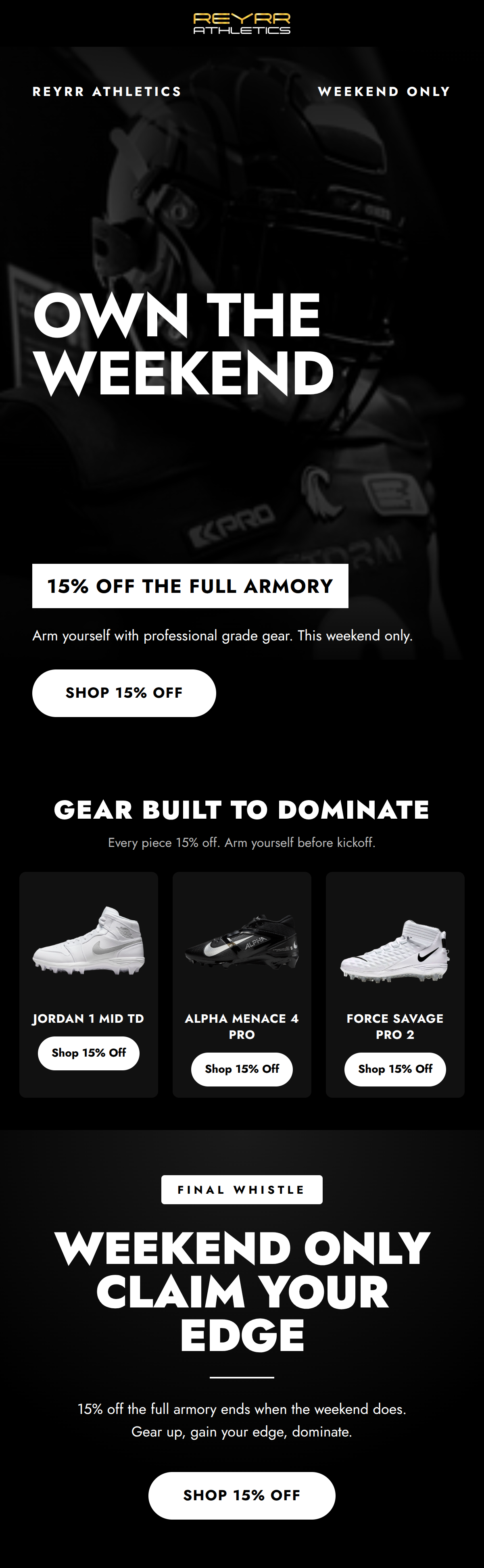
89/100This is a highly effective, conversion-focused promotional email that perfectly executes the brand's 'premium tactical' identity. The messaging is ruthlessly concise, the offer is unmistakable, and the visual hierarchy forcefully guides the reader toward the purchase action. By strictly adhering to a high-contrast black and white palette, the email creates a sense of aggressive authority that will resonate strongly with serious athletes. While the execution is exceptionally strong, minor adjustments to vertical spacing in the hero section and structural tweaks to the product grid could elevate the conversion rate even further by reducing scroll friction and highlighting the premium product details.
Create Your Own
Generate professional email designs like this one in seconds with Kopi AI.
Email Details
- Subject Line
- The Weekend Is Yours: 15% Off Everything
- Brand
- Reyrr Athletics
- Industry
- Outdoor & Sports
- Email Type
- Promotional
- Created
- July 31, 2026
Brand Colors
Why This Email Works
This is a highly effective, conversion-focused promotional email that perfectly executes the brand's 'premium tactical' identity. The messaging is ruthlessly concise, the offer is unmistakable, and the visual hierarchy forcefully guides the reader toward the purchase action. By strictly adhering to a high-contrast black and white palette, the email creates a sense of aggressive authority that will resonate strongly with serious athletes. While the execution is exceptionally strong, minor adjustments to vertical spacing in the hero section and structural tweaks to the product grid could elevate the conversion rate even further by reducing scroll friction and highlighting the premium product details.
Hero (top/initial part) Impact
85/100- The offer ('15% Off The Full Armory') is boxed in stark white, making it impossible to miss upon opening.
- The headline 'OWN THE WEEKEND' perfectly captures the aggressive, performance-driven brand voice.
Content Structure & Flow
90/100- Logical progression from the macro offer ('The Full Armory') to micro examples (specific cleats).
- The final section successfully re-engages the user with a strong urgency play ('Final Whistle') for those who scrolled past the grid.
Visual Hierarchy & Layout
82/100- Masterful use of typography (Jost) with varied weights and tracked-out uppercase letters to establish hierarchy without relying on color.
- The stark contrast between the canvas, text, and primary buttons creates a frictionless scanning experience.
Call-to-Action Strength
95/100- Perfect consistency: every single button drives the exact same action ('Shop 15% Off').
- High-contrast design (black text on white pill) ensures the CTAs are the most visually prominent elements on the page.
Message Clarity & Tone
92/100- Vocabulary choices like 'Armory', 'Dominate', and 'Claim Your Edge' resonate deeply with the psychographics of serious football/floorball players.
- The tone is authoritative and uncompromising, avoiding the generic, overly-excited retail tone that plagues most sporting goods emails.
Readability & Scannability
88/100- Excellent use of high-contrast white text on a black canvas.
- Text blocks are kept to a maximum of two lines, acknowledging that this audience skims rather than reads.
Offer & Value Proposition
85/100- The offer is unambiguous and repeated strategically throughout the top, middle, and bottom of the email.
- The time constraint ('Weekend Only') is clearly communicated, establishing genuine urgency.
Personalization & Audience Fit
90/100- The 'premium tactical' visual execution aligns perfectly with a young, male, performance-focused demographic.
- The selection of high-end cleats (Jordan, Nike Alpha Menace) reinforces the brand's position as a curator of elite, rather than entry-level, gear.
Copy Conciseness & Word Economy
90/100- Zero filler words. The copy relies on strong verbs ('Own', 'Arm', 'Shop', 'Claim') to drive momentum.
- Information is distilled into highly digestible fragments rather than paragraphs.
Quick Wins
- Eliminate the excessive vertical padding in the hero section to pull the 15% off box and primary CTA closer to the top of the email.
- Add a single line of micro-copy under the main CTA clarifying how the discount is redeemed (e.g., 'Discount applied at checkout').
- Lighten the grey hex code used for the original strikethrough prices in the product grid to improve legibility against the dark card backgrounds.

Create Professional Email Designs
Generate beautiful, on-brand email designs in seconds. Just enter your brand URL and let AI do the rest.