Fashion & Apparel Promotional Email Template
“A thank you, and 10% off your next order”
Design Score
82/100This is a highly effective, utilitarian VIP reward email that perfectly aligns with Blank Apparel's pragmatic, B2B-leaning brand voice. The standout feature is the dark offer card, which explicitly addresses primary customer pain points ('Stacks with bulk pricing. No minimum order.'). The email suffers from a minor structural flaw—placing a CTA before revealing the actual offer—and a hero image that feels slightly disconnected from the core 'wholesale' value proposition, but overall, it is a conversion-ready asset.
Create Your Own
Generate professional email designs like this one in seconds with Kopi AI.
Email Details
- Subject Line
- A thank you, and 10% off your next order
- Brand
- Blank Apparel
- Industry
- Fashion & Apparel
- Email Type
- Promotional
- Created
- October 6, 2026
Brand Colors
Email Copy
Preview text: You are one of our best customers. Here is a small thank you.
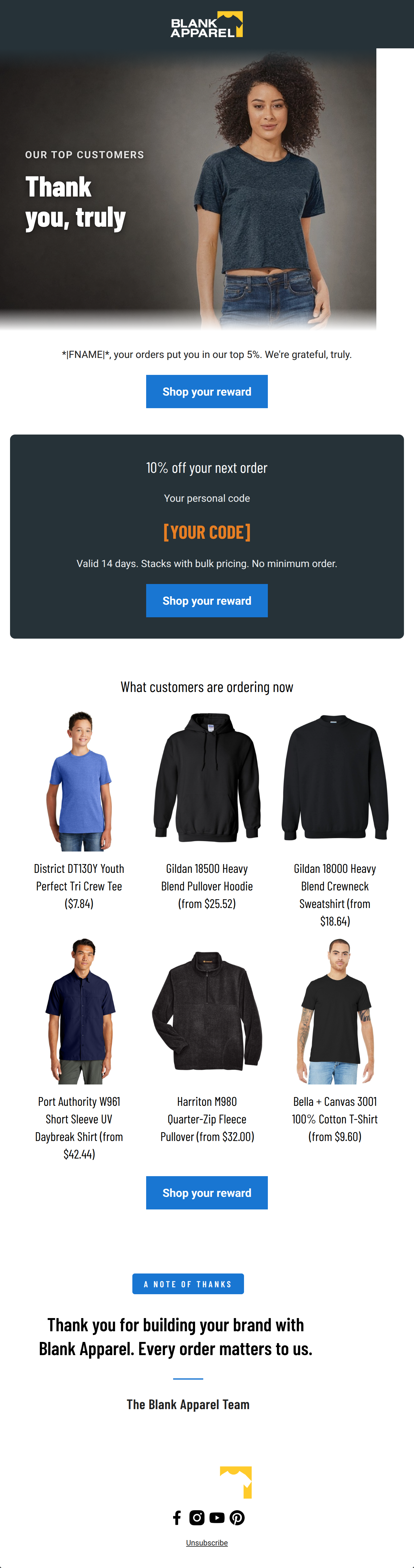
*|FNAME|*, your orders put you in our top 5%. We're grateful, truly.
→ Shop your reward
10% off your next order
Your personal code
[YOUR CODE]
Valid 14 days. Stacks with bulk pricing. No minimum order.
→ Shop your reward
What customers are ordering now
District DT130Y Youth Perfect Tri Crew Tee ($7.84)
Gildan 18500 Heavy Blend Pullover Hoodie (from $25.52)
Gildan 18000 Heavy Blend Crewneck Sweatshirt (from $18.64)
Port Authority W961 Short Sleeve UV Daybreak Shirt (from $42.44)
Harriton M980 Quarter-Zip Fleece Pullover (from $32.00)
Bella + Canvas 3001 100% Cotton T-Shirt (from $9.60)
→ Shop your reward
Unsubscribe
Why This Email Works
This is a highly effective, utilitarian VIP reward email that perfectly aligns with Blank Apparel's pragmatic, B2B-leaning brand voice. The standout feature is the dark offer card, which explicitly addresses primary customer pain points ('Stacks with bulk pricing. No minimum order.'). The email suffers from a minor structural flaw—placing a CTA before revealing the actual offer—and a hero image that feels slightly disconnected from the core 'wholesale' value proposition, but overall, it is a conversion-ready asset.
1. Hero (top/initial part) Impact
68/100- Clean, uncluttered text overlay with good contrast.
- The 'OUR TOP CUSTOMERS' kicker immediately makes the recipient feel valued and sets an exclusive context.
2. Content Structure & Flow
70/100- The inverted pyramid structure is largely intact, driving attention down to the core offer.
- The inclusion of a product grid after the offer serves as excellent immediate inspiration on how to use the code.
3. Visual Hierarchy & Layout
88/100- Excellent use of color contrast to isolate and elevate the primary offer.
- The 3-column product grid is visually organized, utilitarian, and easy to scan, matching the brand's 'catalog' aesthetic.
4. Call-to-Action Strength
85/100- Flawless consistency in CTA messaging; the user is never confused about what action to take.
- High contrast button colors ensure the CTAs pass the 'squint test' effortlessly.
5. Message Clarity & Tone
95/100- Zero-fluff, highly practical tone that respects the customer's time.
- Anticipates and answers critical B2B purchasing questions directly in the sub-copy of the offer.
6. Readability & Scannability
85/100- Short, punchy sentences reduce cognitive load.
- Product specs (e.g., '8 oz 50/50 cotton/poly fleece') are front-loaded, which is exactly what this audience scans for.
7. Offer & Value Proposition
95/100- No minimum order requirement removes the barrier to entry for smaller projects.
- Stacking with bulk pricing rewards high-volume buyers, making the offer universally appealing across the customer base.
8. Personalization & Audience Fit
85/100- Uses first name personalization naturally.
- Positions the customer as an insider ('top 5%'), which builds loyalty.
9. Copy Conciseness & Word Economy
90/100- Distilled, intentional copy that matches the brand's 'efficient' persona.
- Product descriptions are limited to exactly what is needed to make a click decision.
Quick Wins
- Delete the premature 'Shop your reward' button located immediately under the intro text.
- Left-align the product titles and descriptions in the 3-column grid for easier reading.
- Remove the repetitive 'truly' from the intro text so it doesn't echo the hero headline.




Create Professional Email Designs
Generate beautiful, on-brand email designs in seconds. Just enter your brand URL and let AI do the rest.