Health & Wellness Welcome Email Template
“The Science of Vitality: Your Monthly Digest”
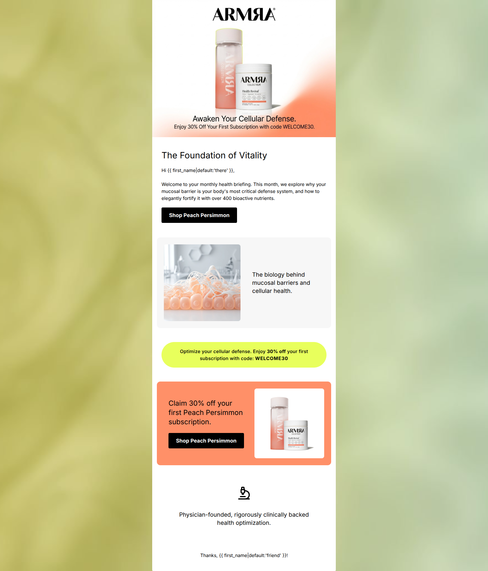
Design Score
62/100This email suffers from an identity crisis, presenting itself as an educational 'monthly health briefing' while aggressively pushing a specific product flavor without narrative transition. While visually aligned with ARMRA's premium bio-tech aesthetic and clearly communicating a strong 30% offer, the disjointed structure and mismatched copy-to-CTA relationship create friction. By aligning the narrative flow and fixing dead-end content blocks, this email could significantly improve its click-through rates.
Create Your Own
Generate professional email designs like this one in seconds with Kopi AI.
Email Details
- Subject Line
- The Science of Vitality: Your Monthly Digest
- Brand
- ARMRA [eval-prod 2026-03-22]
- Industry
- Health & Wellness
- Email Type
- Welcome
- Created
- March 22, 2026
Brand Colors
Email Copy
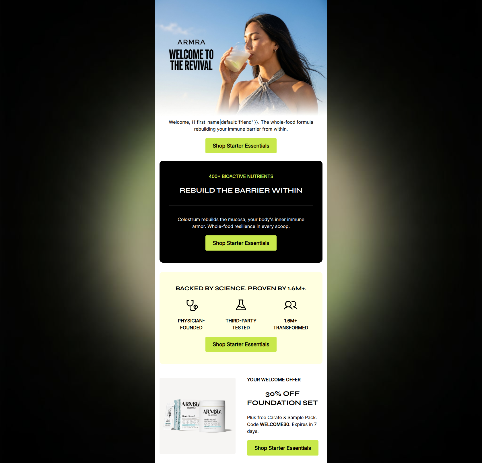
The Foundation of Vitality
Hi there, Welcome to your monthly health briefing. This month, we explore why your mucosal barrier is your body's most critical defense system, and how to elegantly fortify it with over 400 bioactive nutrients.
→ Shop Peach Persimmon
The biology behind mucosal barriers and cellular health.
Claim 30% off your first Peach Persimmon subscription.
→ Shop Peach Persimmon
Physician-founded, rigorously clinically backed health optimization.
Thanks, friend!
Why This Email Works
This email suffers from an identity crisis, presenting itself as an educational 'monthly health briefing' while aggressively pushing a specific product flavor without narrative transition. While visually aligned with ARMRA's premium bio-tech aesthetic and clearly communicating a strong 30% offer, the disjointed structure and mismatched copy-to-CTA relationship create friction. By aligning the narrative flow and fixing dead-end content blocks, this email could significantly improve its click-through rates.
Hero (top/initial part) Impact
65/100- High-quality imagery that perfectly captures the brand's clinical yet organic aesthetic.
- Immediate visibility of the 30% off offer and promo code.
Content Structure & Flow
55/100- Distinct visual banding (white, grey, chartreuse, orange) helps separate content sections.
- Good use of alternating left/right alignment to keep the eye moving down the page.
Visual Hierarchy & Layout
65/100- Strong contrast between the pure black CTAs and the lighter background colors.
- The bright chartreuse promo strip acts as an effective visual pattern interrupt.
Call-to-Action Strength
50/100- High-contrast black buttons are impossible to miss.
- Action-oriented verb ('Shop') is used clearly.
Message Clarity & Tone
50/100- Uses strong, brand-specific terminology ('mucosal barrier', 'bioactive nutrients', 'cellular defense').
- Maintains a sophisticated, premium vocabulary.
Readability & Scannability
75/100- Generous use of white space prevents the email from feeling cluttered.
- Clear, highly legible sans-serif typography.
Offer & Value Proposition
75/100- Offer details (30% off, code WELCOME30) are repeated for reinforcement.
- The promo code is clearly highlighted in the visually distinct chartreuse strip.
Personalization & Audience Fit
60/100- Appeals directly to the audience's desire for root-cause, cellular-level health solutions.
- Basic dynamic tag usage for the recipient's name.
Quick Wins
- Add a CTA button (e.g., 'Read the Science') to the grey section about the biology of mucosal barriers.
- Change the sign-off from the overly casual 'Thanks, [Name]!' to a more authoritative, brand-aligned sign-off.
- Add one sentence explaining that Peach Persimmon is a delicious flavor of their core colostrum product to provide context.
Create Professional Email Designs
Generate beautiful, on-brand email designs in seconds. Just enter your brand URL and let AI do the rest.