Fashion & Apparel Promotional Email Template
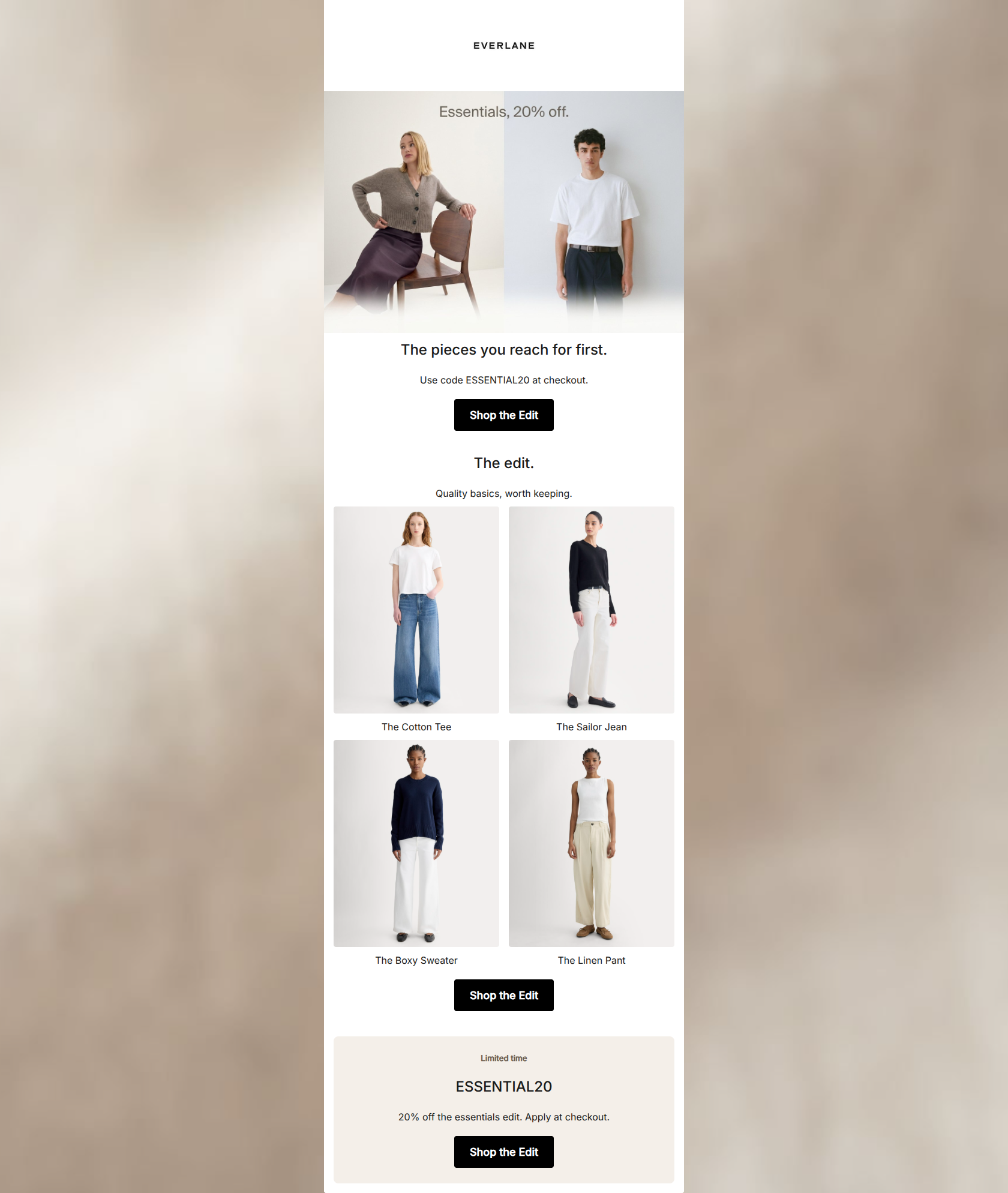
“The essentials, 20% off.”
Design Score
92/100This is a masterclass in minimalist, direct-to-consumer email design. It perfectly respects the brand guidelines while employing a rigorous, conversion-focused structure. The adherence to a single, repeated CTA and the ruthless word economy make this an exceptionally strong asset that respects the reader's time. The few areas for improvement revolve around subtly reinforcing the brand's unique value proposition (material quality) and ensuring the core offer is anchored in the HTML text rather than just the imagery.
Create Your Own
Generate professional email designs like this one in seconds with Kopi AI.
Email Details
- Subject Line
- The essentials, 20% off.
- Brand
- Everlane
- Industry
- Fashion & Apparel
- Email Type
- Promotional
- Created
- May 6, 2026
Brand Colors
Email Copy
The pieces you reach for first.
Use code ESSENTIAL20 at checkout.
→ Shop the Edit
The edit.
Quality basics, worth keeping.
The Cotton Tee
The Sailor Jean
The Boxy Sweater
The Linen Pant
→ Shop the Edit
Limited time
ESSENTIAL20
20% off the essentials edit. Apply at checkout.
→ Shop the Edit
Why This Email Works
This is a masterclass in minimalist, direct-to-consumer email design. It perfectly respects the brand guidelines while employing a rigorous, conversion-focused structure. The adherence to a single, repeated CTA and the ruthless word economy make this an exceptionally strong asset that respects the reader's time. The few areas for improvement revolve around subtly reinforcing the brand's unique value proposition (material quality) and ensuring the core offer is anchored in the HTML text rather than just the imagery.
Hero (top/initial part) Impact
88/100- Instantly recognizable brand aesthetic.
- Lifestyle imagery clearly demonstrates the product in use.
- The overall layout funnels attention downward.
Content Structure & Flow
94/100- Clear, linear scan path.
- Excellent use of a final promotional block to catch scrollers who bypassed the top.
- Sections are distinctly separated by generous whitespace.
Visual Hierarchy & Layout
90/100- Exceptional use of negative space to reduce cognitive load.
- CTA buttons are the highest-contrast elements on the screen.
- The 2x2 grid layout is perfectly balanced.
Call-to-Action Strength
98/100- Unambiguous primary action ('Shop the Edit').
- Perfect repetition without variation that might cause confusion.
- High-contrast color usage ensures immediate visibility.
Message Clarity & Tone
92/100- Honest, direct language.
- Zero throat-clearing or marketing fluff.
- Evokes a sense of calm assurance.
Readability & Scannability
94/100- No text fatigue or walls of copy.
- Ample breathing room around all text elements.
- Clear, legible typography.
Offer & Value Proposition
90/100- The value proposition is clear and easy to understand.
- The promo code is repeated to ensure it isn't missed.
- The dedicated promo block at the bottom acts as a strong final push.
Personalization & Audience Fit
90/100- Imagery heavily resonates with the target demographic's aesthetic.
- The focus on 'pieces you reach for first' directly addresses the audience's desire to reduce decision fatigue.
Copy Conciseness & Word Economy
95/100- Ruthless editing; no wasted words.
- Communicates the maximum amount of information with the minimum footprint.
- Respects the reader's time and attention span.
Quick Wins
- Bold the promo code 'ESSENTIAL20' in the initial body text for immediate scannability.
- Increase the font weight of the product titles in the grid to improve hierarchy.
- Add a defining material adjective to the product grid titles (e.g., 'The Organic Cotton Tee') to instantly communicate value.

Create Professional Email Designs
Generate beautiful, on-brand email designs in seconds. Just enter your brand URL and let AI do the rest.