Fashion & Apparel Promotional Email Template
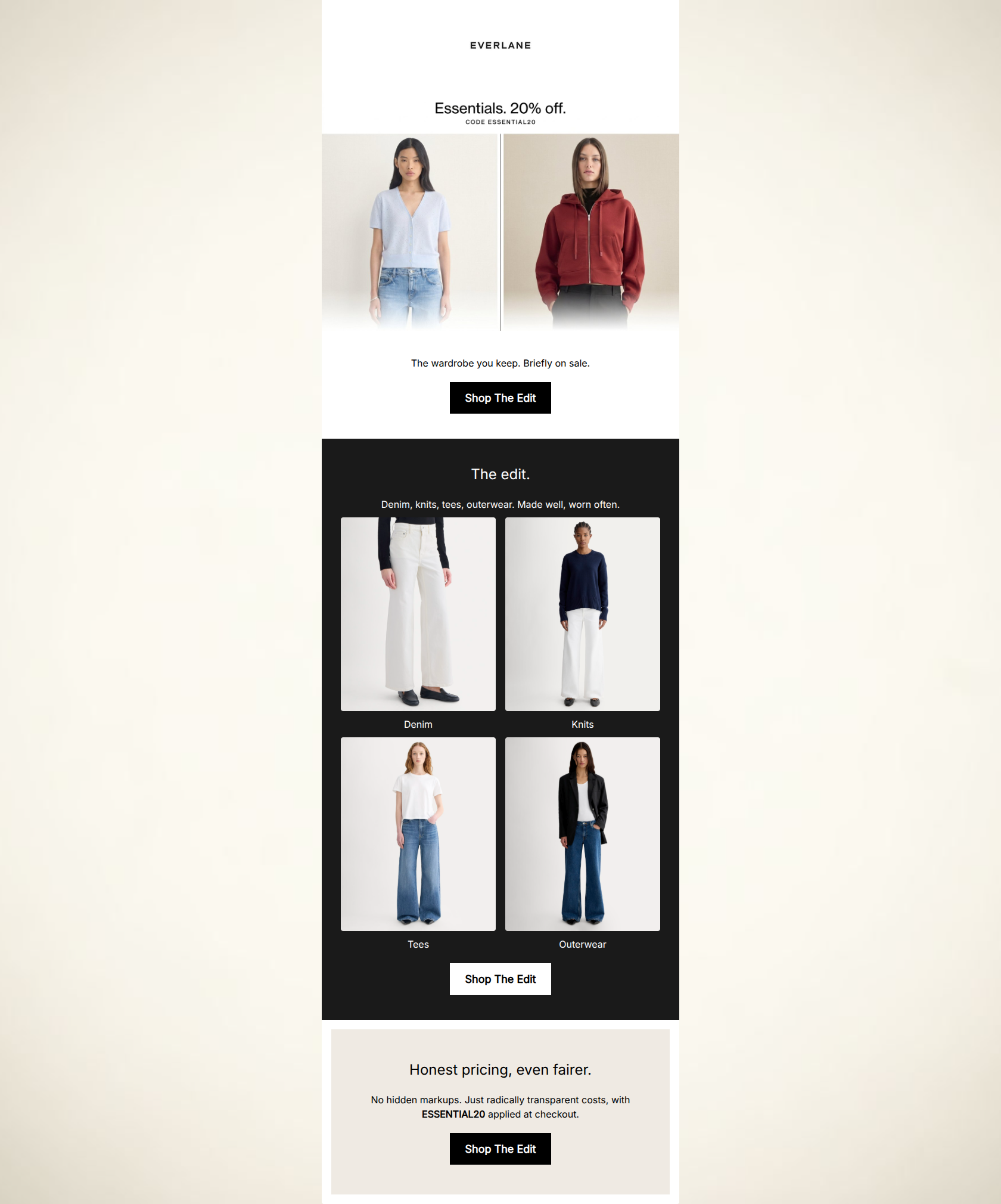
“The essentials, 20% off.”
Design Score
91/100This is an exceptionally strong, brand-aligned email that perfectly executes Everlane's minimalist, 'radical transparency' aesthetic. The conversion path is highly focused, utilizing stark visual contrast and zero-fluff copy to guide the eye directly to the primary call-to-action. The repetition of the primary CTA and destination is flawless, eliminating decision fatigue. The main opportunities for optimization lie in reducing friction around how the promo code is applied and improving the legibility of micro-copy elements.
Create Your Own
Generate professional email designs like this one in seconds with Kopi AI.
Email Details
- Subject Line
- The essentials, 20% off.
- Brand
- Everlane
- Industry
- Fashion & Apparel
- Email Type
- Promotional
- Created
- May 6, 2026
Brand Colors
Email Copy
The wardrobe you keep. Briefly on sale.
→ Shop The Edit
The edit.
Denim, knits, tees, outerwear. Made well, worn often.
Denim
Knits
Tees
Outerwear
→ Shop The Edit
Honest pricing, even fairer.
No hidden markups. Just radically transparent costs, with ESSENTIAL20 applied at checkout.
→ Shop The Edit
Why This Email Works
This is an exceptionally strong, brand-aligned email that perfectly executes Everlane's minimalist, 'radical transparency' aesthetic. The conversion path is highly focused, utilizing stark visual contrast and zero-fluff copy to guide the eye directly to the primary call-to-action. The repetition of the primary CTA and destination is flawless, eliminating decision fatigue. The main opportunities for optimization lie in reducing friction around how the promo code is applied and improving the legibility of micro-copy elements.
Hero Impact
88/100- Immediate delivery of the 20% off value proposition.
- Striking, on-brand editorial imagery that draws the user in.
- Clear, inverted pyramid structure funneling down to the first CTA.
Content Structure & Flow
92/100- Distinct visual sections (white, black, beige) clearly delineate the narrative flow.
- Ends on a strong note by reinforcing the brand's core values rather than just repeating the sale.
Visual Hierarchy & Layout
90/100- Excellent use of high-contrast color blocking to guide the eye.
- Zero-rounded corners on imagery and buttons perfectly match the sharp, modern brand aesthetic.
Call-to-Action Strength
98/100- Complete consistency in CTA copy and destination.
- High-contrast button styling (black on white, white on black) ensures the CTA pops in every section.
- Strategic placement of CTAs immediately following value propositions.
Message Clarity & Tone
95/100- Perfectly captures the brand's understated, authoritative voice.
- Avoids cheap marketing jargon ('Hurry!', 'Act Now!').
Readability & Scannability
85/100- Short, punchy sentences that respect the reader's time.
- Excellent contrast between primary text and background colors.
Offer & Value Proposition
88/100- Connects the discount to the brand's ethical positioning, elevating it above a cheap clearance sale.
- The core offer is established in the first two seconds of opening.
Personalization & Audience Fit
94/100- Visuals and copy align perfectly with the audience's desire for 'quiet luxury' and effortless style.
- Resonates with the audience's pain point regarding fast fashion by emphasizing pieces that are 'worn often'.
Copy Conciseness & Word Economy
98/100- Zero filler content; highly distilled messaging.
- Relying on imagery to do the heavy lifting rather than describing the clothes.
Quick Wins
- Increase the font size and visual weight of the promo code in the header section to ensure it is immediately legible.
- Increase the font size of the category labels ('Denim', 'Knits', 'Tees', 'Outerwear') beneath the 2x2 image grid.
- Tighten the padding between the sub-headline 'The wardrobe you keep...' and the first 'Shop The Edit' button.

Create Professional Email Designs
Generate beautiful, on-brand email designs in seconds. Just enter your brand URL and let AI do the rest.