Apparel & Fashion Promotional Email Template
“The crew everyone keeps reordering”
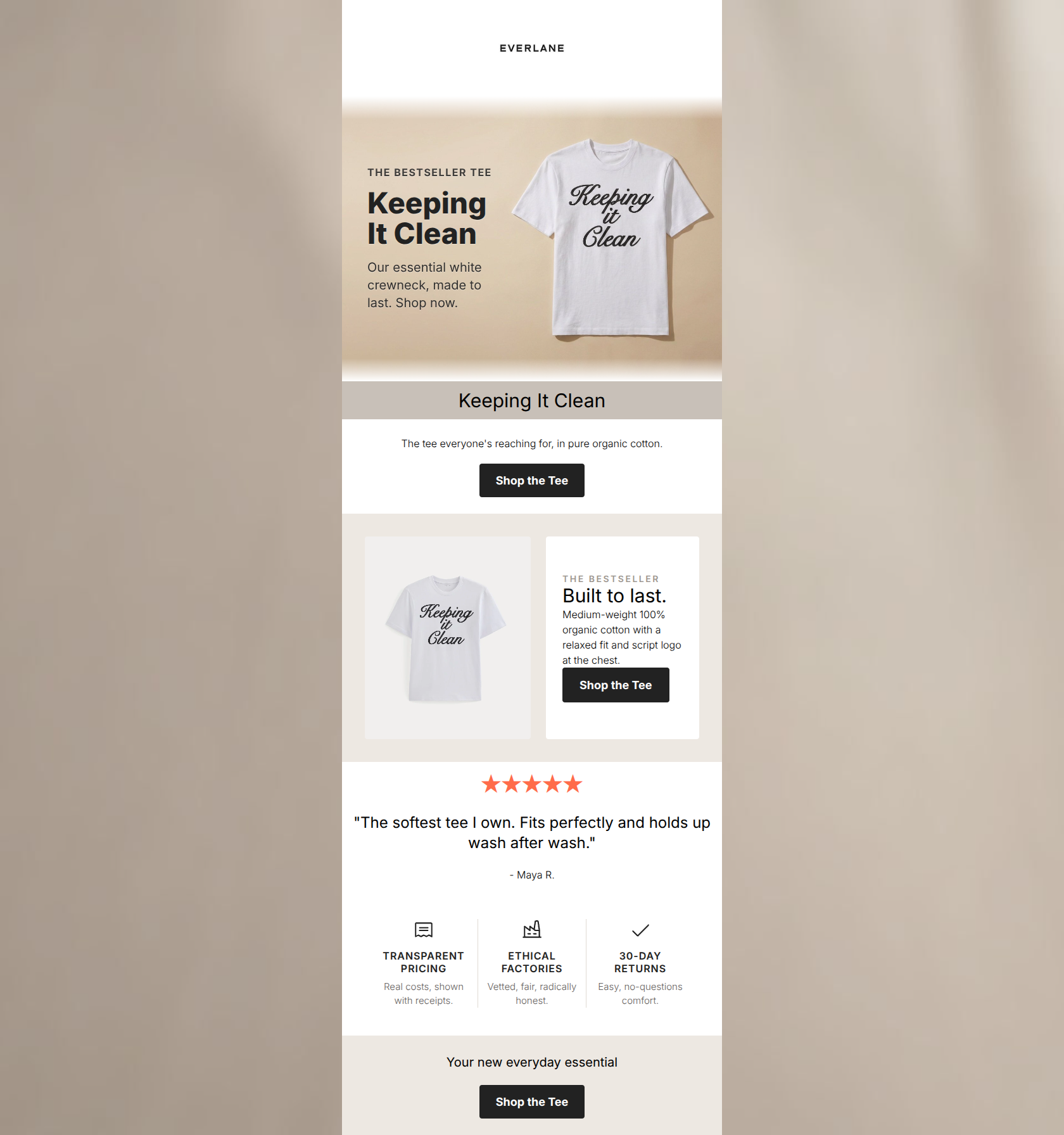
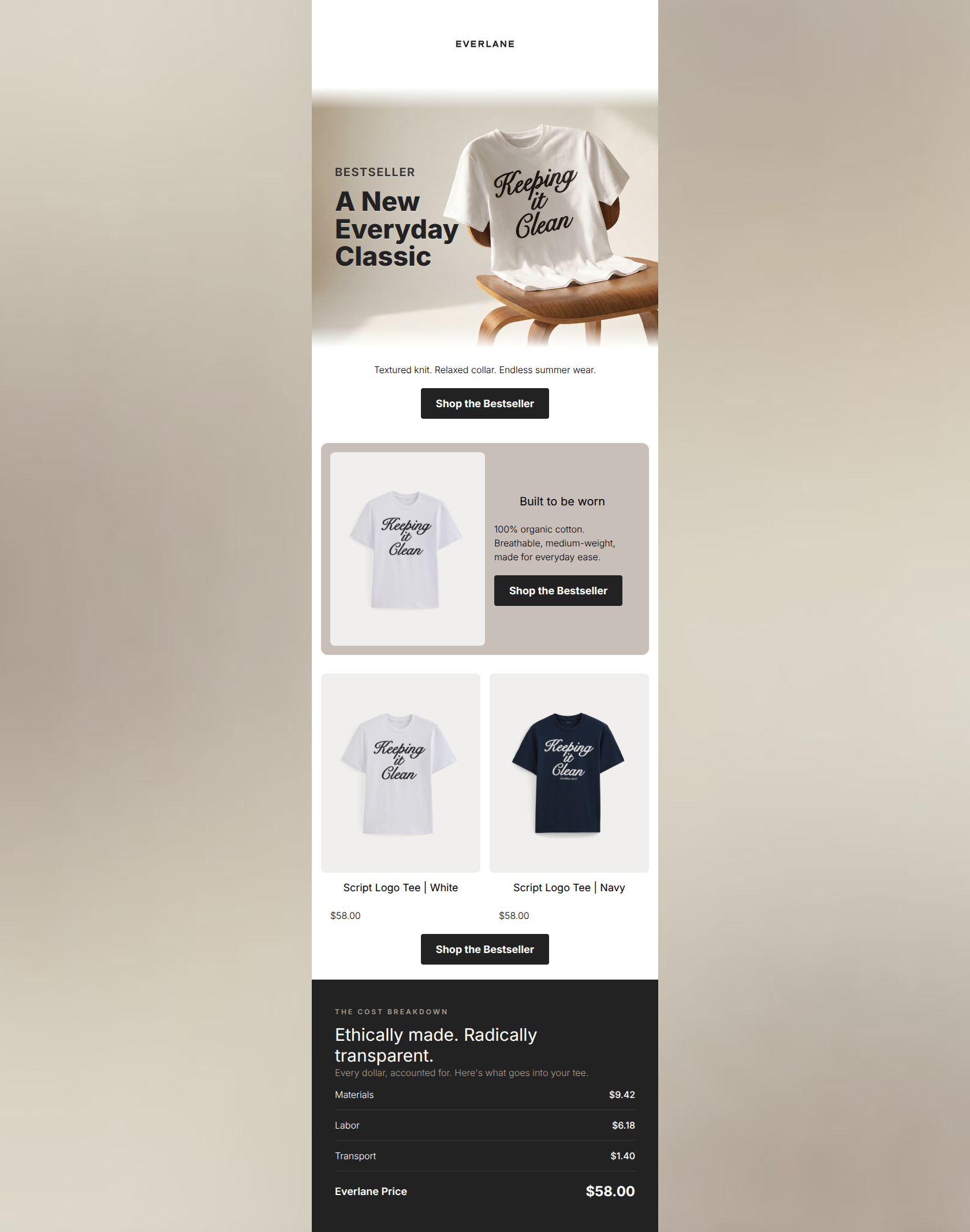
![Apparel & Fashion Promotional email design for Everlane [eval-prod 2026-06-04] — "The crew everyone keeps reordering"](https://file.rendit.io/n/aba18b757363.png)
Design Score
77/100This email effectively leverages Everlane's core differentiator—Radical Transparency—and maintains a strong, on-brand aesthetic. The logical flow from lifestyle imagery to product details, social proof, and finally the value proposition (cost breakdown) builds a compelling case for conversion. However, careless execution in copy repetition and layout (specifically a stacked duplicate CTA at the bottom and poor text contrast in the hero) drags down the overall professionalism and introduces unnecessary friction. Fixing these easily avoidable errors would significantly elevate the campaign's impact.
Create Your Own
Generate professional email designs like this one in seconds with Kopi AI.
Email Details
- Subject Line
- The crew everyone keeps reordering
- Brand
- Everlane [eval-prod 2026-06-04]
- Industry
- Apparel & Fashion
- Email Type
- Promotional
- Created
- July 14, 2026
Brand Colors
Email Copy
Ribbed, soft, and made to layer. The crew everyone keeps reordering.
→ Shop the bestseller
★★★★★
"The fit is perfect and the quality is unreal. I bought it in every color."
- Maya R.
→ Shop the bestseller
Why This Email Works
This email effectively leverages Everlane's core differentiator—Radical Transparency—and maintains a strong, on-brand aesthetic. The logical flow from lifestyle imagery to product details, social proof, and finally the value proposition (cost breakdown) builds a compelling case for conversion. However, careless execution in copy repetition and layout (specifically a stacked duplicate CTA at the bottom and poor text contrast in the hero) drags down the overall professionalism and introduces unnecessary friction. Fixing these easily avoidable errors would significantly elevate the campaign's impact.
Hero (top/initial part) Impact
65/100- Strong lifestyle imagery that fits the brand's effortless aesthetic.
- Clear, benefit-driven headline ('everyday layer').
- Immediate use of social proof with the 'BESTSELLER' kicker.
Content Structure & Flow
75/100- Excellent narrative arc: Hook -> Product -> Proof -> Value.
- The Radical Transparency block serves as a powerful, logical closer.
- Single-column layout keeps the user focused on the downward scroll path.
Visual Hierarchy & Layout
75/100- Effective use of background shading to highlight the product feature card.
- Clean, tabular layout for the complex pricing information.
- Consistent typography sizing that guides the eye logically through the content.
Call-to-Action Strength
75/100- Perfect consistency in CTA destination and intent.
- High-contrast button design (black on white/grey) ensures they stand out.
- Action-oriented, specific button copy.
Message Clarity & Tone
85/100- Nails the brand's authoritative yet accessible voice.
- The 'True Cost' section perfectly articulates the brand's unique value proposition.
- Focuses on tangible product benefits ('Ribbed knit, flattering fit').
Readability & Scannability
80/100- Short, punchy sentences that respect the reader's time.
- Excellent use of a list/tabular format for complex pricing data.
- Clear distinction between headings and body text.
Offer & Value Proposition
90/100- The cost breakdown is a highly effective, brand-specific conversion lever.
- Strong use of social proof (reviews and bestseller tags) to de-risk the purchase.
- Clear juxtaposition of 'True Cost' vs. 'Traditional Retail'.
Personalization & Audience Fit
85/100- Aesthetic and messaging perfectly align with the target audience's values.
- Avoids fast-fashion urgency tactics, relying on quality and ethics to sell.
- The review highlights exactly what this audience wants: fit and quality.
Copy Conciseness & Word Economy
70/100- No filler adjectives or throat-clearing openers.
- The transparency section communicates complex info with absolute minimal text.
- The review is edited down to the most impactful sentence.
Quick Wins
- Delete the redundant `<SECTION>` at the very bottom of the email that creates a stacked, duplicate CTA.
- Rewrite the headline on the product feature card to avoid duplicating the 'Your new everyday layer' hero text.
- Condense the descriptive copy so you aren't saying 'made to layer' in three different places.
Create Professional Email Designs
Generate beautiful, on-brand email designs in seconds. Just enter your brand URL and let AI do the rest.