SaaS & Software Announcement Email Template
“Test Email from Beyond the Brand Media®”
Design Score
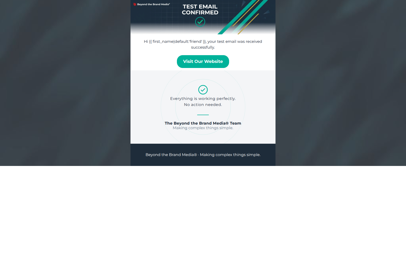
40/100CRITICAL FAILURE: This email fundamentally contradicts itself, capping its score. While the visual aesthetic is clean and aligns well with the brand, the email presents a Call-to-Action button ('Visit Our Website') immediately followed by text explicitly stating, 'No action needed.' If the goal is to drive clicks, actively telling the user not to act is a massive conversion blocker. Furthermore, the hero section acts as a dead-end informational banner rather than providing any incentive or curiosity to drive engagement.
Create Your Own
Generate professional email designs like this one in seconds with Kopi AI.
Email Details
- Subject Line
- Test Email from Beyond the Brand Media®
- Brand
- Beyond the Brand Media®
- Industry
- SaaS & Software
- Email Type
- Announcement
- Created
- April 23, 2026
Brand Colors
Email Copy
Hi friend, your test email was received successfully.
→ Visit Our Website
Beyond the Brand Media® · Making complex things simple.
Why This Email Works
CRITICAL FAILURE: This email fundamentally contradicts itself, capping its score. While the visual aesthetic is clean and aligns well with the brand, the email presents a Call-to-Action button ('Visit Our Website') immediately followed by text explicitly stating, 'No action needed.' If the goal is to drive clicks, actively telling the user not to act is a massive conversion blocker. Furthermore, the hero section acts as a dead-end informational banner rather than providing any incentive or curiosity to drive engagement.
Hero (top/initial part) Impact
35/100- Strong use of brand colors (corporate navy and vibrant teal).
- Clear, unmistakable communication of the email's primary system purpose.
Content Structure & Flow
50/100- Use of the sign-off card creates distinct visual sections.
- Generous whitespace prevents the small amount of copy from feeling cramped.
Visual Hierarchy & Layout
80/100- Excellent contrast between the teal button and the white background.
- Clean, grid-based alignment reflects the agency's modern aesthetic.
Call-to-Action Strength
40/100- Button color (#00B29A) is high-contrast and on-brand.
- Button placement is central and impossible to miss.
Message Clarity & Tone
50/100- Tone is confident and lacks jargon, fitting the brand voice.
- The confirmation message itself is unambiguous.
Readability & Scannability
95/100- Excellent text-to-background contrast ratios.
- Short, punchy sentences.
Offer & Value Proposition
10/100- Delivers the expected utility of a test confirmation.
Personalization & Audience Fit
60/100- Attempts basic personalization with a fallback tag.
Copy Conciseness & Word Economy
85/100- No throat-clearing or filler adjectives.
- Gets straight to the point.
Quick Wins
- Delete the text 'No action needed.' to remove friction against the CTA.
- Change the generic 'Visit Our Website' button copy to something more specific, like 'View Our Work'.
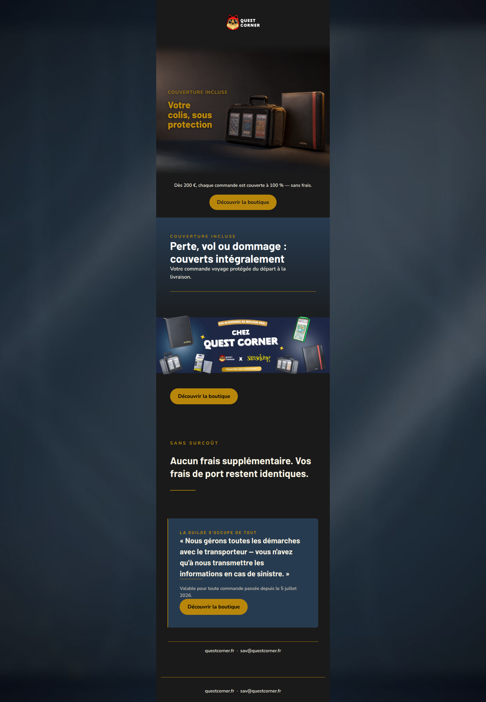
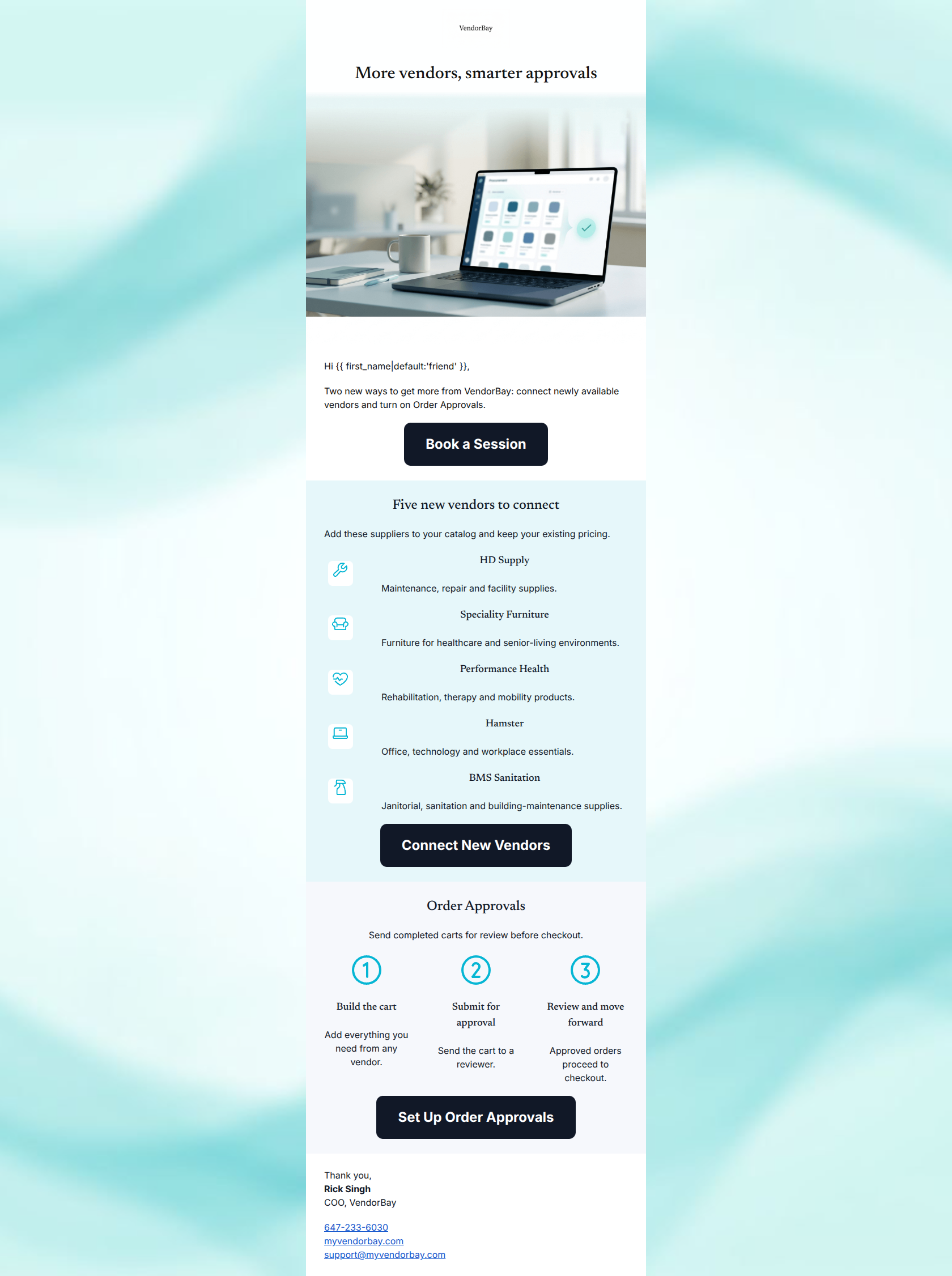
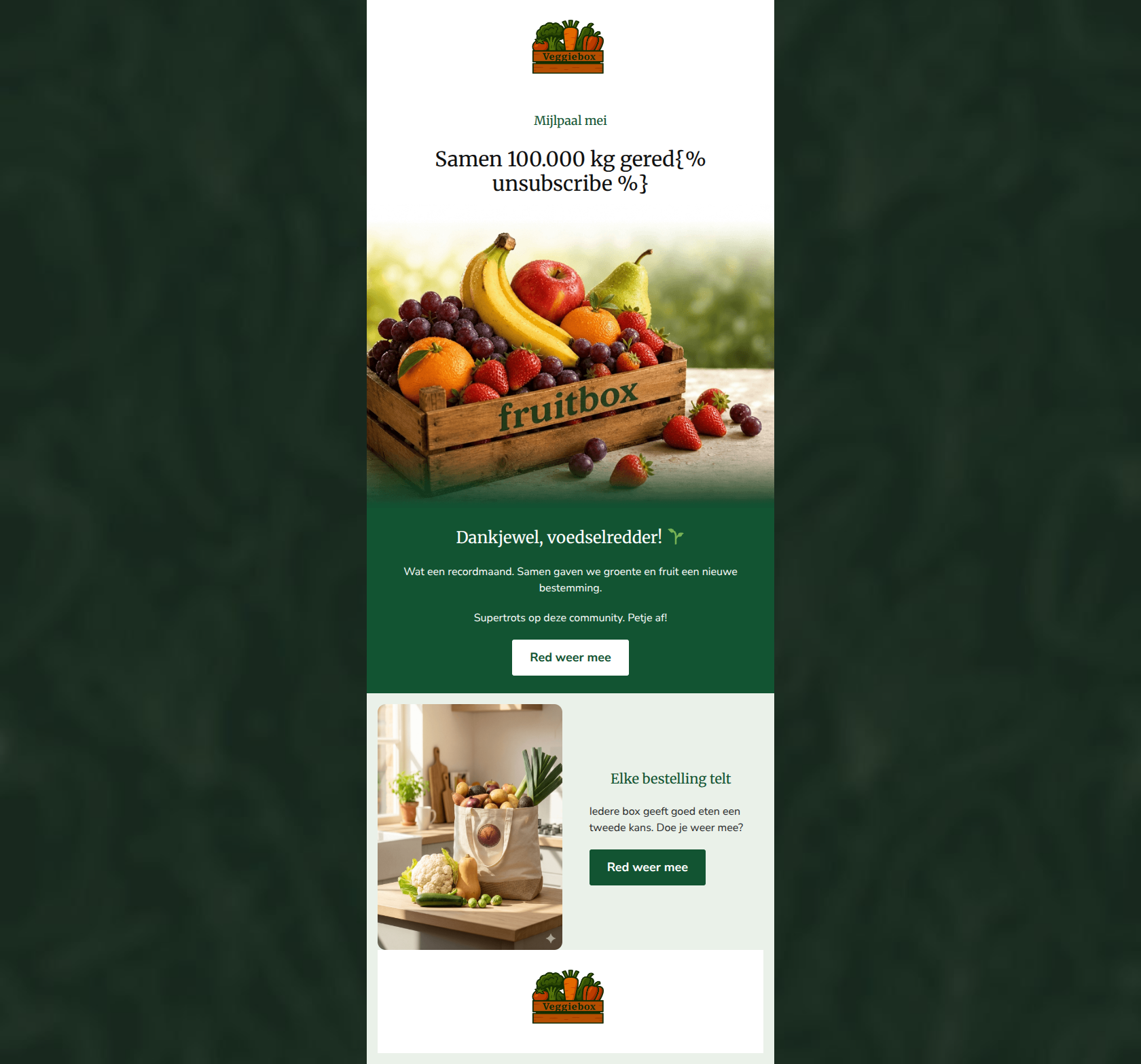
Create Professional Email Designs
Generate beautiful, on-brand email designs in seconds. Just enter your brand URL and let AI do the rest.