Health & Wellness Welcome Email Template
“Te damos la bienvenida al Especialista I.T.A”
Design Score
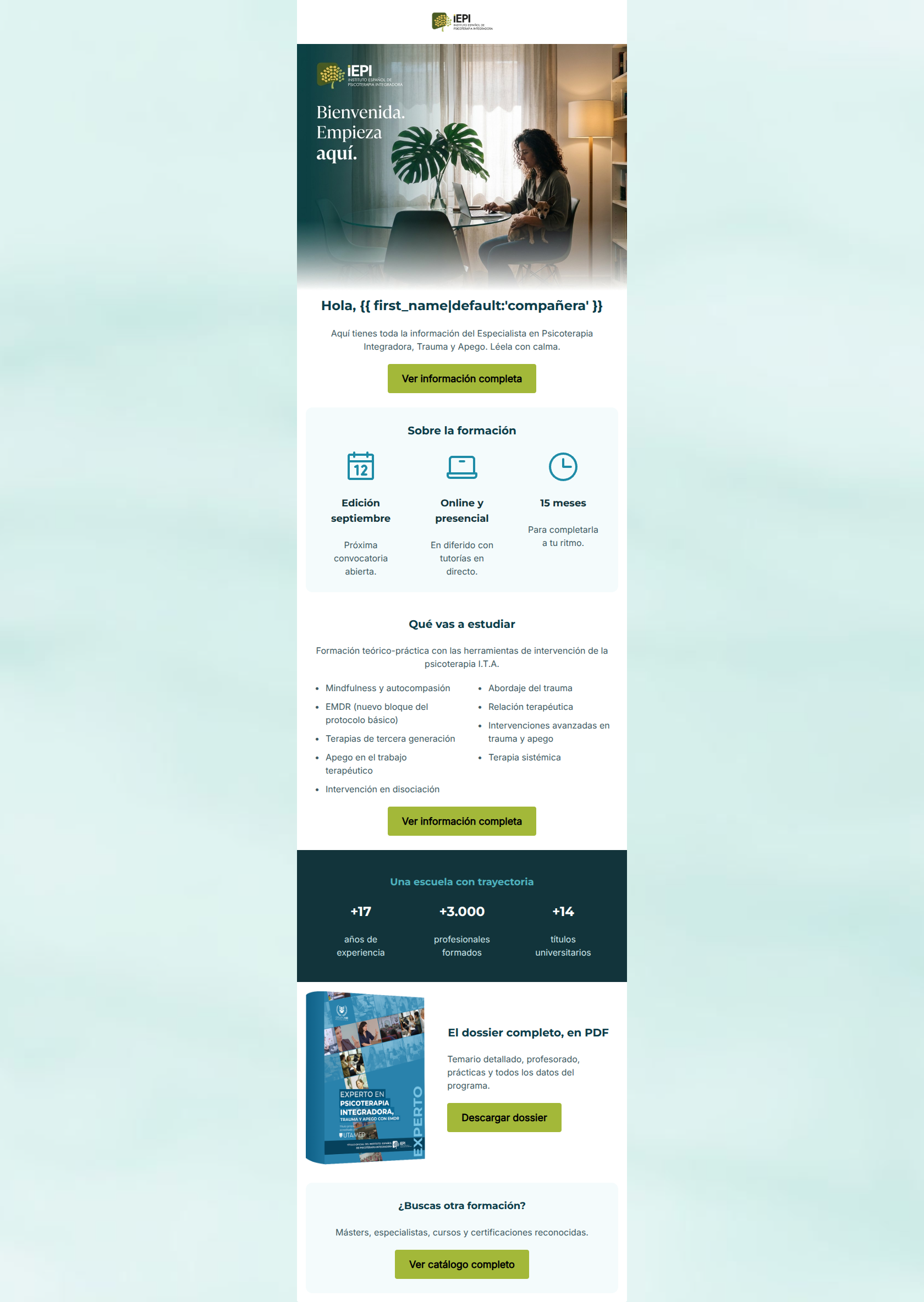
80/100This email is structurally excellent, highly scannable, and communicates the logistical details of the program with impressive word economy. However, it suffers from two significant strategic flaws. First, there is a major visual identity disconnect: the email relies heavily on clinical blues, which directly contradicts the brand's mandate to use earthy greens to evoke growth and healing. Second, the email dilutes its primary conversion goal by presenting three equally weighted, competing calls-to-action at the bottom of the email. Furthermore, the copy leans entirely on features while omitting the brand's unique differentiators, such as the proprietary REN-MEMORA® protocol. By aligning the visual palette, establishing a single primary click path, and injecting more benefit-driven copy, this highly competent email can become a top-tier conversion asset.
Create Your Own
Generate professional email designs like this one in seconds with Kopi AI.
Email Details
- Subject Line
- Te damos la bienvenida al Especialista I.T.A
- Brand
- NB Psicología / Instituto Español de Psicoterapia Integradora (IEPI)
- Industry
- Health & Wellness
- Email Type
- Welcome
- Created
- May 20, 2026
Brand Colors
Email Copy
Hola, compañera
Aquí tienes toda la información del Especialista en Psicoterapia Integradora, Trauma y Apego. Léela con calma.
→ Ver información completa
Sobre la formación
Edición septiembre
Próxima convocatoria abierta.
Online y presencial
En diferido con tutorías en directo.
15 meses
Para completarla a tu ritmo.
Qué vas a estudiar
Formación teórico-práctica con las herramientas de intervención de la psicoterapia I.T.A.
- Mindfulness y autocompasión
- EMDR (nuevo bloque del protocolo básico)
- Terapias de tercera generación
- Apego en el trabajo terapéutico
- Intervención en disociación
- Abordaje del trauma
- Relación terapéutica
- Intervenciones avanzadas en trauma y apego
- Terapia sistémica
→ Ver información completa
Una escuela con trayectoria
+17
años de experiencia
+3.000
profesionales formados
+14
títulos universitarios
El dossier completo, en PDF
Temario detallado, profesorado, prácticas y todos los datos del programa.
→ Descargar dossier
¿Buscas otra formación?
Másters, especialistas, cursos y certificaciones reconocidas.
→ Ver catálogo completo
Why This Email Works
This email is structurally excellent, highly scannable, and communicates the logistical details of the program with impressive word economy. However, it suffers from two significant strategic flaws. First, there is a major visual identity disconnect: the email relies heavily on clinical blues, which directly contradicts the brand's mandate to use earthy greens to evoke growth and healing. Second, the email dilutes its primary conversion goal by presenting three equally weighted, competing calls-to-action at the bottom of the email. Furthermore, the copy leans entirely on features while omitting the brand's unique differentiators, such as the proprietary REN-MEMORA® protocol. By aligning the visual palette, establishing a single primary click path, and injecting more benefit-driven copy, this highly competent email can become a top-tier conversion asset.
Hero (top/initial part) Impact
72/100- Personalization tag is front and center.
- The hero image feels warm and human-centric, aligning with the brand's approachable tone.
Content Structure & Flow
85/100- The sequence naturally answers a prospective student's questions in the exact order they are likely to ask them.
- The dark statistics band provides an excellent visual transition.
Visual Hierarchy & Layout
75/100- Excellent use of a dark background block for the statistics section to create a natural visual break.
- The three-column icon layout is easily digestible and well-proportioned.
Call-to-Action Strength
65/100- The primary button color provides excellent contrast against the background.
- The primary action is clearly labeled and repeated twice.
Message Clarity & Tone
85/100- Uses precise clinical terminology (disociación, apego) that proves the brand speaks the audience's language.
- The welcoming tone lowers the barrier to entry without sacrificing academic credibility.
Readability & Scannability
92/100- Bulleted lists efficiently organize the complex curriculum.
- Icons immediately communicate the format, duration, and start date without requiring the user to read paragraphs.
- Excellent use of negative space around text blocks.
Offer & Value Proposition
65/100- Practical details are immediately clear.
- Authoritative statistics build instant trust and institutional credibility.
Personalization & Audience Fit
85/100- The subject matter and terminology are highly relevant to the target audience.
- The imagery reflects a modern professional environment.
Copy Conciseness & Word Economy
95/100- No 'wall of text' to intimidate the reader.
- Descriptions are punchy, direct, and respect the reader's time.
Quick Wins
- Update the email's background and text colors to the brand's approved earthy greens and off-whites, eliminating the off-brand clinical blues.
- Demote the 'Descargar dossier' and 'Ver catálogo completo' buttons to simple text links to ensure the primary 'Ver información completa' CTA stands out as the single main action.
- Replace the generic 'Bienvenida. Empieza aquí.' image text with a benefit-driven headline.
Create Professional Email Designs
Generate beautiful, on-brand email designs in seconds. Just enter your brand URL and let AI do the rest.