Fashion & Apparel Promotional Email Template
“Sæsonens tre looks er landet”
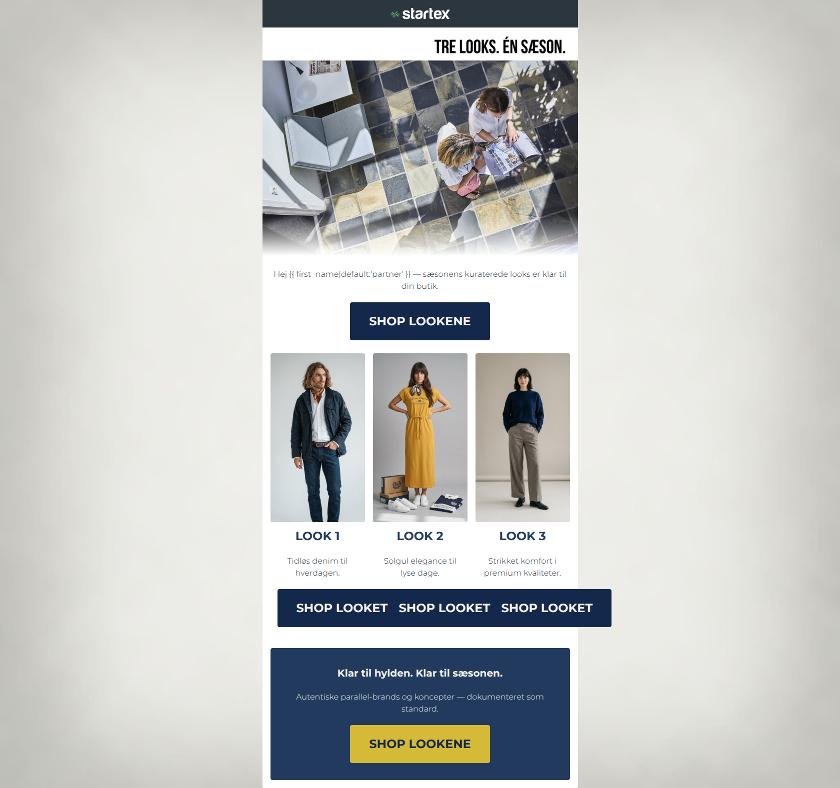
Design Score
83/100This is a strong, highly professional B2B email that clearly understands its target audience. The tone is authoritative, the copy is refreshingly concise, and the final banner effectively reinforces Startex's core value propositions (authenticity and shelf-readiness). However, the email leaves some conversion potential on the table due to a disconnected hero image and a missed opportunity to use the brand's vibrant mustard color to establish a stronger visual hierarchy for the primary calls-to-action early in the email.
Create Your Own
Generate professional email designs like this one in seconds with Kopi AI.
Email Details
- Subject Line
- Sæsonens tre looks er landet
- Brand
- Startex ApS
- Industry
- Fashion & Apparel
- Email Type
- Promotional
- Created
- May 11, 2026
Brand Colors
Email Copy
Hej partner — sæsonens kuraterede looks er klar til din butik.
→ SHOP LOOKENE
LOOK 1
Tidløs denim til hverdagen.
→ SHOP LOOKET
LOOK 2
Solgul elegance til lyse dage.
→ SHOP LOOKET
LOOK 3
Strikket komfort i premium kvaliteter.
→ SHOP LOOKET
Klar til hylden. Klar til sæsonen.
Autentiske parallel-brands og koncepter — dokumenteret som standard.
→ SHOP LOOKENE
Why This Email Works
This is a strong, highly professional B2B email that clearly understands its target audience. The tone is authoritative, the copy is refreshingly concise, and the final banner effectively reinforces Startex's core value propositions (authenticity and shelf-readiness). However, the email leaves some conversion potential on the table due to a disconnected hero image and a missed opportunity to use the brand's vibrant mustard color to establish a stronger visual hierarchy for the primary calls-to-action early in the email.
Hero Impact
70/100- Directly addresses the B2B buyer ('klar til din butik' / ready for your store).
- No throat-clearing; gets straight to the point of the email.
Content Structure & Flow
88/100- Logical progression from introduction to specific products to brand value proposition.
- The dark footer block acts as an excellent visual anchor to stop the scroll and catch the final CTA.
Visual Hierarchy & Layout
78/100- Excellent use of negative space around the product columns.
- The inverted color scheme in the final banner creates a clear separation of content.
Call-to-Action Strength
85/100- Flawless adherence to the single primary goal.
- The final CTA in mustard on a navy background is a textbook example of high-converting contrast.
Message Clarity & Tone
86/100- Strong B2B framing ('Klar til hylden. Klar til sæsonen.').
- Explicitly states the trust factor ('dokumenteret som standard'), which directly addresses a major pain point for this audience.
Readability & Scannability
90/100- Bite-sized copy.
- Clear, bold headings for each 'Look'.
Offer & Value Proposition
82/100- Strong alignment with the target audience's need for ready-to-sell, authentic inventory.
Personalization & Audience Fit
85/100- Appropriate B2B fallback tag.
- Language is tailored to business outcomes.
Copy Conciseness & Word Economy
95/100- No filler adjectives or throat-clearing introductions.
- Distilled, punchy messaging.
Quick Wins
- Change the Hero CTA background color to the brand mustard (#D4BA36) with dark text to make it pop.
- Make the three product images in the middle section clickable, routing them to the same /concepts/ URL.


Create Professional Email Designs
Generate beautiful, on-brand email designs in seconds. Just enter your brand URL and let AI do the rest.