Apparel & Accessories Promotional Email Template
“Rebels, are you ready?”
Design Score
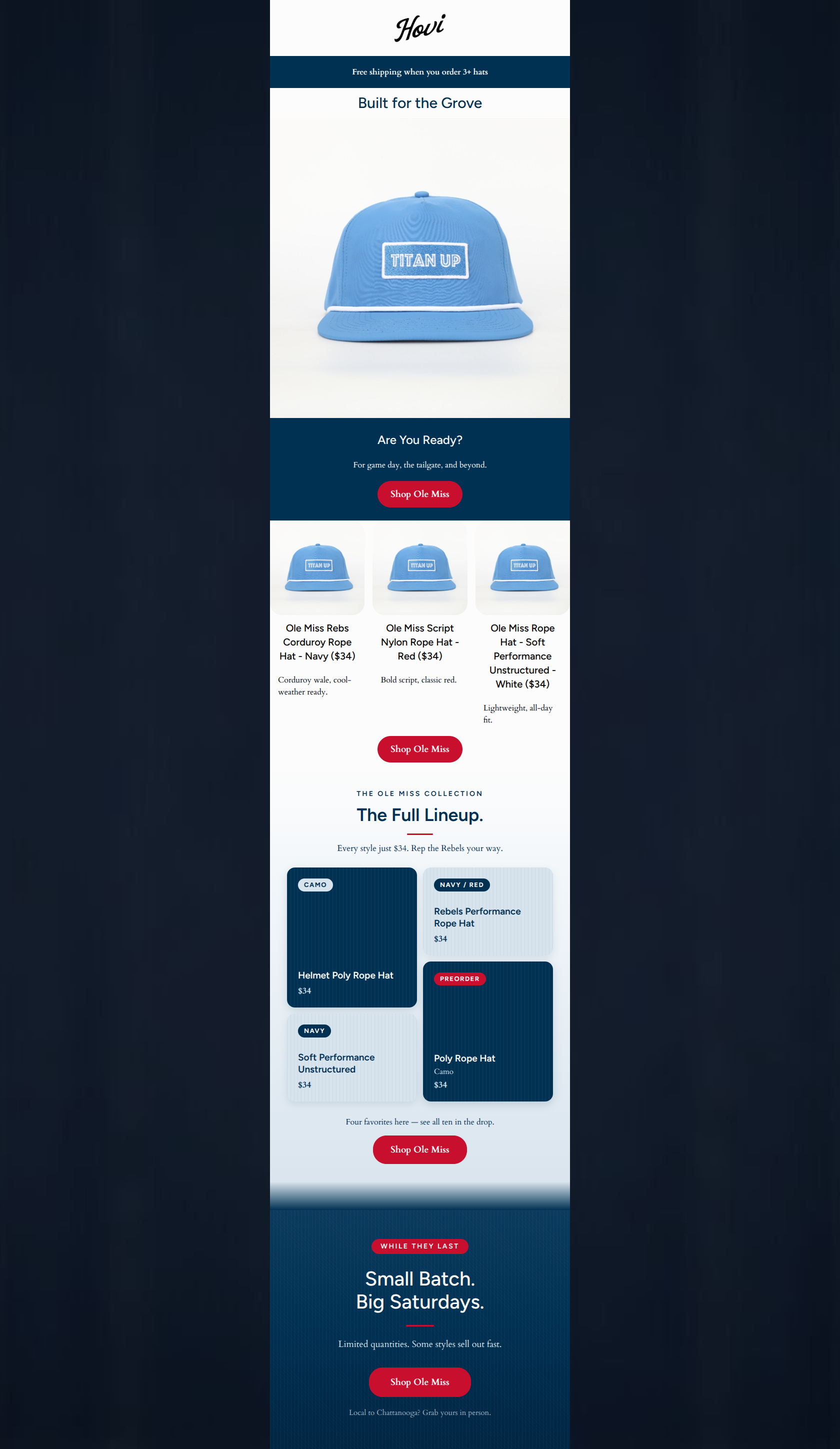
58/100This email features excellent, punchy copywriting that perfectly captures the brand's 'collegiate weekend' psychographics, and it executes its CTA strategy flawlessly. However, it suffers from severe visual execution errors. The most glaring issue is a massive disconnect between the highly targeted Ole Miss copy ('Built for the Grove') and the imagery, which repeatedly displays a Tennessee Titans ('TITAN UP') hat. Furthermore, the 3-column product grid uses the exact same image for three vastly different products (corduroy, red nylon, white performance), and the custom masonry grid relies entirely on text cards without any product photography. For an apparel brand, failing to accurately show the product creates immense cognitive friction and will crater conversion rates.
Create Your Own
Generate professional email designs like this one in seconds with Kopi AI.
Email Details
- Subject Line
- Rebels, are you ready?
- Brand
- Hovi Dry Goods
- Industry
- Apparel & Accessories
- Email Type
- Promotional
- Created
- July 14, 2026
Brand Colors
Email Copy
Free shipping when you order 3+ hats
Built for the Grove
Are You Ready?
For game day, the tailgate, and beyond.
→ Shop Ole Miss
Ole Miss Rebs Corduroy Rope Hat - Navy ($34)
Corduroy wale, cool-weather ready.
Ole Miss Script Nylon Rope Hat - Red ($34)
Bold script, classic red.
Ole Miss Rope Hat - Soft Performance Unstructured - White ($34)
Lightweight, all-day fit.
→ Shop Ole Miss
Why This Email Works
This email features excellent, punchy copywriting that perfectly captures the brand's 'collegiate weekend' psychographics, and it executes its CTA strategy flawlessly. However, it suffers from severe visual execution errors. The most glaring issue is a massive disconnect between the highly targeted Ole Miss copy ('Built for the Grove') and the imagery, which repeatedly displays a Tennessee Titans ('TITAN UP') hat. Furthermore, the 3-column product grid uses the exact same image for three vastly different products (corduroy, red nylon, white performance), and the custom masonry grid relies entirely on text cards without any product photography. For an apparel brand, failing to accurately show the product creates immense cognitive friction and will crater conversion rates.
Hero (top/initial part) Impact
40/100- The promo banner clearly communicates the 'Free shipping on 3+ hats' offer right away.
- The headline 'Built for the Grove' is an excellent, insider nod to the target audience.
Content Structure & Flow
50/100- The narrative arc builds nicely toward a strong urgency play at the bottom.
- The distinct scarcity section effectively signals a change in tone to drive immediate action.
Visual Hierarchy & Layout
45/100- The masonry grid layout itself provides a nice visual break from standard symmetrical rows.
- Good use of subtle textures/gradients in the custom HTML blocks to elevate the premium feel.
Call-to-Action Strength
90/100- Flawless consistency: every button uses the exact same, clear 'Shop Ole Miss' copy.
- High contrast: the red buttons pop aggressively against both the navy and white backgrounds.
Message Clarity & Tone
40/100- The brand voice is confident, premium, and speaks directly to the sports fan's psychographics without feeling corporate.
- The 'Local to Chattanooga?' note is a great touch of brand authenticity.
Readability & Scannability
75/100- Excellent use of varied heading sizes to establish a clear hierarchy.
- Sufficient line height and padding around text blocks prevent crowding.
Offer & Value Proposition
65/100- The free shipping threshold incentivizes larger basket sizes right from the top.
- The scarcity framing ('While They Last', 'Small Batch') adds genuine urgency without feeling cheap.
Personalization & Audience Fit
65/100- Deeply understands the target audience's desire for elevated, non-mass-market gear.
- Uses insider language that resonates emotionally with the specific fanbase.
Copy Conciseness & Word Economy
90/100- Reads like distilled, confident brand messaging.
- Uses short, punchy fragments effectively to maintain momentum.
Quick Wins
- Fix the glaring visual mismatch: replace the 'TITAN UP' placeholder images with the actual Ole Miss products being described.
- Move the first 'Shop Ole Miss' CTA up to sit immediately under the hero image.
- Shorten the product titles in the 3-column grid for faster scannability.
Create Professional Email Designs
Generate beautiful, on-brand email designs in seconds. Just enter your brand URL and let AI do the rest.