Fitness Promotional Email Template
“66 days to change your life.”
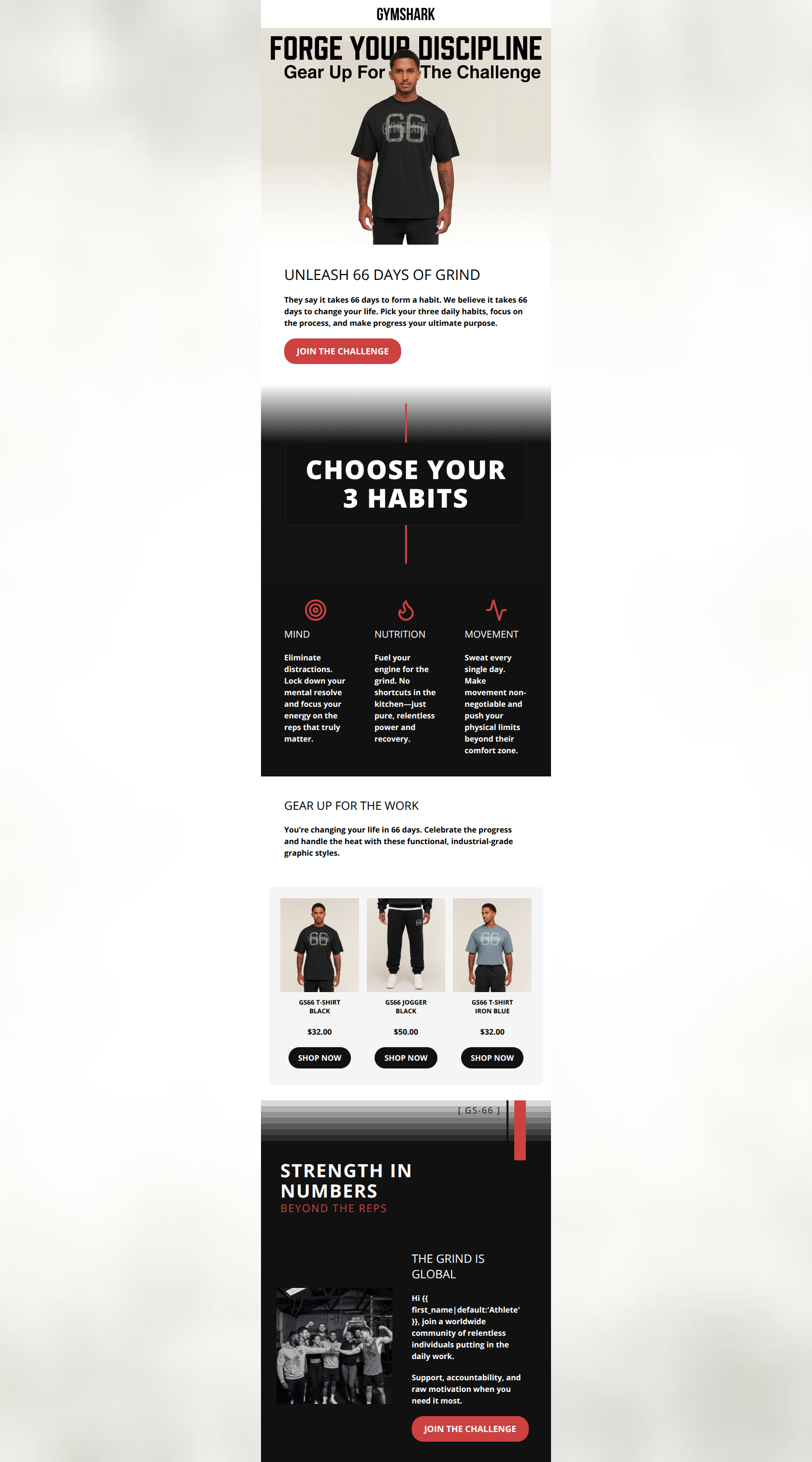
Design Score
81/100This email successfully captures Gymshark's utilitarian, motivational tone and clearly introduces the 'Gymshark 66' challenge. The inverted pyramid structure effectively sells the concept before introducing the product. However, the email is held back by a visually underwhelming hero image, jarring transitions between light and dark sections, and secondary CTAs that lack the punch of the primary copy. It's a solid B-tier execution that needs visual cohesion to reach the top tier.
Create Your Own
Generate professional email designs like this one in seconds with Kopi AI.
Email Details
- Subject Line
- 66 days to change your life.
- Brand
- Gymshark
- Industry
- Fitness
- Email Type
- Promotional
- Created
- March 24, 2026
Brand Colors
Email Copy
UNLEASH 66 DAYS OF GRIND
They say it takes 66 days to form a habit. We believe it takes 66 days to change your life. Pick your three daily habits, focus on the process, and make progress your ultimate purpose.
→ JOIN THE CHALLENGE
MIND
Eliminate distractions. Lock down your mental resolve and focus your energy on the reps that truly matter.
NUTRITION
Fuel your engine for the grind. No shortcuts in the kitchen—just pure, relentless power and recovery.
MOVEMENT
Sweat every single day. Make movement non-negotiable and push your physical limits beyond their comfort zone.
GEAR UP FOR THE WORK
You’re changing your life in 66 days. Celebrate the progress and handle the heat with these functional, industrial-grade graphic styles.
GS66 T-SHIRT BLACK
$32.00
→ SHOP NOW
GS66 JOGGER BLACK
$50.00
→ SHOP NOW
GS66 T-SHIRT IRON BLUE
$32.00
→ SHOP NOW
THE GRIND IS GLOBAL
Hi Athlete, join a worldwide community of relentless individuals putting in the daily work.
Support, accountability, and raw motivation when you need it most.
→ JOIN THE CHALLENGE
Why This Email Works
This email successfully captures Gymshark's utilitarian, motivational tone and clearly introduces the 'Gymshark 66' challenge. The inverted pyramid structure effectively sells the concept before introducing the product. However, the email is held back by a visually underwhelming hero image, jarring transitions between light and dark sections, and secondary CTAs that lack the punch of the primary copy. It's a solid B-tier execution that needs visual cohesion to reach the top tier.
Hero (top/initial part) Impact
72/100- The H1 'UNLEASH 66 DAYS OF GRIND' immediately sets the tone and expectations.
- The primary 'JOIN THE CHALLENGE' CTA is visible above the fold on most devices.
- The introductory paragraph clearly and succinctly explains the premise of the campaign.
Content Structure & Flow
86/100- Excellent use of the inverted pyramid, prioritizing the core campaign message over immediate product pushing.
- The 'CHOOSE YOUR 3 HABITS' section acts as a strong, digestible middle anchor.
- The narrative arc logically concludes with the community aspect, reinforcing the 'join us' primary CTA.
Visual Hierarchy & Layout
78/100- Headings use a distinct scale that clearly guides the eye down the page.
- The dark backgrounds effectively highlight the bright red primary brand color.
- The three-column layout for the habits provides quick, scannable chunks of information.
Call-to-Action Strength
84/100- Primary CTAs use a high-contrast red (#cd4141) that pops beautifully against both light and dark backgrounds.
- The primary CTA copy ('JOIN THE CHALLENGE') is direct and aligns perfectly with the campaign goal.
- Secondary black CTAs on the product block correctly signal a lower priority action compared to the primary red buttons.
Message Clarity & Tone
94/100- Nails the 'Industrial Athlete' tone without sounding overly cliché.
- The '3 Habits' descriptions are tight, actionable, and focus on outcomes (focus, power, pushing limits).
- Consistent use of active verbs drives the momentum of the read.
Readability & Scannability
85/100- Excellent contrast between text and background colors throughout (#000000 on white, #FFFFFF on black).
- Short, punchy sentences reduce cognitive load.
- Distinct visual sections make it easy to skim to the parts the user cares about.
Offer & Value Proposition
76/100- The intangible offer (self-improvement, community) is articulated powerfully.
- Pricing is clearly visible on the product blocks, reducing friction for interested buyers.
Personalization & Audience Fit
82/100- Spot-on understanding of the target audience's desire for discipline and hardcore aesthetics.
- The imagery used in the community section reflects the diverse but dedicated customer base.
- Smart use of 'Athlete' as a fallback term for the personalization token.
Quick Wins
- Change the secondary 'SHOP NOW' buttons to 'SHOP GS66' to maintain campaign consistency.
- Move the personalization token ({{ first_name }}) from the final section to the opening paragraph to immediately hook the reader.
- Fix the awkward casing in the hero image overlay (change 'Gear Up For The Challenge' to all caps or sentence case to match brand standards).
Create Professional Email Designs
Generate beautiful, on-brand email designs in seconds. Just enter your brand URL and let AI do the rest.