Fashion & Apparel Product Launch Email Template
“VIPs: Your early access starts now”
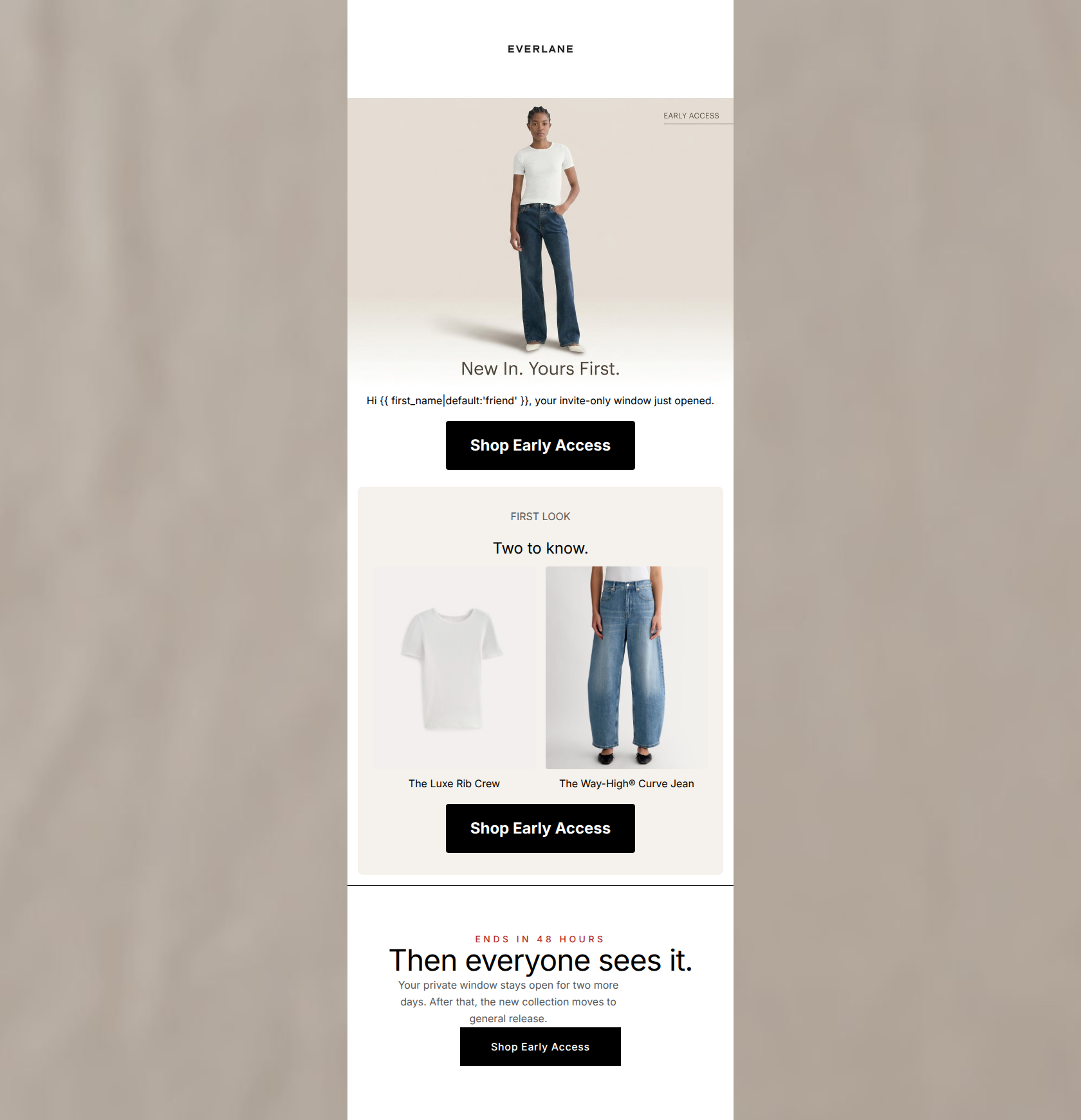
Design Score
91/100This is an exceptionally well-executed early access campaign. It leverages Everlane's minimalist aesthetic to create a sense of quiet luxury and VIP exclusivity. The inverted pyramid structure is textbook: it establishes the offer, provides a tangible tease of the products, and concludes with a strong, definitive urgency driver. The relentless focus on a single, repeated CTA ('Shop Early Access') ensures there is zero cognitive friction for the user. Minor improvements can be made in product storytelling within the 'First Look' section, but structurally, this is a top-tier conversion asset.
Create Your Own
Generate professional email designs like this one in seconds with Kopi AI.
Email Details
- Subject Line
- VIPs: Your early access starts now
- Brand
- Everlane [eval-prod 2026-05-22]
- Industry
- Fashion & Apparel
- Email Type
- Product Launch
- Created
- May 22, 2026
Brand Colors
Email Copy
Hi friend, your invite-only window just opened.
→ Shop Early Access
FIRST LOOK
Two to know.
The Luxe Rib Crew
The Way-High® Curve Jean
→ Shop Early Access
Why This Email Works
This is an exceptionally well-executed early access campaign. It leverages Everlane's minimalist aesthetic to create a sense of quiet luxury and VIP exclusivity. The inverted pyramid structure is textbook: it establishes the offer, provides a tangible tease of the products, and concludes with a strong, definitive urgency driver. The relentless focus on a single, repeated CTA ('Shop Early Access') ensures there is zero cognitive friction for the user. Minor improvements can be made in product storytelling within the 'First Look' section, but structurally, this is a top-tier conversion asset.
Hero (top/initial part) Impact
88/100- Personalization tag ({{ first_name }}) enhances the 'invite-only' narrative.
- Image copy clearly establishes the core value proposition (exclusivity) without requiring the user to read the body text.
- High-contrast CTA button is immediately visible upon opening.
Content Structure & Flow
92/100- Logical progression from announcement -> teaser -> urgency.
- Effective use of background color blocking (#FFFFFF to #F5F1EC to #FFFFFF) to create clear, digestible sections.
Visual Hierarchy & Layout
85/100- Excellent use of negative space to drive focus toward the products and CTAs.
- Clean, balanced two-column layout for the product teasers.
Call-to-Action Strength
98/100- Repetition of the exact same CTA copy ('Shop Early Access') builds strong intent and reduces decision fatigue.
- Solid black buttons provide maximum contrast against the white and light beige backgrounds, easily passing the squint test.
- All buttons drive to the exact same URL destination.
Message Clarity & Tone
90/100- Urgency is communicated calmly but firmly ('Then everyone sees it', 'ENDS IN 48 HOURS').
- The language feels exclusive but not arrogant, matching the brand's 'radical transparency' ethos.
Readability & Scannability
92/100- Minimal reliance on dense paragraphs; communicates almost entirely through headlines and images.
- Clear typographical hierarchy distinguishes headers from supporting copy.
Offer & Value Proposition
85/100- Uses time-bound exclusivity effectively as the primary conversion driver.
- Protects brand equity by avoiding promotional discounting for new arrivals.
Personalization & Audience Fit
88/100- Design and copy perfectly match the brand's known psychographic profile (value clean design, no hyperbole).
- The personalized greeting reinforces the 'invite-only' framing.
Copy Conciseness & Word Economy
95/100- Eliminates unnecessary throat-clearing openers.
- The urgency module copy ('Your private window stays open for two more days...') is tight, factual, and highly effective.
Quick Wins
- Add a brief material or fit descriptor (e.g., '100% Organic Cotton') directly beneath the product names in the 'First Look' section to increase product desire.
- Increase the font size of the product names slightly to improve legibility and visual hierarchy within the product block.

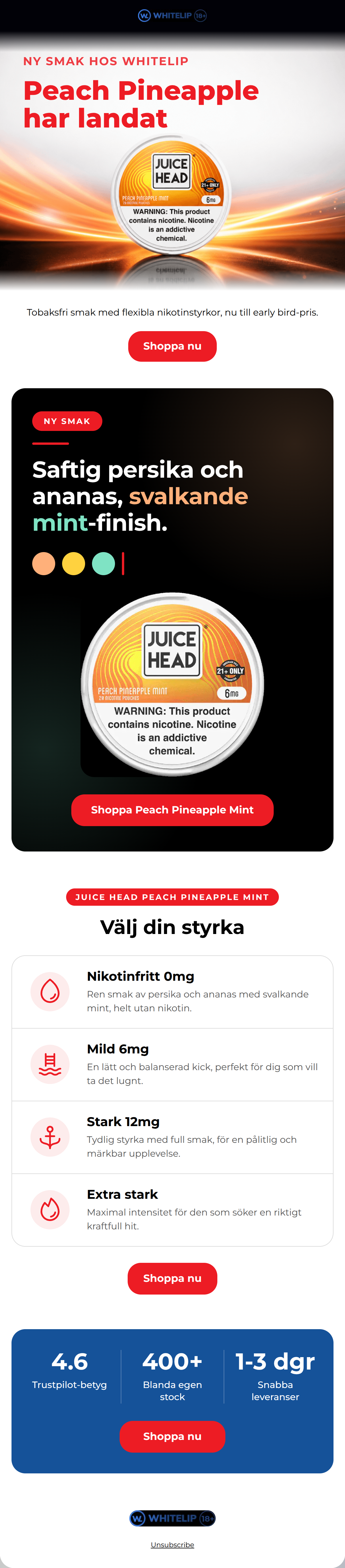


Create Professional Email Designs
Generate beautiful, on-brand email designs in seconds. Just enter your brand URL and let AI do the rest.