Fashion & Apparel Product Launch Email Template
“Pink just landed.”
Design Score
89/100This is a highly effective, top-tier product launch email that executes the fundamentals of conversion optimization brilliantly. It follows a perfect inverted pyramid structure: introducing the visual concept, offering specific product choices, and closing with a strong 'Reason to Believe' grounded in material benefits. The word economy is exceptionally tight, and the visual hierarchy effortlessly guides the eye down the page. The minor friction points stem from a slight 'double-headline' effect in the hero and an opportunity to push the functional value proposition slightly higher in the visual hierarchy.
Create Your Own
Generate professional email designs like this one in seconds with Kopi AI.
Email Details
- Subject Line
- Pink just landed.
- Brand
- Kopi Agent Eval [2026-05-22]
- Industry
- Fashion & Apparel
- Email Type
- Product Launch
- Created
- May 29, 2026
Brand Colors
Email Copy
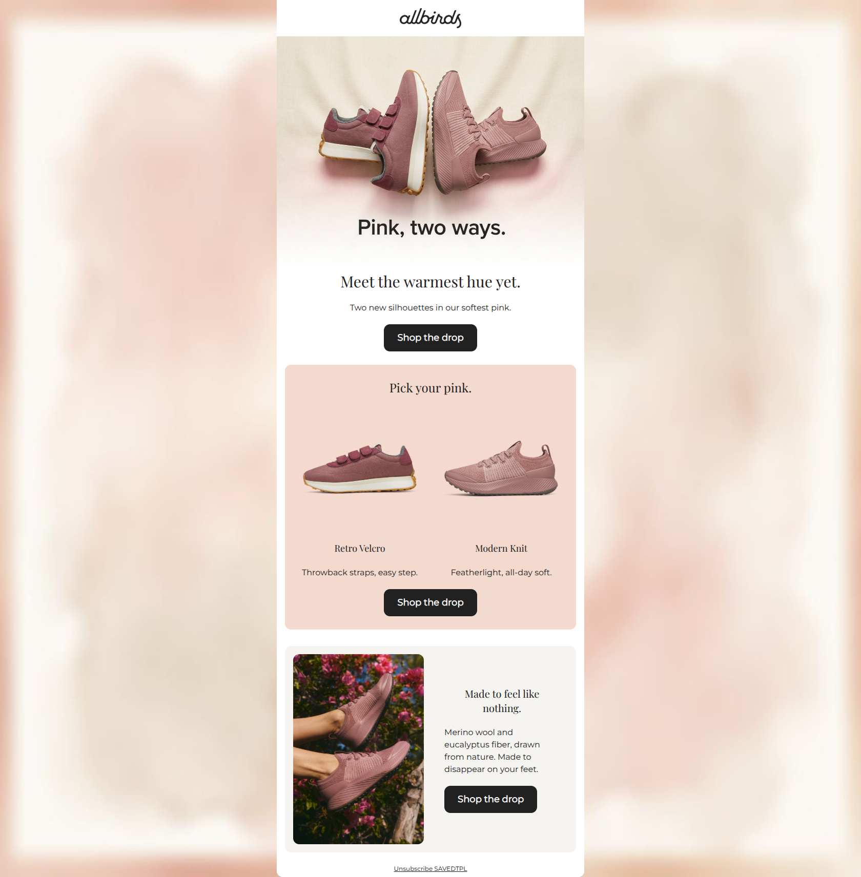
Meet the warmest hue yet.
Two new silhouettes in our softest pink.
→ Shop the drop
Pick your pink.
Retro Velcro
Throwback straps, easy step.
Modern Knit
Featherlight, all-day soft.
→ Shop the drop
Made to feel like nothing.
Merino wool and eucalyptus fiber, drawn from nature. Made to disappear on your feet.
→ Shop the drop
Unsubscribe SAVEDTPL
Why This Email Works
This is a highly effective, top-tier product launch email that executes the fundamentals of conversion optimization brilliantly. It follows a perfect inverted pyramid structure: introducing the visual concept, offering specific product choices, and closing with a strong 'Reason to Believe' grounded in material benefits. The word economy is exceptionally tight, and the visual hierarchy effortlessly guides the eye down the page. The minor friction points stem from a slight 'double-headline' effect in the hero and an opportunity to push the functional value proposition slightly higher in the visual hierarchy.
Hero (top/initial part) Impact
85/100- Immediate visual communication of the product and the core theme (the color pink).
- High-quality imagery that anchors the email's aesthetic.
- Immediate placement of the primary CTA above the fold.
Content Structure & Flow
92/100- Textbook execution of the inverted pyramid.
- Clear delineation between the 'awareness', 'consideration', and 'justification' phases of the message.
- No unnecessary detours or distracting secondary content blocks.
Visual Hierarchy & Layout
88/100- Excellent use of negative space to make the products pop.
- Intentional use of background blocking to guide the scroll pattern.
- Clear, uncrowded placement of the CTA buttons.
Call-to-Action Strength
98/100- Perfect repetition of the primary action.
- Consistent destination URLs for all primary buttons.
- High-contrast button design that stands out against all background colors.
Message Clarity & Tone
88/100- Benefit-driven copy ('easy step', 'all-day soft').
- Consistent, casual brand voice.
- Zero technical jargon when discussing materials.
Readability & Scannability
90/100- Bite-sized copy blocks.
- Strong typographic hierarchy distinguishing headings from body text.
- High-contrast text on all background colors.
Offer & Value Proposition
86/100- Clear connection between the materials (wool/eucalyptus) and the user benefit (disappears on your feet).
- Highlights the distinct usage scenarios for the two different silhouettes.
Personalization & Audience Fit
85/100- Tone and imagery align perfectly with the target psychographics.
- Focus on eco-friendly materials resonates with the brand's core audience.
Copy Conciseness & Word Economy
92/100- Extremely tight phrasing.
- Avoidance of generic introductory fluff ('We are excited to announce...').
- High impact-to-word-count ratio.
Quick Wins
- Remove the embedded text from the hero image and handle the primary headline entirely in the HTML block to eliminate the 'double-headline' visual friction.
- Left-align the product names ('Retro Velcro', 'Modern Knit') and their subtext in the 'Pick your pink' section to improve scannability.
- Add one qualifying adjective to the materials in the final section (e.g., 'cooling eucalyptus') to make the functional benefit even clearer.



Create Professional Email Designs
Generate beautiful, on-brand email designs in seconds. Just enter your brand URL and let AI do the rest.