Fashion & Apparel Promotional Email Template
“Ny herrekollektion fra Startex”
Design Score
87/100This is a highly effective, professional B2B email that nails its aesthetic and structural execution. The use of a dark theme with a contrasting bright white product card creates an excellent visual hierarchy that immediately draws the eye to the merchandise. The messaging is tight, focusing heavily on B2B pain points like speed to shelf and documented authenticity. The email strictly adheres to best practices for CTA repetition, making the next step undeniable. The primary areas for improvement involve aligning the visual expectations set by the hero image with the actual casual products offered, and clarifying the specific brands being showcased to fulfill the hero's promise.
Create Your Own
Generate professional email designs like this one in seconds with Kopi AI.
Email Details
- Subject Line
- Ny herrekollektion fra Startex
- Brand
- Startex ApS
- Industry
- Fashion & Apparel
- Email Type
- Promotional
- Created
- May 18, 2026
Brand Colors
Email Copy
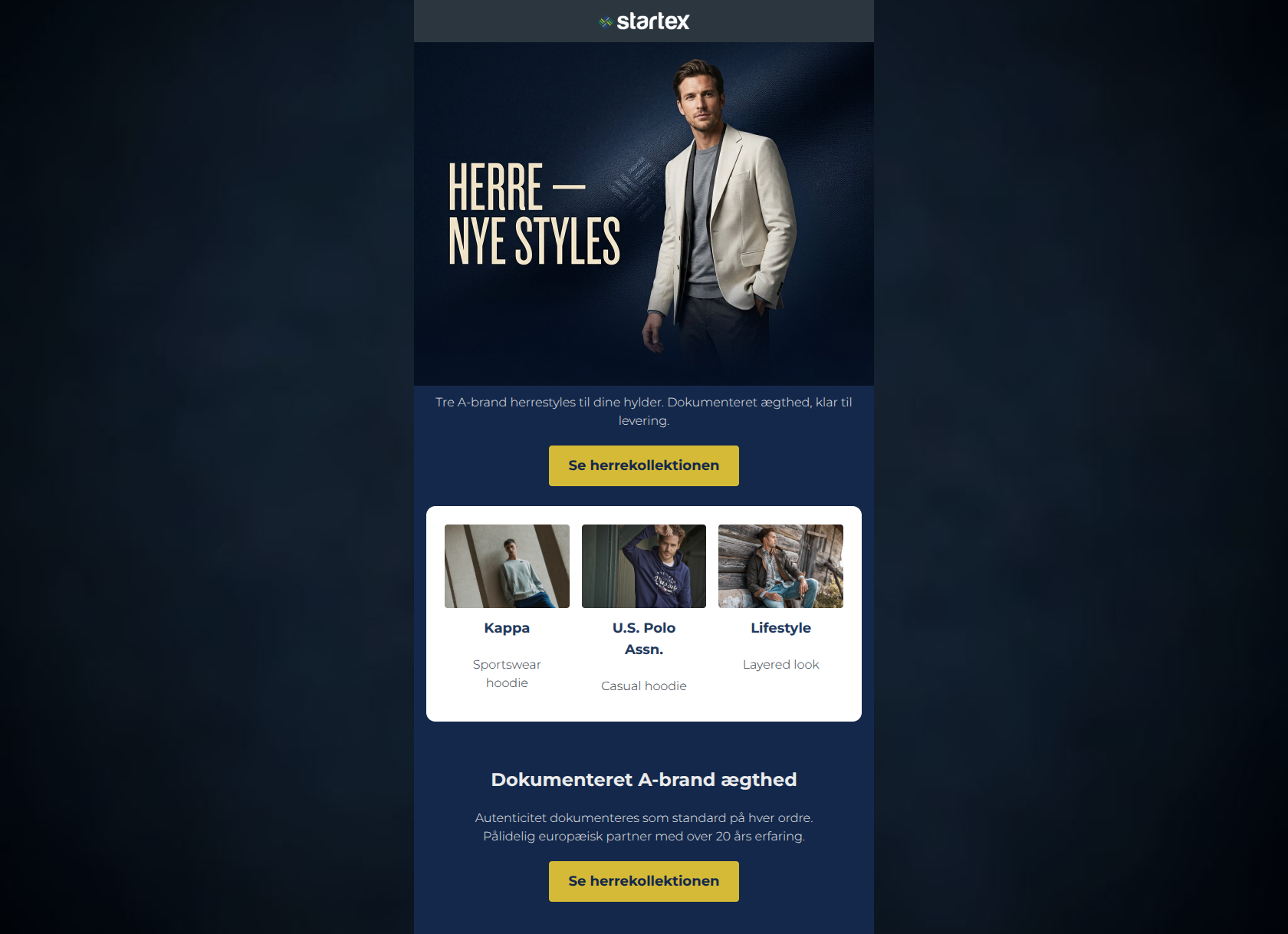
Tre A-brand herrestyles til dine hylder. Dokumenteret ægthed, klar til levering.
→ Se herrekollektionen
Kappa
Sportswear hoodie
U.S. Polo Assn.
Casual hoodie
Lifestyle
Layered look
Dokumenteret A-brand ægthed
Autenticitet dokumenteres som standard på hver ordre. Pålidelig europæisk partner med over 20 års erfaring.
→ Se herrekollektionen
Why This Email Works
This is a highly effective, professional B2B email that nails its aesthetic and structural execution. The use of a dark theme with a contrasting bright white product card creates an excellent visual hierarchy that immediately draws the eye to the merchandise. The messaging is tight, focusing heavily on B2B pain points like speed to shelf and documented authenticity. The email strictly adheres to best practices for CTA repetition, making the next step undeniable. The primary areas for improvement involve aligning the visual expectations set by the hero image with the actual casual products offered, and clarifying the specific brands being showcased to fulfill the hero's promise.
Hero Impact
85/100- High-quality lifestyle imagery sets a premium brand tone.
- Subcopy directly addresses the B2B buyer's needs ('til dine hylder' / for your shelves).
Content Structure & Flow
92/100- Perfect use of an inset white card on a dark background to break up the email and highlight products.
- Logical progression from hook to product to trust-building footer.
Visual Hierarchy & Layout
90/100- Exceptional use of color contrast to create visual grouping and highlight the product card.
- CTA buttons pop brilliantly against the dark navy background.
Call-to-Action Strength
95/100- Perfect repetition of the primary CTA.
- High contrast mustard-on-navy button design ensures the CTA cannot be missed.
Message Clarity & Tone
85/100- Addresses core B2B pain points (authenticity, speed of delivery) directly.
- Tone is confident and reliable, fitting a partner with 20 years of experience.
Readability & Scannability
88/100- Short, direct sentences prevent cognitive overload.
- Clear section divisions make scanning effortless.
Offer & Value Proposition
78/100- The guarantee of documented authenticity is a massive trust signal and a strong unique selling proposition.
- The offer of immediate availability ('klar til levering') is highly compelling for retailers.
Personalization & Audience Fit
88/100- Copy is explicitly tailored to retail buyers ('til dine hylder').
- Focuses on business outcomes rather than just product features.
Copy Conciseness & Word Economy
92/100- Zero filler words; highly distilled messaging.
- Respects the reader's time by getting straight to the value.
Quick Wins
- Increase the font size of the text immediately below the hero image to improve scannability.
- Change the 'Lifestyle' heading on the third product card to the actual brand name to fulfill the '3 A-brands' promise.
- Increase the font weight of the grey text under the brand names in the white product card.




Create Professional Email Designs
Generate beautiful, on-brand email designs in seconds. Just enter your brand URL and let AI do the rest.