Home & Garden Product Launch Email Template
“Nuovi prodotti in catalogo, pronti alla consegna”
Design Score
81/100A highly functional, brand-aligned email that successfully channels Effezeta Italia's 'digital warehouse' positioning. The minimalist layout is scannable, and the copy directly addresses B2B pain points regarding stock availability and delivery. However, the email leaves conversion on the table by routing all primary CTA buttons to the generic homepage instead of a dedicated 'New Arrivals' landing page, causing unnecessary friction. Additionally, it briefly abandons its sharp, operational tone for generic marketing fluff in the trust section.
Create Your Own
Generate professional email designs like this one in seconds with Kopi AI.
Email Details
- Subject Line
- Nuovi prodotti in catalogo, pronti alla consegna
- Brand
- Effezeta Italia
- Industry
- Home & Garden
- Email Type
- Product Launch
- Created
- June 29, 2026
Brand Colors
Email Copy
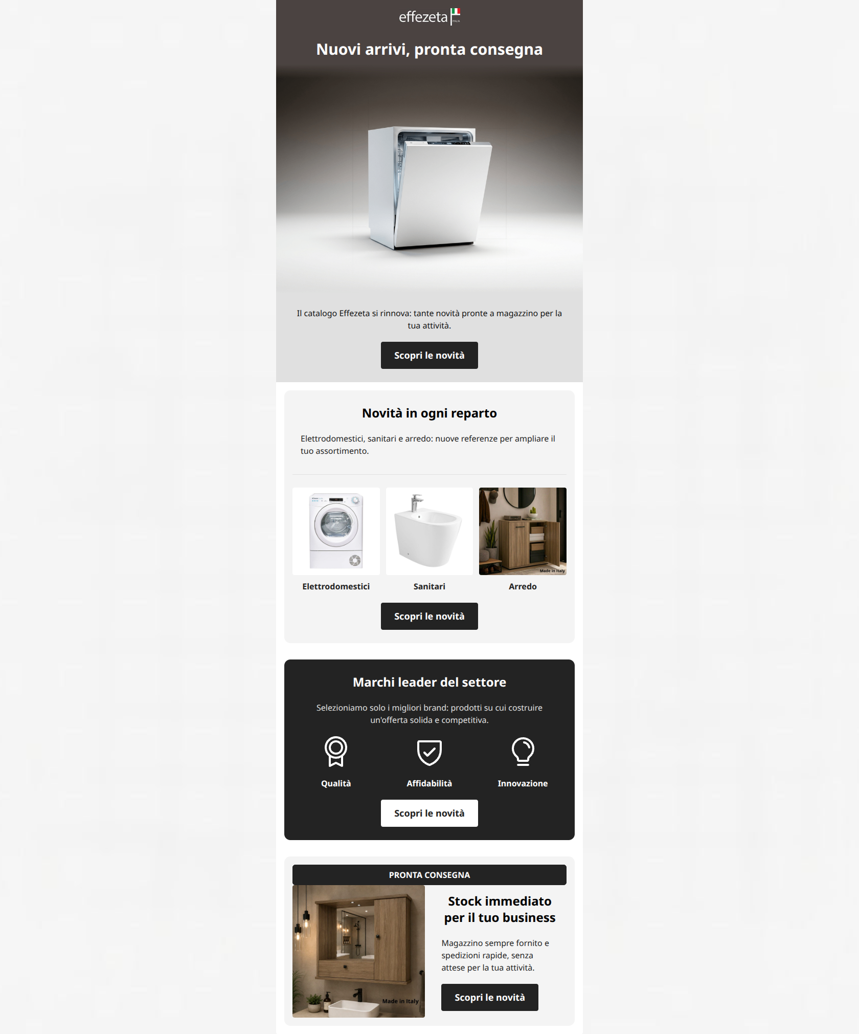
Nuovi arrivi, pronta consegna
Il catalogo Effezeta si rinnova: tante novità pronte a magazzino per la tua attività.
→ Scopri le novità
Novità in ogni reparto
Elettrodomestici, sanitari e arredo: nuove referenze per ampliare il tuo assortimento.
Elettrodomestici
Sanitari
Arredo
→ Scopri le novità
Marchi leader del settore
Selezioniamo solo i migliori brand: prodotti su cui costruire un'offerta solida e competitiva.
Qualità
Affidabilità
Innovazione
→ Scopri le novità
PRONTA CONSEGNA
Stock immediato per il tuo business
Magazzino sempre fornito e spedizioni rapide, senza attese per la tua attività.
→ Scopri le novità
Why This Email Works
A highly functional, brand-aligned email that successfully channels Effezeta Italia's 'digital warehouse' positioning. The minimalist layout is scannable, and the copy directly addresses B2B pain points regarding stock availability and delivery. However, the email leaves conversion on the table by routing all primary CTA buttons to the generic homepage instead of a dedicated 'New Arrivals' landing page, causing unnecessary friction. Additionally, it briefly abandons its sharp, operational tone for generic marketing fluff in the trust section.
Hero Impact
82/100- Direct, no-nonsense headline that hits the primary customer pain point immediately.
- Utilitarian, clean product photography that matches the brand's 'digital warehouse' aesthetic.
Content Structure & Flow
78/100- Clear, block-based sectioning makes it easy for busy procurement managers to scan.
- Logical progression from a broad announcement to specific departmental categories.
Visual Hierarchy & Layout
85/100- Excellent use of high-contrast background blocks (dark grey/light grey/white) to denote distinct sections.
- Minimalist design prevents visual fatigue and keeps focus on the inventory.
Call-to-Action Strength
70/100- Excellent, consistent repetition of the primary CTA across every section.
- Strong visual contrast for all buttons (black on light backgrounds, white on dark).
Message Clarity & Tone
88/100- Tone is highly appropriate for the B2B target audience: professional and transactional.
- Effectively uses industry terminology ('referenze', 'assortimento').
Readability & Scannability
90/100- Excellent use of short, punchy headings to guide the eye.
- High text contrast across both light and dark background bands.
Offer & Value Proposition
80/100- The brand's primary differentiator (immediate stock) is front and center.
- Value proposition is communicated both in text and via visual badges (the Pronta Consegna banner).
Personalization & Audience Fit
82/100- Directly addresses the reader's business outcomes ('senza attese per la tua attività').
Copy Conciseness & Word Economy
85/100- Avoids long paragraphs; favors single, declarative sentences.
- No wasted space on aspirational lifestyle copy.
Quick Wins
- Update all 'Scopri le novità' CTA buttons to link directly to the '/nuovi-prodotti' page to remove friction and match user intent.
- Remove the light grey (#e0e0e0) background behind the first text/CTA block to visually integrate it with the hero section above it.


Create Professional Email Designs
Generate beautiful, on-brand email designs in seconds. Just enter your brand URL and let AI do the rest.