Fitness Product Launch Email Template
“New collection + 15% off”
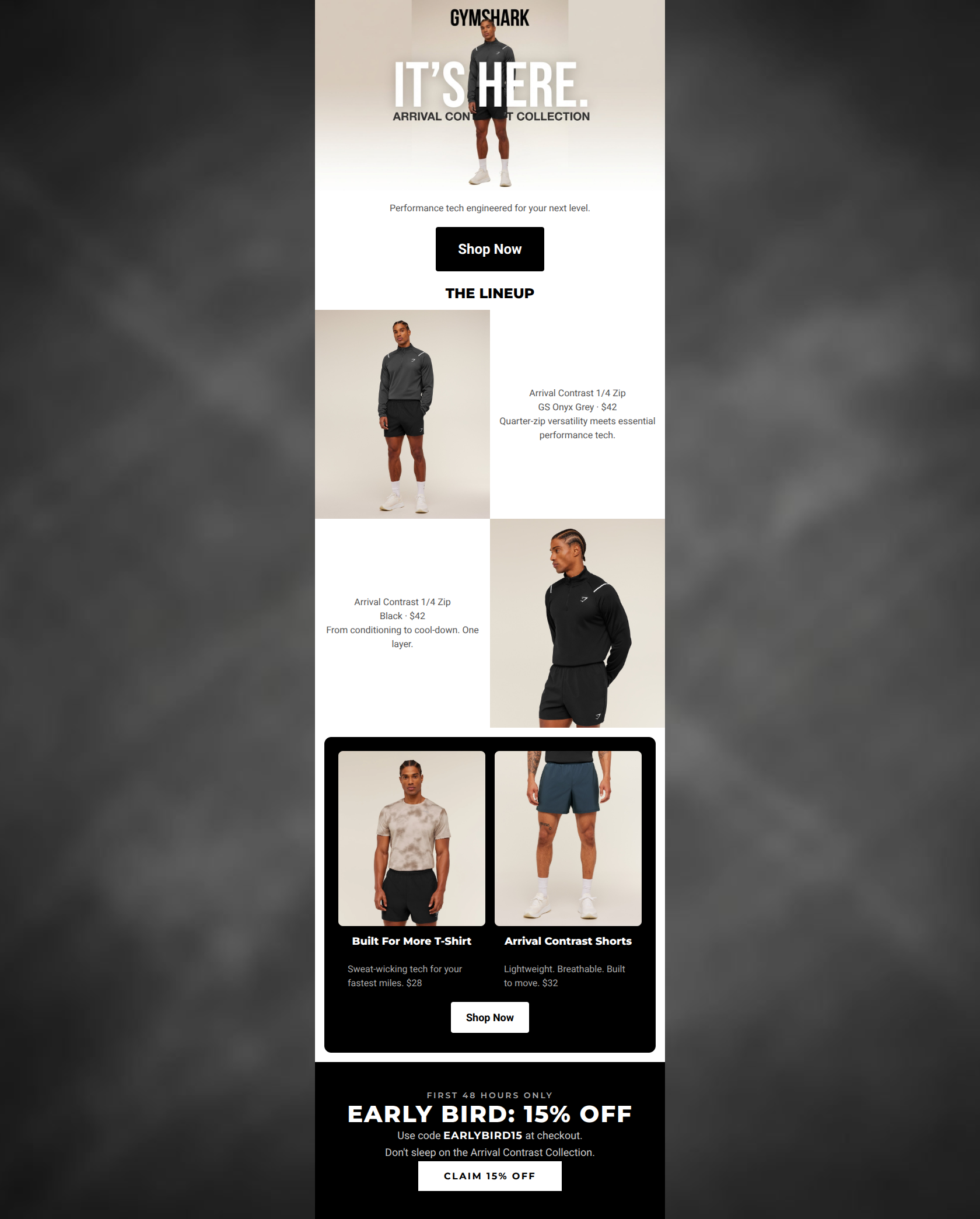
Design Score
79/100This email is visually striking and aligns beautifully with Gymshark's gritty, minimalist, and athletic-editorial aesthetic. It effectively showcases the new Arrival Contrast Collection with high-quality imagery and punchy, brand-appropriate copy. However, it leaves conversions on the table by burying its most powerful click-driver—the 15% Early Bird discount—at the absolute bottom of the scroll. Furthermore, the middle 'Lineup' section suffers from weak visual hierarchy, small typography, and a lack of explicit CTAs, which creates unnecessary friction in the shopping journey.
Create Your Own
Generate professional email designs like this one in seconds with Kopi AI.
Email Details
- Subject Line
- New collection + 15% off
- Brand
- Gymshark
- Industry
- Fitness
- Email Type
- Product Launch
- Created
- March 31, 2026
Brand Colors
Email Copy
Performance tech engineered for your next level.
→ Shop Now
THE LINEUP
Arrival Contrast 1/4 Zip GS Onyx Grey · $42 Quarter-zip versatility meets essential performance tech.
Arrival Contrast 1/4 Zip Black · $42 From conditioning to cool-down. One layer.
Built For More T-Shirt
Sweat-wicking tech for your fastest miles. $28
Arrival Contrast Shorts
Lightweight. Breathable. Built to move. $32
→ Shop Now
Why This Email Works
This email is visually striking and aligns beautifully with Gymshark's gritty, minimalist, and athletic-editorial aesthetic. It effectively showcases the new Arrival Contrast Collection with high-quality imagery and punchy, brand-appropriate copy. However, it leaves conversions on the table by burying its most powerful click-driver—the 15% Early Bird discount—at the absolute bottom of the scroll. Furthermore, the middle 'Lineup' section suffers from weak visual hierarchy, small typography, and a lack of explicit CTAs, which creates unnecessary friction in the shopping journey.
Hero (top/initial part) Impact
75/100- High-impact lifestyle photography that instantly establishes the brand's aesthetic.
- The primary 'Shop Now' CTA is high-contrast and immediately visible above the fold.
Content Structure & Flow
82/100- Alternating dark and light background sections successfully break up the vertical scroll and maintain visual interest.
- Logical funnel: Hero announcement -> Specific product focus -> Broader category grid -> Urgency driver.
Visual Hierarchy & Layout
74/100- The black product card section (Section 3) effectively groups items and draws the eye.
- Strong use of bold, uppercase headings to guide the reader's eye down the page.
Call-to-Action Strength
68/100- Buttons utilize excellent black/white contrast against their respective backgrounds, passing the squint test easily.
- The final CTA ('Claim 15% Off') is specific and highly compelling.
Message Clarity & Tone
88/100- Excellent use of short, utilitarian fragments ('Lightweight. Breathable. Built to move.') that appeal to the target demographic.
- The tone is confident and action-oriented, perfectly matching the 'dedicated coach' persona.
Readability & Scannability
72/100- Pricing is placed directly next to product names, reducing the cognitive load for shoppers.
- Clear distinction between bold headings and lighter body copy establishes a good text hierarchy within the dark cards.
Offer & Value Proposition
78/100- Clear, upfront pricing on all featured products.
- The Early Bird promo uses a specific deadline ('First 48 hours only') to generate genuine urgency.
Personalization & Audience Fit
85/100- Photography features relatable yet aspirational athletic models that reflect the target audience.
- The overall gritty, stripped-back visual approach honors the brand's 'streetwear meets gym' positioning.
Copy Conciseness & Word Economy
88/100- Outstanding word economy in the product grid (e.g., 'From conditioning to cool-down. One layer.').
- No throat-clearing intro paragraphs; it gets straight to the product.
Quick Wins
- Tease the '15% Off' Early Bird offer in the hero section or preheader so users know there is an immediate financial incentive to shop.
- Increase the font size and weight of the body copy in the white 'Lineup' sections to improve legibility.
- Add explicit text links (e.g., 'Shop the 1/4 Zip') to the alternating product rows.

Create Professional Email Designs
Generate beautiful, on-brand email designs in seconds. Just enter your brand URL and let AI do the rest.