SaaS & Software Product Launch Email Template
“Meet the Agent window.”
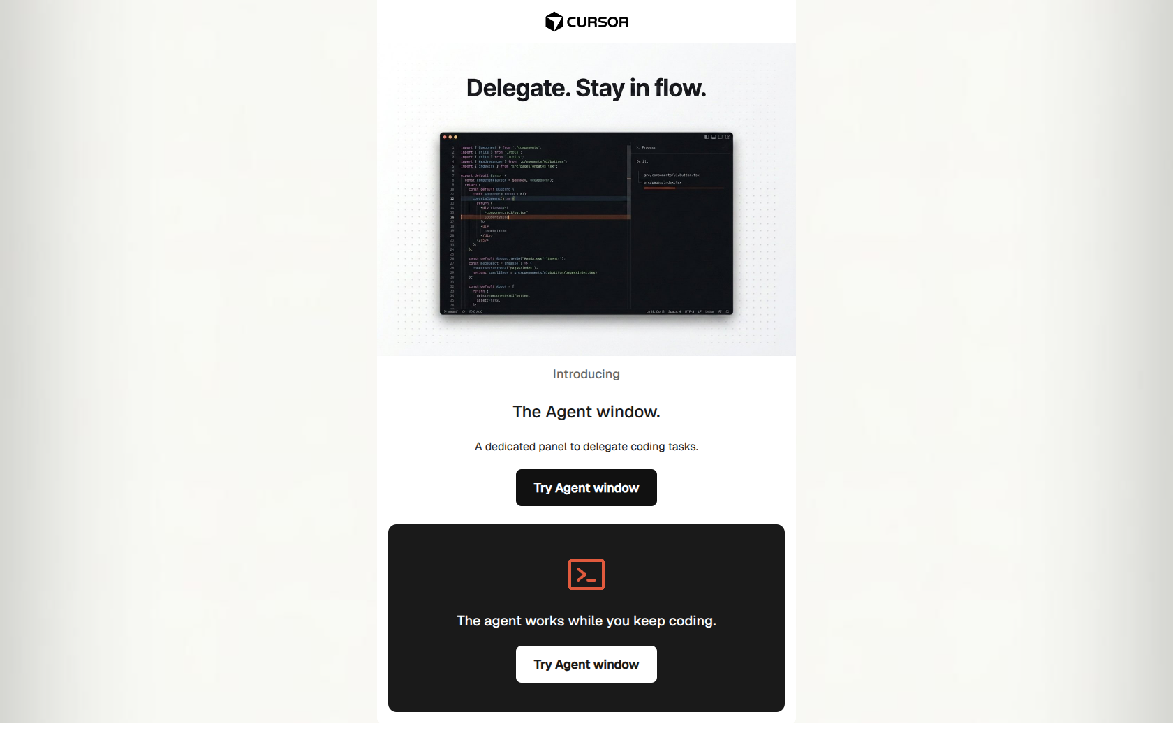
Design Score
91/100This is an outstanding example of a product launch email tailored specifically for a highly technical audience. It adheres perfectly to the 'developer-native' aesthetic: hyper-functional, devoid of marketing fluff, and heavily focused on the UI and the core value proposition ('stay in flow'). The email structure is a perfect inverted pyramid, moving from a visually compelling hero directly to a clear benefit and a consistent call-to-action. While the conciseness is a major strength, it slightly undersells the feature by not providing a concrete example of a task to delegate, and it omits logistical details on how to actually access the new feature within the app.
Create Your Own
Generate professional email designs like this one in seconds with Kopi AI.
Email Details
- Subject Line
- Meet the Agent window.
- Brand
- Cursor
- Industry
- SaaS & Software
- Email Type
- Product Launch
- Created
- May 11, 2026
Brand Colors
Email Copy
Introducing
The Agent window.
A dedicated panel to delegate coding tasks.
→ Try Agent window
The agent works while you keep coding.
→ Try Agent window
Why This Email Works
This is an outstanding example of a product launch email tailored specifically for a highly technical audience. It adheres perfectly to the 'developer-native' aesthetic: hyper-functional, devoid of marketing fluff, and heavily focused on the UI and the core value proposition ('stay in flow'). The email structure is a perfect inverted pyramid, moving from a visually compelling hero directly to a clear benefit and a consistent call-to-action. While the conciseness is a major strength, it slightly undersells the feature by not providing a concrete example of a task to delegate, and it omits logistical details on how to actually access the new feature within the app.
Hero (top/initial part) Impact
85/100- Hero image text directly addresses a core developer desire ('Stay in flow').
- Immediate presentation of the product UI builds trust and relevance.
Content Structure & Flow
90/100- Perfect implementation of the inverted pyramid structure.
- Zero friction or dead-ends; every element points towards the CTA.
Visual Hierarchy & Layout
95/100- High-contrast CTA buttons (black on white, white on black) make the next step undeniable.
- The layout reflects the UI of the product itself, creating brand consistency.
Call-to-Action Strength
98/100- Perfect repetition of the primary CTA without unnecessary variation.
- Buttons are visually dominant and distinct from surrounding text.
Message Clarity & Tone
95/100- Speaks the audience's language without relying on jargon.
- Focuses entirely on the outcome (staying in flow) rather than the underlying technology.
Readability & Scannability
98/100- Short, punchy sentences.
- Excellent use of text sizing to guide the eye.
Offer & Value Proposition
85/100- Directly addresses the friction of current AI tools (having to stop coding to prompt).
Personalization & Audience Fit
90/100- Tone and visual style are perfectly calibrated for a cynical, highly technical audience.
Copy Conciseness & Word Economy
95/100- Every sentence adds specific value.
- Highly distilled messaging.
Quick Wins
- Remove the word 'Introducing' to make the headline punchier.
- Darken the '#666666' text slightly for better accessibility.
- Add a small margin-bottom to the paragraph text above the first CTA.


Create Professional Email Designs
Generate beautiful, on-brand email designs in seconds. Just enter your brand URL and let AI do the rest.