Electronics & Tech Promotional Email Template
“Meet Levi: The Senior Designer Behind Our Best Bui”
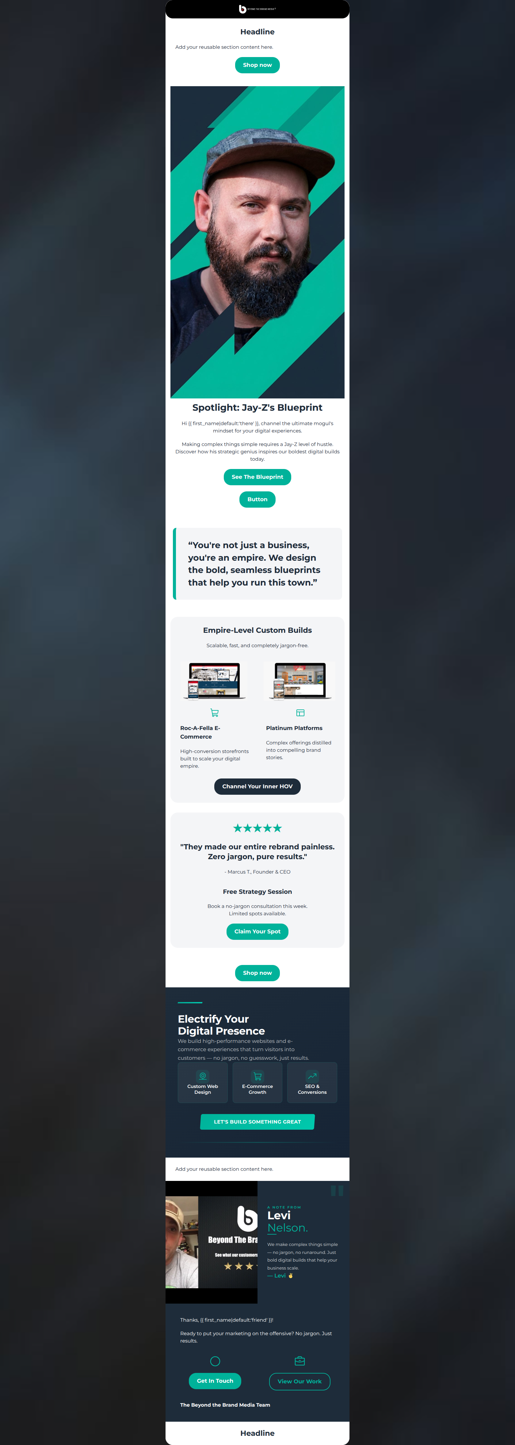
Design Score
82/100This email is a visually striking and on-brand nurture piece that successfully translates the agency's 'zero jargon' philosophy into a scannable narrative. However, its slightly 'me-centric' hero headline and passive calls-to-action leave potential engagement on the table by focusing more on the agency than the client's immediate business needs.
Create Your Own
Generate professional email designs like this one in seconds with Kopi AI.
Email Details
- Subject Line
- Meet Levi: The Senior Designer Behind Our Best Bui
- Brand
- Beyond the Brand Media®
- Industry
- Electronics & Tech
- Email Type
- Promotional
- Created
- March 10, 2026
Brand Colors
Email Copy
Headline
Add your reusable section content here.
→ Shop now
Spotlight: Jay-Z's Blueprint
Hi there, channel the ultimate mogul's mindset for your digital experiences.
Making complex things simple requires a Jay-Z level of hustle. Discover how his strategic genius inspires our boldest digital builds today.
→ See The Blueprint
→ Button
Empire-Level Custom Builds
Scalable, fast, and completely jargon-free.
Roc-A-Fella E-Commerce
High-conversion storefronts built to scale your digital empire.
Platinum Platforms
Complex offerings distilled into compelling brand stories.
→ Channel Your Inner HOV
★★★★★
"They made our entire rebrand painless. Zero jargon, pure results."
- Marcus T., Founder & CEO
Free Strategy Session
Book a no-jargon consultation this week. Limited spots available.
→ Claim Your Spot
→ Shop now
Add your reusable section content here.
Thanks, friend!
Ready to put your marketing on the offensive? No jargon. Just results.
→ Get In Touch
→ View Our Work
The Beyond the Brand Media Team
Headline
Why This Email Works
This email is a visually striking and on-brand nurture piece that successfully translates the agency's 'zero jargon' philosophy into a scannable narrative. However, its slightly 'me-centric' hero headline and passive calls-to-action leave potential engagement on the table by focusing more on the agency than the client's immediate business needs.
Hero Impact
70/100- The hero image is visually striking and perfectly aligns with the brand's stated technical, modern aesthetic.
- A clear, contrasting CTA is present immediately above the fold.
Content Structure & Flow
88/100- Excellent use of the inverted pyramid approach, moving from a broad introduction down to specific, tangible examples of work.
- The transitions between sections (from the dark philosophy block to the light quote card) create a natural scrolling rhythm.
Visual Hierarchy & Layout
92/100- The dark navy 'Conversion first' block acts as a fantastic visual pattern interrupt, forcing the reader to pause and absorb the core value proposition.
- The grid-based card layout for the 'Recent Custom Builds' effectively organizes the portfolio without clutter.
Call-to-Action Strength
74/100- CTAs use strong, high-contrast brand colors (Teal and Navy) that stand out clearly from their respective backgrounds.
- Sufficient breathing room (padding) around the buttons makes them easily tappable.
Message Clarity & Tone
94/100- The phrase 'Conversion first. Zero jargon.' is a masterclass in clear, concise B2B positioning.
- The pull quote ('making complex user journeys feel intuitively simple') directly reinforces the agency's core brand promise.
Readability & Scannability
85/100- The use of varying heading levels (H1, H2, H4) establishes a clear typographical hierarchy.
- Copy lengths are kept strictly in check; there are no intimidating walls of text.
Offer & Value Proposition
78/100- The value proposition is explicitly stated and visually prioritized in the dark mid-section.
- The portfolio cards clearly label the type of solution provided (Scalable E-Commerce, Corporate Web Platforms).
Personalization & Audience Fit
80/100- The use of 'mid-range and premium commercial clients' explicitly calls out the target audience, pre-qualifying leads.
- The language specifically targets business outcomes ('revenue drivers', 'seamlessly scale') rather than just design aesthetics.
Quick Wins
- Change the Hero H1 from an agency-centric 'Spotlight' to a client-centric, benefit-driven headline.
- Update the CTA button copy from passive ('See His Work') to active, outcome-focused language.
- Break the paragraph in the dark 'Conversion first' block into two shorter sentences for easier reading.

Create Professional Email Designs
Generate beautiful, on-brand email designs in seconds. Just enter your brand URL and let AI do the rest.