SaaS & Software Announcement Email Template
“Just a Quick Hello From Our Team”
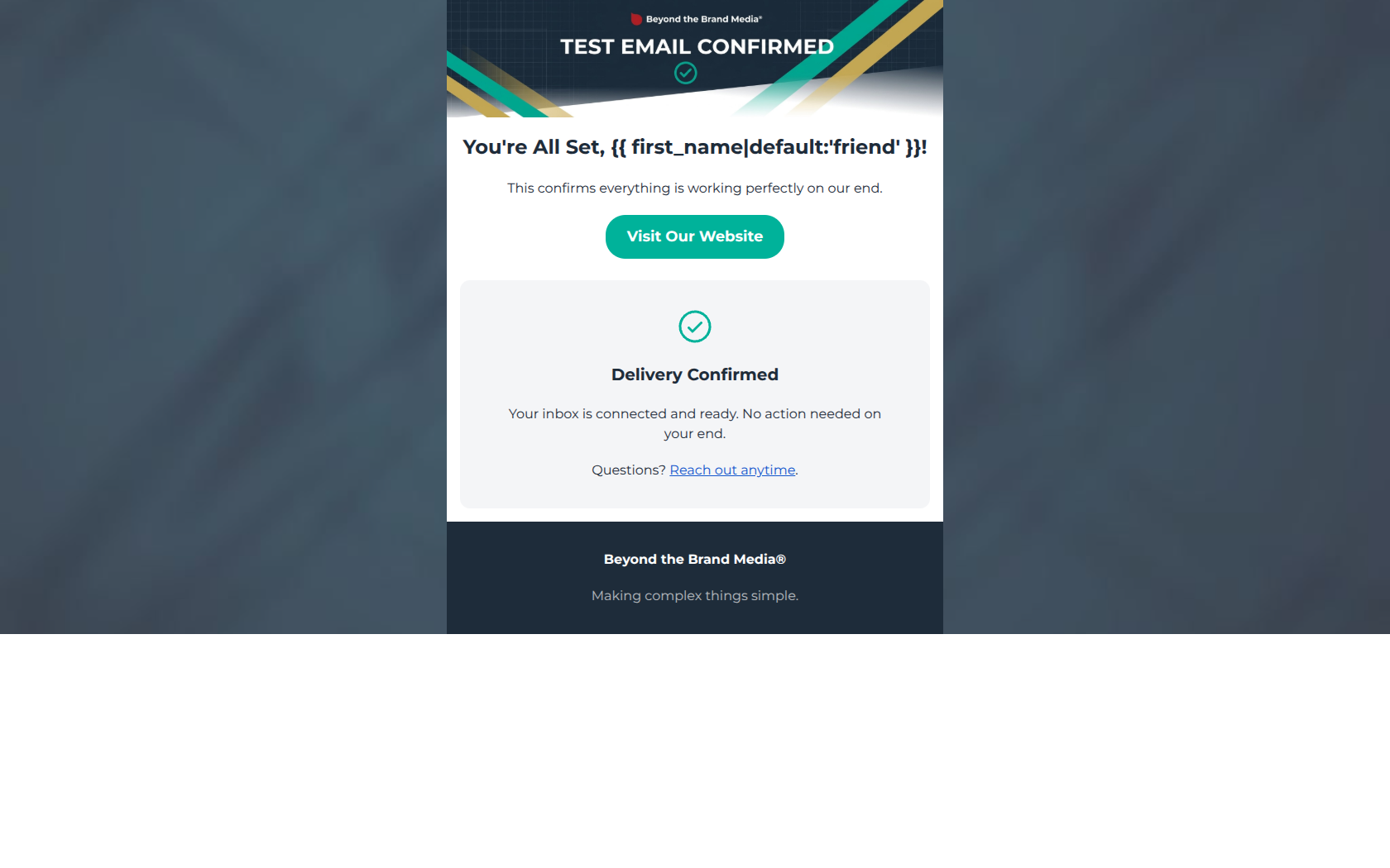
Design Score
55/100This email functions as a basic system ping but completely fails as a marketing touchpoint for a premium B2B agency. While visually clean and aligned with the brand's technical aesthetic, the copy aggressively tells the user "no action needed," actively killing any motivation to click through. For a brand targeting busy SMB owners looking for ROI, sending a dead-end email is a missed opportunity to establish authority, share a quick win, or build rapport. Every pixel should drive action; this email asks the user to do nothing.
Create Your Own
Generate professional email designs like this one in seconds with Kopi AI.
Email Details
- Subject Line
- Just a Quick Hello From Our Team
- Brand
- Beyond the Brand Media®
- Industry
- SaaS & Software
- Email Type
- Announcement
- Created
- April 22, 2026
Brand Colors
Email Copy
You're All Set, friend!
This confirms everything is working perfectly on our end.
→ Visit Our Website
Delivery Confirmed
Your inbox is connected and ready. No action needed on your end.
Questions? Reach out anytime.
Beyond the Brand Media®
Making complex things simple.
Why This Email Works
This email functions as a basic system ping but completely fails as a marketing touchpoint for a premium B2B agency. While visually clean and aligned with the brand's technical aesthetic, the copy aggressively tells the user "no action needed," actively killing any motivation to click through. For a brand targeting busy SMB owners looking for ROI, sending a dead-end email is a missed opportunity to establish authority, share a quick win, or build rapport. Every pixel should drive action; this email asks the user to do nothing.
Hero Impact
45/100- Strong visual alignment with the brand's geometric, technical aesthetic.
- Immediately communicates the purpose of the email via the image graphic.
Content Structure & Flow
50/100- Simple, single-column layout keeps focus centered.
- The grey card effectively separates secondary information from the primary message.
Visual Hierarchy & Layout
80/100- The vibrant teal CTA button pops clearly against the white background, passing the squint test.
- Generous padding and the use of a subtle grey background card (#F4F5F7) create a clean, modern aesthetic.
Call-to-Action Strength
55/100- High-contrast button color makes the action visually obvious.
- Central placement directly follows the main headline.
Message Clarity & Tone
65/100- Zero jargon. The message is instantly understandable.
- Short, direct sentences reduce cognitive load to near zero.
Readability & Scannability
90/100- Excellent use of short copy and centered alignment.
- High contrast text against both the white body and dark navy footer.
Offer & Value Proposition
30/100- The brand tagline 'Making complex things simple' in the footer acts as a micro-value proposition.
Personalization & Audience Fit
40/100- Use of dynamic tags for the recipient's first name.
Copy Conciseness & Word Economy
50/100- Short sentences prevent the user from getting bogged down in text.
Quick Wins
- Replace the generic 'Visit Our Website' CTA with a specific, value-driven action like 'See Our Latest Case Studies'.
- Remove the repetitive 'Delivery Confirmed' card and replace it with a link to your best-performing blog post or a client success story.
- Update the hero subtext to transition smoothly from the confirmation to a reason to click (e.g., 'Everything is set. While you're here, see how we can help you scale.').
Create Professional Email Designs
Generate beautiful, on-brand email designs in seconds. Just enter your brand URL and let AI do the rest.