Fashion & Apparel Promotional Email Template
“Introducing Flow.”
Design Score
88/100This is a highly effective, beautifully restrained email that perfectly executes Viita's 'editorial luxury' brand mandate. The stark black-and-white aesthetic, combined with tight, confident copy, elevates leak-proof apparel out of the clinical space and into fashion. The email follows a strong inverted pyramid, moving from an emotional hero to practical product education, hitting a compelling offer, and finishing with a strong sustainability value proposition. The structural pacing is excellent, and the consistent, high-contrast Call-to-Action strategy is textbook execution for driving clicks. The minor deductions come from missed opportunities to visualize data (absorbency levels) and a slightly disjointed presentation of the green subsidy benefit.
Create Your Own
Generate professional email designs like this one in seconds with Kopi AI.
Email Details
- Subject Line
- Introducing Flow.
- Brand
- Viita Protection
- Industry
- Fashion & Apparel
- Email Type
- Promotional
- Created
- May 18, 2026
Brand Colors
Email Copy
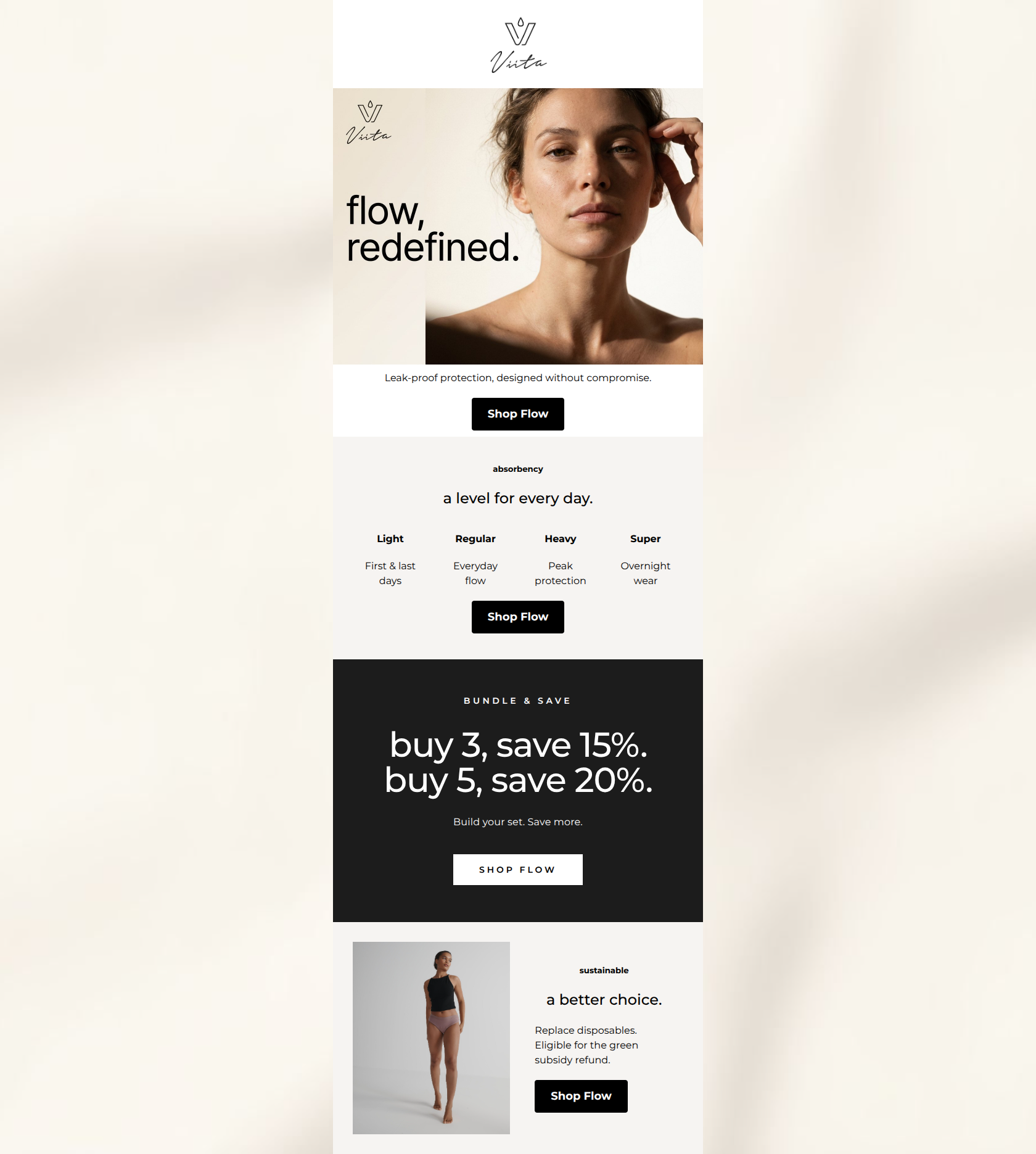
Leak-proof protection, designed without compromise.
→ Shop Flow
absorbency
a level for every day.
Light
First & last days
Regular
Everyday flow
Heavy
Peak protection
Super
Overnight wear
→ Shop Flow
sustainable
a better choice.
Replace disposables. Eligible for the green subsidy refund.
→ Shop Flow
Why This Email Works
This is a highly effective, beautifully restrained email that perfectly executes Viita's 'editorial luxury' brand mandate. The stark black-and-white aesthetic, combined with tight, confident copy, elevates leak-proof apparel out of the clinical space and into fashion. The email follows a strong inverted pyramid, moving from an emotional hero to practical product education, hitting a compelling offer, and finishing with a strong sustainability value proposition. The structural pacing is excellent, and the consistent, high-contrast Call-to-Action strategy is textbook execution for driving clicks. The minor deductions come from missed opportunities to visualize data (absorbency levels) and a slightly disjointed presentation of the green subsidy benefit.
1. Hero Impact
88/100- Stunning, on-brand photography that elevates the product category.
- Clear, confident headline copy.
- Immediate introduction of the core value proposition.
2. Content Structure & Flow
90/100- Logical progression of information.
- Excellent use of color-blocking to break up sections and maintain engagement.
- Generous whitespace supports the premium aesthetic.
3. Visual Hierarchy & Layout
85/100- Strict, disciplined typography that reinforces the brand's premium positioning.
- The dark bundle block serves as a powerful visual anchor.
- Consistent padding and alignment create a structured, calming reading experience.
4. Call-to-Action Strength
98/100- Relentless focus on a single primary action.
- High-contrast black-on-white and white-on-black buttons are impossible to miss.
- CTA copy is clear, brief, and action-oriented.
5. Message Clarity & Tone
85/100- Confident, understated copy that avoids clinical clichés.
- Treats a sensitive topic with dignity and high-fashion sensibility.
- Clear articulation of benefits over mere features.
6. Readability & Scannability
90/100- Excellent word economy.
- Strong visual differentiation between headings and body text.
- Offer block is instantly digestible.
7. Offer & Value Proposition
92/100- Offer is deeply aligned with customer purchase behavior (building a set).
- Tiered discount encourages higher AOV.
- Striking visual presentation of the offer.
8. Personalization & Audience Fit
82/100- Addresses real functional needs (different flow days).
- Appeals to the audience's desire for eco-friendly alternatives.
9. Copy Conciseness & Word Economy
95/100- Zero fluff or filler phrases.
- Direct, impactful sentence structures.
- Allows the design and photography to breathe.
Quick Wins
- Add minimalist visual indicators (e.g., filled geometric shapes) above the text in the 4-column 'absorbency' section to visually communicate the scale from Light to Super.
- Change 'a level for every day.' to 'Find your perfect level.' to make the copy more 'you'-centric.
- Add a brief clarifying note to the sustainability section regarding the green subsidy, such as 'We'll show you how at checkout.' to close the loop on that claim.




Create Professional Email Designs
Generate beautiful, on-brand email designs in seconds. Just enter your brand URL and let AI do the rest.