SaaS & Software Announcement Email Template
“Internal Test — Confirm Email Rendering”
Design Score
40/100CRITICAL FAILURE: The email content contains a fatal messaging contradiction. It explicitly tells the recipient 'No action needed' and is formatted as an internal IT 'Systems Check' notification, yet it contains primary CTAs asking the user to visit the website. This creates absolute cognitive dissonance for a customer and destroys any conversion momentum. Furthermore, an email functioning as a generic 'systems test' provides zero value to an external marketing audience. While the visual design, contrast, and readability are exceptionally strong and highly on-brand, the core content is incoherent for a promotional campaign, capping the overall score heavily.
Create Your Own
Generate professional email designs like this one in seconds with Kopi AI.
Email Details
- Subject Line
- Internal Test — Confirm Email Rendering
- Brand
- Beyond the Brand Media®
- Industry
- SaaS & Software
- Email Type
- Announcement
- Created
- April 22, 2026
Brand Colors
Email Copy
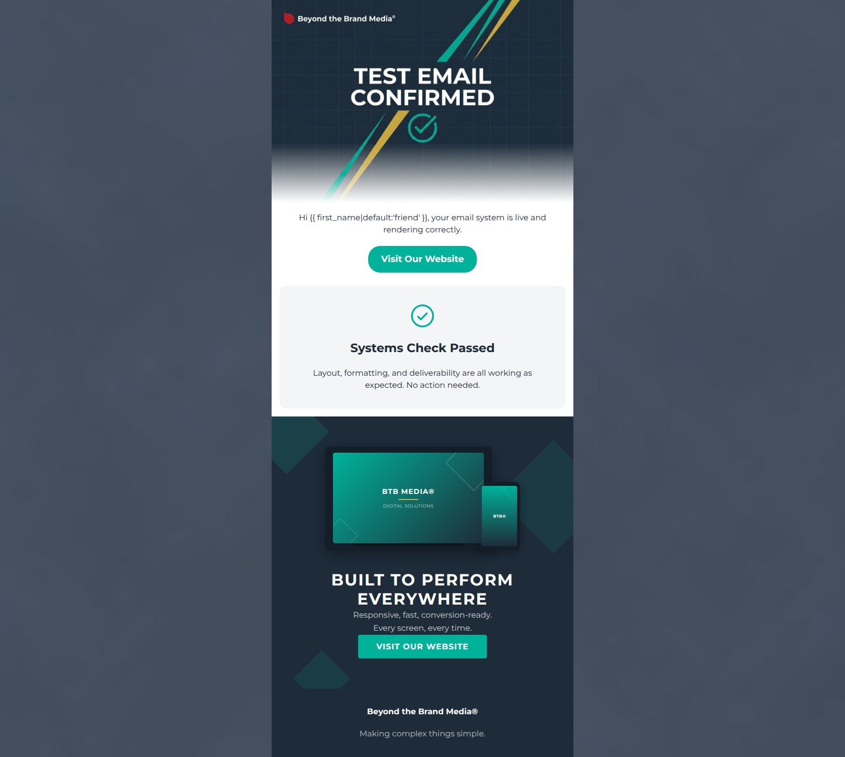
Hi friend, your email system is live and rendering correctly.
→ Visit Our Website
Systems Check Passed
Layout, formatting, and deliverability are all working as expected. No action needed.
Beyond the Brand Media®
Making complex things simple.
Why This Email Works
CRITICAL FAILURE: The email content contains a fatal messaging contradiction. It explicitly tells the recipient 'No action needed' and is formatted as an internal IT 'Systems Check' notification, yet it contains primary CTAs asking the user to visit the website. This creates absolute cognitive dissonance for a customer and destroys any conversion momentum. Furthermore, an email functioning as a generic 'systems test' provides zero value to an external marketing audience. While the visual design, contrast, and readability are exceptionally strong and highly on-brand, the core content is incoherent for a promotional campaign, capping the overall score heavily.
Hero (top/initial part) Impact
10/100- Strong visual execution of brand guidelines, utilizing the geometric diagonals and brand color palette effectively.
- High-contrast text over the background image makes the (flawed) message immediately legible.
Content Structure & Flow
30/100- Clear visual delineation between sections using background color changes (white to light grey to dark navy).
- The layout relies on distinct, easy-to-digest blocks rather than overwhelming the reader with a single long column.
Visual Hierarchy & Layout
90/100- Excellent use of the canvas background (#1E2C3A) framing the white body, creating a polished 'app-like' feel.
- The teal CTA buttons and icons pop brilliantly against both the white and dark navy backgrounds.
- Consistent and deliberate use of brand colors reinforces brand identity without overwhelming the eye.
Call-to-Action Strength
50/100- CTAs are highly visible, utilizing the vibrant brand teal for maximum contrast.
- The email adheres perfectly to the rule of repeating a single primary CTA with a consistent destination.
Message Clarity & Tone
20/100- The tone, while applied to the wrong subject matter, remains professional and confident, avoiding jargon.
- The final tagline ('Making complex things simple') is clear and effectively placed.
Readability & Scannability
90/100- Excellent use of iconography (the check mark) to break up text visually.
- Generous line height and padding around text blocks prevent visual crowding.
- Dark text on light backgrounds and light text on dark backgrounds pass all contrast 'squint tests'.
Offer & Value Proposition
30/100- The bottom section succinctly lists key technical benefits ('Responsive, fast, conversion-ready') without resorting to deep jargon.
Personalization & Audience Fit
20/100- The inclusion of a default fallback ('friend') ensures the greeting doesn't break if data is missing.
Copy Conciseness & Word Economy
85/100- Every sentence gets straight to the point.
- Bullet-point style phrasing ('Responsive, fast, conversion-ready') communicates maximum information with minimum reading effort.
Quick Wins
- Remove the conflicting 'No action needed' sentence immediately to clear the path for conversions.
- Update all CTA buttons to a more compelling, action-oriented phrase like 'Explore Custom Solutions'.
- Delete the entire top 'Test Email' hero and 'Systems Check' sections, making the 'Built to Perform Everywhere' block the primary focus of the email.
Create Professional Email Designs
Generate beautiful, on-brand email designs in seconds. Just enter your brand URL and let AI do the rest.